FabCon is coming to Atlanta
Join us at FabCon Atlanta from March 16 - 20, 2026, for the ultimate Fabric, Power BI, AI and SQL community-led event. Save $200 with code FABCOMM.
Register now!- Power BI forums
- Get Help with Power BI
- Desktop
- Service
- Report Server
- Power Query
- Mobile Apps
- Developer
- DAX Commands and Tips
- Custom Visuals Development Discussion
- Health and Life Sciences
- Power BI Spanish forums
- Translated Spanish Desktop
- Training and Consulting
- Instructor Led Training
- Dashboard in a Day for Women, by Women
- Galleries
- Data Stories Gallery
- Themes Gallery
- Contests Gallery
- Quick Measures Gallery
- Notebook Gallery
- Translytical Task Flow Gallery
- TMDL Gallery
- R Script Showcase
- Webinars and Video Gallery
- Ideas
- Custom Visuals Ideas (read-only)
- Issues
- Issues
- Events
- Upcoming Events
Calling all Data Engineers! Fabric Data Engineer (Exam DP-700) live sessions are back! Starting October 16th. Sign up.
- Power BI forums
- Forums
- Get Help with Power BI
- DAX Commands and Tips
- Re: Dynamic Column Name changed by the selected Ye...
- Subscribe to RSS Feed
- Mark Topic as New
- Mark Topic as Read
- Float this Topic for Current User
- Bookmark
- Subscribe
- Printer Friendly Page
- Mark as New
- Bookmark
- Subscribe
- Mute
- Subscribe to RSS Feed
- Permalink
- Report Inappropriate Content
Dynamic Column Name changed by the selected Year & Month
Dear Kudos
I am converting an old Excel file report to the BI.
The old Excel file has many customized columns and cells.
One of my missions is to create measures for the following tables.
Factory | Operation | Last Year Total | Last 13 Month by Month | Current Year Total | Current Year Avg.
Above the list is the column header.
The production data refers to many different database files.
So there are many rows that measures are not coming from one table.
Order
Production
Stock
Priority
And so on...
So it is not easy to create the table. Furthermore, I would like to change the month and year based on the date slicer.
For example, if I select 2023/Oct by the date slicer, the report should show
Factory | Operation | 2022 Total | 2022 Oct - 2023 Oct by month | 2023 Total | 2023 Avg.
Order
Production
Stock
Priority
Is there a proper approach to make this kind of complicated table by Dax measure?
Solved! Go to Solution.
- Mark as New
- Bookmark
- Subscribe
- Mute
- Subscribe to RSS Feed
- Permalink
- Report Inappropriate Content
hi, @Young_G_Han
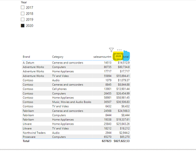
There no direct posiibility to create such things but you can make a new measure for selected year and make card visual and overlap it in measure or column name
like below
make new measure for selected year only
overlap it on column where you want to use for selected year total and avg. like below image

here yellow color is card visual after resize it and red color is measure name
If this post helps, then please consider Accept it as the solution to help the other members find it more quickly.
- Mark as New
- Bookmark
- Subscribe
- Mute
- Subscribe to RSS Feed
- Permalink
- Report Inappropriate Content
hi, @Young_G_Han
There no direct posiibility to create such things but you can make a new measure for selected year and make card visual and overlap it in measure or column name
like below
make new measure for selected year only
overlap it on column where you want to use for selected year total and avg. like below image

here yellow color is card visual after resize it and red color is measure name
If this post helps, then please consider Accept it as the solution to help the other members find it more quickly.
- Mark as New
- Bookmark
- Subscribe
- Mute
- Subscribe to RSS Feed
- Permalink
- Report Inappropriate Content
Dear Dangar332
Nice idea. I supposed that would not be easy.
But your idea is reasonable.
Thank you.
Helpful resources

FabCon Global Hackathon
Join the Fabric FabCon Global Hackathon—running virtually through Nov 3. Open to all skill levels. $10,000 in prizes!

Power BI Monthly Update - September 2025
Check out the September 2025 Power BI update to learn about new features.

| User | Count |
|---|---|
| 9 | |
| 8 | |
| 7 | |
| 4 | |
| 3 |
