FabCon is coming to Atlanta
Join us at FabCon Atlanta from March 16 - 20, 2026, for the ultimate Fabric, Power BI, AI and SQL community-led event. Save $200 with code FABCOMM.
Register now!- Power BI forums
- Get Help with Power BI
- Desktop
- Service
- Report Server
- Power Query
- Mobile Apps
- Developer
- DAX Commands and Tips
- Custom Visuals Development Discussion
- Health and Life Sciences
- Power BI Spanish forums
- Translated Spanish Desktop
- Training and Consulting
- Instructor Led Training
- Dashboard in a Day for Women, by Women
- Galleries
- Data Stories Gallery
- Themes Gallery
- Contests Gallery
- Quick Measures Gallery
- Notebook Gallery
- Translytical Task Flow Gallery
- TMDL Gallery
- R Script Showcase
- Webinars and Video Gallery
- Ideas
- Custom Visuals Ideas (read-only)
- Issues
- Issues
- Events
- Upcoming Events
To celebrate FabCon Vienna, we are offering 50% off select exams. Ends October 3rd. Request your discount now.
- Power BI forums
- Forums
- Get Help with Power BI
- DAX Commands and Tips
- Re: Dynamic Average Line for Column chart based on...
- Subscribe to RSS Feed
- Mark Topic as New
- Mark Topic as Read
- Float this Topic for Current User
- Bookmark
- Subscribe
- Printer Friendly Page
- Mark as New
- Bookmark
- Subscribe
- Mute
- Subscribe to RSS Feed
- Permalink
- Report Inappropriate Content
Dynamic Average Line for Column chart based on filter
Hello,
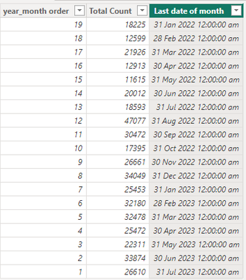
I have a simple calculated table and I would like to have column chart by months, together with an average line across.
The calculated table looks like this:
The column chart looks like this. At the top right hand corner, there is a year_month_order slicer for users to choose how many months of data they would like to see in the chart.
I would like to have an average line across, which is dynamic based on the slicer.
So for example,
- if year_month_no 1 to 19 are selected, the average line will show the total of 19 months divided by 19, which is standard across all months.
- if year_month_no 1 to 7 are selected, the average line will show the total of 7 months divided by 7, standard across all months in the chart.
The chart would look something like this:
Thank you.
Solved! Go to Solution.
- Mark as New
- Bookmark
- Subscribe
- Mute
- Subscribe to RSS Feed
- Permalink
- Report Inappropriate Content
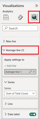
Try using the Average line from the Analytics pane.
- Mark as New
- Bookmark
- Subscribe
- Mute
- Subscribe to RSS Feed
- Permalink
- Report Inappropriate Content
- Mark as New
- Bookmark
- Subscribe
- Mute
- Subscribe to RSS Feed
- Permalink
- Report Inappropriate Content
Hi @nandukrishnavs ,
Thank you! This works after I've changed my chart to clustered column chart. Realised that the "average line" is not applicable on stacked column charts.
- Mark as New
- Bookmark
- Subscribe
- Mute
- Subscribe to RSS Feed
- Permalink
- Report Inappropriate Content
Hi @nandukrishnavs , there is no "Average Line" in my Analytics pane, I can only see "Error Bars". What do I need to do to see it?
Helpful resources
| User | Count |
|---|---|
| 15 | |
| 9 | |
| 8 | |
| 6 | |
| 5 |
| User | Count |
|---|---|
| 31 | |
| 18 | |
| 13 | |
| 7 | |
| 5 |


