Join us at FabCon Vienna from September 15-18, 2025
The ultimate Fabric, Power BI, SQL, and AI community-led learning event. Save €200 with code FABCOMM.
Get registered- Power BI forums
- Get Help with Power BI
- Desktop
- Service
- Report Server
- Power Query
- Mobile Apps
- Developer
- DAX Commands and Tips
- Custom Visuals Development Discussion
- Health and Life Sciences
- Power BI Spanish forums
- Translated Spanish Desktop
- Training and Consulting
- Instructor Led Training
- Dashboard in a Day for Women, by Women
- Galleries
- Data Stories Gallery
- Themes Gallery
- Contests Gallery
- Quick Measures Gallery
- Notebook Gallery
- Translytical Task Flow Gallery
- TMDL Gallery
- R Script Showcase
- Webinars and Video Gallery
- Ideas
- Custom Visuals Ideas (read-only)
- Issues
- Issues
- Events
- Upcoming Events
Enhance your career with this limited time 50% discount on Fabric and Power BI exams. Ends September 15. Request your voucher.
- Power BI forums
- Forums
- Get Help with Power BI
- DAX Commands and Tips
- Distinct Count Challenge
- Subscribe to RSS Feed
- Mark Topic as New
- Mark Topic as Read
- Float this Topic for Current User
- Bookmark
- Subscribe
- Printer Friendly Page
- Mark as New
- Bookmark
- Subscribe
- Mute
- Subscribe to RSS Feed
- Permalink
- Report Inappropriate Content
Distinct Count Challenge
Hello all! I am having an issue and can't wrap my head around the solution or problem after hours of googling. I would really appreciate any help or ideas.
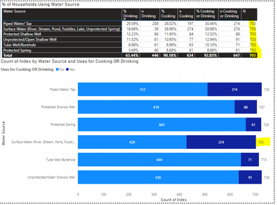
The problem: I am working on analyzing a survey from 5 organizations that each coded responses differently. I appended them in PowerQuery and then cleaned them in PQ and Dax. There are 703 unique respondents to the survey who were asked about using different water sources. However, when I create a bar chart, it shows more than 703 yes/no responses.
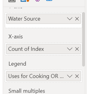
The visual is based off this, with count distinct for the Index:
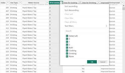
The data in the table is based off a calculated column in Dax:
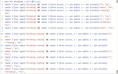
The columns "uses for Cooking" and "Uses for Drinking" I made using Switch as per below (example from "Uses for Drinking")
I think the problem with the table might be because it is showing a distinct count of indexes for both the "yes" and "no" responses per water source per type of use ( I want the distinct count of indexes for "yes" OR "no", so that it will show something like "Count distinct Index if "yes" or "no" for any type of use of the water source"
Is there a problem with my calculated columns?
Is there a way I can create a measure to get this distinct count?
Or any other ideas about what the problem could be and how to solve it?
Thanks so much in advance to all.
Helpful resources
| User | Count |
|---|---|
| 15 | |
| 13 | |
| 9 | |
| 6 | |
| 6 |
| User | Count |
|---|---|
| 29 | |
| 19 | |
| 13 | |
| 8 | |
| 5 |


