Join us at FabCon Vienna from September 15-18, 2025
The ultimate Fabric, Power BI, SQL, and AI community-led learning event. Save €200 with code FABCOMM.
Get registered- Power BI forums
- Get Help with Power BI
- Desktop
- Service
- Report Server
- Power Query
- Mobile Apps
- Developer
- DAX Commands and Tips
- Custom Visuals Development Discussion
- Health and Life Sciences
- Power BI Spanish forums
- Translated Spanish Desktop
- Training and Consulting
- Instructor Led Training
- Dashboard in a Day for Women, by Women
- Galleries
- Data Stories Gallery
- Themes Gallery
- Contests Gallery
- Quick Measures Gallery
- Notebook Gallery
- Translytical Task Flow Gallery
- TMDL Gallery
- R Script Showcase
- Webinars and Video Gallery
- Ideas
- Custom Visuals Ideas (read-only)
- Issues
- Issues
- Events
- Upcoming Events
Compete to become Power BI Data Viz World Champion! First round ends August 18th. Get started.
- Power BI forums
- Forums
- Get Help with Power BI
- DAX Commands and Tips
- Re: Disconnecting distinct annual cycles in Stacke...
- Subscribe to RSS Feed
- Mark Topic as New
- Mark Topic as Read
- Float this Topic for Current User
- Bookmark
- Subscribe
- Printer Friendly Page
- Mark as New
- Bookmark
- Subscribe
- Mute
- Subscribe to RSS Feed
- Permalink
- Report Inappropriate Content
Disconnecting distinct annual cycles in Stacked Area Chart?
I am tracking the number of applications on any given date over multiple annual cycles using a simple measure:
# Applications State-in-Time = COUNTROWS(Applications)
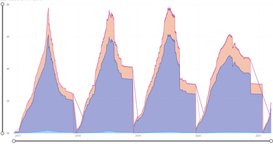
This measure calculates correctly but causes the separate cycles to be connected by lines when plotted on a Stacked Area Chart, which is messy when legend fields are added:
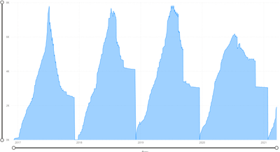
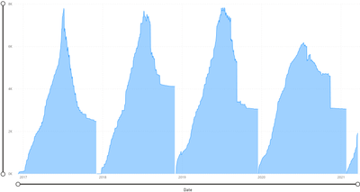
Any ideas for a DAX measure that would force each cycle to plot separately?
Current (legend removed):
Desired:
Solved! Go to Solution.
- Mark as New
- Bookmark
- Subscribe
- Mute
- Subscribe to RSS Feed
- Permalink
- Report Inappropriate Content
inject zero values into your data at the appropriate marks. (this can be done by appending your data table with a manually created table of these zero values).
- Mark as New
- Bookmark
- Subscribe
- Mute
- Subscribe to RSS Feed
- Permalink
- Report Inappropriate Content
inject zero values into your data at the appropriate marks. (this can be done by appending your data table with a manually created table of these zero values).
- Mark as New
- Bookmark
- Subscribe
- Mute
- Subscribe to RSS Feed
- Permalink
- Report Inappropriate Content
Thanks! You reminded me of adding 0 at the end of the measure. That simple change works well for what I need. Here's my updated measure:
# Applications State-in-Time = COUNTROWS(Applications)+0
Helpful resources
| User | Count |
|---|---|
| 17 | |
| 8 | |
| 7 | |
| 6 | |
| 6 |
| User | Count |
|---|---|
| 26 | |
| 13 | |
| 12 | |
| 9 | |
| 8 |


