Join us at FabCon Vienna from September 15-18, 2025
The ultimate Fabric, Power BI, SQL, and AI community-led learning event. Save €200 with code FABCOMM.
Get registered- Power BI forums
- Get Help with Power BI
- Desktop
- Service
- Report Server
- Power Query
- Mobile Apps
- Developer
- DAX Commands and Tips
- Custom Visuals Development Discussion
- Health and Life Sciences
- Power BI Spanish forums
- Translated Spanish Desktop
- Training and Consulting
- Instructor Led Training
- Dashboard in a Day for Women, by Women
- Galleries
- Data Stories Gallery
- Themes Gallery
- Contests Gallery
- Quick Measures Gallery
- Notebook Gallery
- Translytical Task Flow Gallery
- TMDL Gallery
- R Script Showcase
- Webinars and Video Gallery
- Ideas
- Custom Visuals Ideas (read-only)
- Issues
- Issues
- Events
- Upcoming Events
Compete to become Power BI Data Viz World Champion! First round ends August 18th. Get started.
- Power BI forums
- Forums
- Get Help with Power BI
- DAX Commands and Tips
- Re: Different value after using legen/details in v...
- Subscribe to RSS Feed
- Mark Topic as New
- Mark Topic as Read
- Float this Topic for Current User
- Bookmark
- Subscribe
- Printer Friendly Page
- Mark as New
- Bookmark
- Subscribe
- Mute
- Subscribe to RSS Feed
- Permalink
- Report Inappropriate Content
Different value after using legen/details in visual
I have one data table that grows with new data every week. This is real estate market data, so the snapshot occurs weekly, the same advert_number will often appear in the data however with a different data download_date.
In several visualizations, I want to show the number of bids that changes under different filters, however, the metric is always to show the number of bids equal to the maximum day in the entire table.
#2#CountAdvertMaxData =
CALCULATE (
    COUNT ( estate_data[advert_number] ),
    FILTER (
        ALL ( estate_data[date_download] ),
        estate_data[date_download] = MAX ( estate_data[date_download] )
    )
)
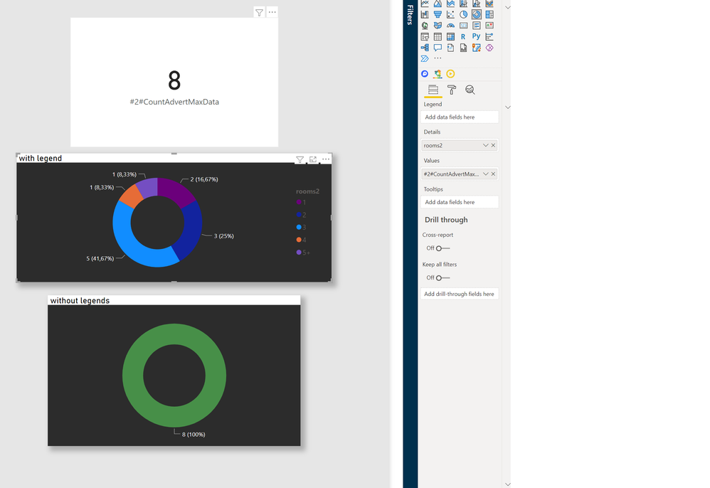
After putting on a few filters, I was able to filter out 8 records. The metrics show this number well, as does the pie chart when there is no legend. When the legend is added it shows values that are not clear where they come from.
The chart behaves as if it does not take the maximum date into account.
After adding an additional date slicer and manually selecting the latest date, the chart shows the correct data.
Any ideas why it behave's like this?
Solved! Go to Solution.
- Mark as New
- Bookmark
- Subscribe
- Mute
- Subscribe to RSS Feed
- Permalink
- Report Inappropriate Content
@kageyoshi777 , Try like
#2#CountAdvertMaxData =
Var _max = MAXX(ALL ( estate_data[date_download] ), estate_data[date_download] )
return
CALCULATE (
COUNT ( estate_data[advert_number] ),
FILTER (
ALL ( estate_data[date_download] ),
estate_data[date_download] = _max
)
)
- Mark as New
- Bookmark
- Subscribe
- Mute
- Subscribe to RSS Feed
- Permalink
- Report Inappropriate Content
perfect! Thank you very much.
Helpful resources
| User | Count |
|---|---|
| 16 | |
| 8 | |
| 6 | |
| 6 | |
| 5 |
| User | Count |
|---|---|
| 23 | |
| 13 | |
| 13 | |
| 8 | |
| 8 |


