Go To
- Power BI forums
- Get Help with Power BI
- Desktop
- Service
- Report Server
- Power Query
- Mobile Apps
- Developer
- DAX Commands and Tips
- Custom Visuals Development Discussion
- Health and Life Sciences
- Power BI Spanish forums
- Translated Spanish Desktop
- Training and Consulting
- Instructor Led Training
- Dashboard in a Day for Women, by Women
- Galleries
- Data Stories Gallery
- Themes Gallery
- Contests Gallery
- Quick Measures Gallery
- Notebook Gallery
- Translytical Task Flow Gallery
- TMDL Gallery
- R Script Showcase
- Webinars and Video Gallery
- Ideas
- Custom Visuals Ideas (read-only)
- Issues
- Issues
- Events
- Upcoming Events
Turn on suggestions
Auto-suggest helps you quickly narrow down your search results by suggesting possible matches as you type.
Showing results for
To celebrate FabCon Vienna, we are offering 50% off select exams. Ends October 3rd. Request your discount now.
- Power BI forums
- Forums
- Get Help with Power BI
- DAX Commands and Tips
- Daily Phone Call Report
Reply
Topic Options
- Subscribe to RSS Feed
- Mark Topic as New
- Mark Topic as Read
- Float this Topic for Current User
- Bookmark
- Subscribe
- Printer Friendly Page
- Mark as New
- Bookmark
- Subscribe
- Mute
- Subscribe to RSS Feed
- Permalink
- Report Inappropriate Content
Daily Phone Call Report
05-22-2023
03:00 PM
Hello community, this is my very first question about PowerBI.
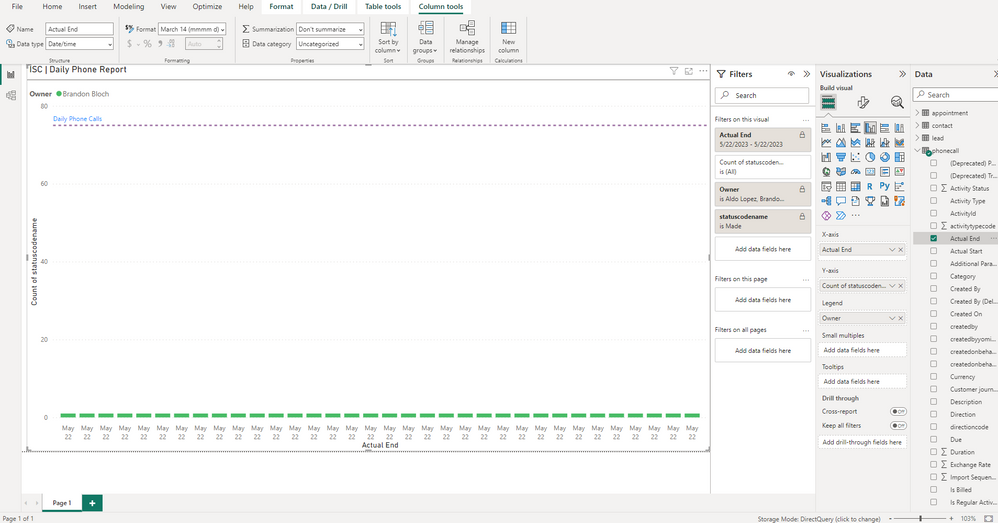
I'm trying to create a report that shows how many call are being made by a SDR day by day to make a comparative clustered column chart. I'm using 3 columns from my phonecall table which comes from a Direct Query to our CRM (Dataverse) so i know there are some inherit limits with that.
For my x-axis i have "Actual End" Column.
For my y-axis i have "count of statuscodename" I tried distinct and still not working.
And the legend is the "Owner"
My question is, what I'm missing and why my graph is displaying multiple bars. Thank for all and have a great day!
0 REPLIES 0
Helpful resources
Top Solution Authors
| User | Count |
|---|---|
| 14 | |
| 11 | |
| 6 | |
| 6 | |
| 5 |
Top Kudoed Authors
| User | Count |
|---|---|
| 29 | |
| 17 | |
| 11 | |
| 7 | |
| 5 |


