Party with Power BI’s own Guy in a Cube
Power BI is turning 10! Tune in for a special live episode on July 24 with behind-the-scenes stories, product evolution highlights, and a sneak peek at what’s in store for the future.
Save the date- Power BI forums
- Get Help with Power BI
- Desktop
- Service
- Report Server
- Power Query
- Mobile Apps
- Developer
- DAX Commands and Tips
- Custom Visuals Development Discussion
- Health and Life Sciences
- Power BI Spanish forums
- Translated Spanish Desktop
- Training and Consulting
- Instructor Led Training
- Dashboard in a Day for Women, by Women
- Galleries
- Webinars and Video Gallery
- Data Stories Gallery
- Themes Gallery
- Contests Gallery
- Quick Measures Gallery
- Notebook Gallery
- Translytical Task Flow Gallery
- R Script Showcase
- Ideas
- Custom Visuals Ideas (read-only)
- Issues
- Issues
- Events
- Upcoming Events
Join us for an expert-led overview of the tools and concepts you'll need to become a Certified Power BI Data Analyst and pass exam PL-300. Register now.
- Power BI forums
- Forums
- Get Help with Power BI
- DAX Commands and Tips
- DAX query without specific filter?
- Subscribe to RSS Feed
- Mark Topic as New
- Mark Topic as Read
- Float this Topic for Current User
- Bookmark
- Subscribe
- Printer Friendly Page
- Mark as New
- Bookmark
- Subscribe
- Mute
- Subscribe to RSS Feed
- Permalink
- Report Inappropriate Content
DAX query without specific filter?
Hello,
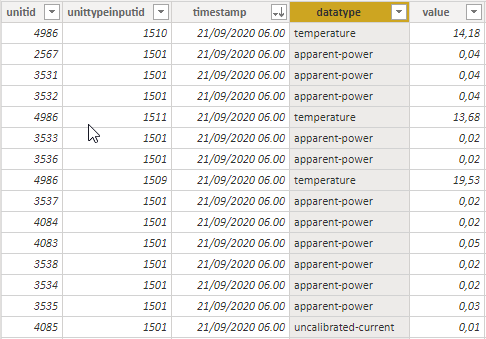
I have a data table containing among other a timestamp, a numerical data value, and a data type:
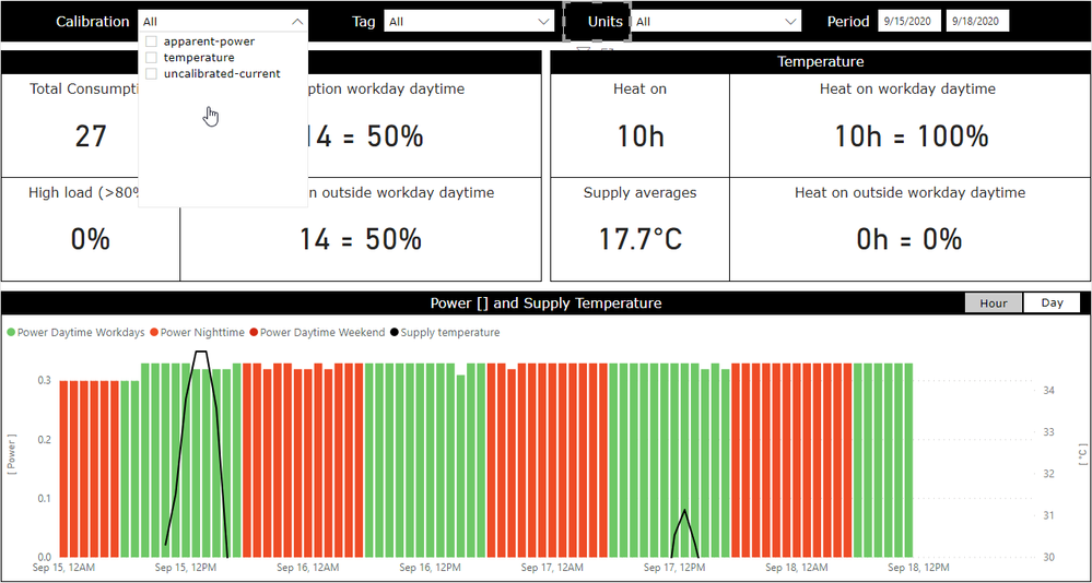
The data is displayed in a report:
In the "Calibration" drop down menu you can see the three present datatypes. Notice the black curve over the red/green bar graph. This is data of datatype temperature, which is shown using the following DAX measure:
Supply temperature = calculate( selectedvalue( 'Data'[value] ), 'Data'[unittypeinputid] = 1511 )
What I would like to do is to always show the temperature curve no matter what datatypes are selected i the "Calibration" menu.
I know there are ways to control filter context using the filter pane and DAX filter functions, but after several hours of researching and experimenting I haven't been able to crack this nut. Any help is appreciated.
Thanks in advance, Mike
Solved! Go to Solution.
- Mark as New
- Bookmark
- Subscribe
- Mute
- Subscribe to RSS Feed
- Permalink
- Report Inappropriate Content
Supply temperature =
    calculate(
        selectedvalue( 'Data'[value] ),
        'Data'[unittypeinputid] = 1511,
        ALL( 'Data'[datatype] )
)- Mark as New
- Bookmark
- Subscribe
- Mute
- Subscribe to RSS Feed
- Permalink
- Report Inappropriate Content
Supply temperature =
    calculate(
        selectedvalue( 'Data'[value] ),
        'Data'[unittypeinputid] = 1511,
        ALL( 'Data'[datatype] )
)- Mark as New
- Bookmark
- Subscribe
- Mute
- Subscribe to RSS Feed
- Permalink
- Report Inappropriate Content
It works exactly as it should! @Anonymous Thanks for helping me out on this. Now comes the harder part, figuring out *how* it works...
- Mark as New
- Bookmark
- Subscribe
- Mute
- Subscribe to RSS Feed
- Permalink
- Report Inappropriate Content
- Mark as New
- Bookmark
- Subscribe
- Mute
- Subscribe to RSS Feed
- Permalink
- Report Inappropriate Content
I have the book, I am just not through all of its 740 pages yet 🙂 Again, thanks for your help and time.
- Mark as New
- Bookmark
- Subscribe
- Mute
- Subscribe to RSS Feed
- Permalink
- Report Inappropriate Content
- Mark as New
- Bookmark
- Subscribe
- Mute
- Subscribe to RSS Feed
- Permalink
- Report Inappropriate Content
or:
Supply temperature =
    calculate(
        selectedvalue( 'Data'[value] ),
        'Data'[datatype] = "temperature"
    )
Helpful resources

Power BI Monthly Update - July 2025
Check out the July 2025 Power BI update to learn about new features.

Join our Fabric User Panel
This is your chance to engage directly with the engineering team behind Fabric and Power BI. Share your experiences and shape the future.

| User | Count |
|---|---|
| 15 | |
| 9 | |
| 7 | |
| 7 | |
| 6 |
| User | Count |
|---|---|
| 22 | |
| 11 | |
| 10 | |
| 10 | |
| 8 |


