Join us at FabCon Vienna from September 15-18, 2025
The ultimate Fabric, Power BI, SQL, and AI community-led learning event. Save €200 with code FABCOMM.
Get registered- Power BI forums
- Get Help with Power BI
- Desktop
- Service
- Report Server
- Power Query
- Mobile Apps
- Developer
- DAX Commands and Tips
- Custom Visuals Development Discussion
- Health and Life Sciences
- Power BI Spanish forums
- Translated Spanish Desktop
- Training and Consulting
- Instructor Led Training
- Dashboard in a Day for Women, by Women
- Galleries
- Data Stories Gallery
- Themes Gallery
- Contests Gallery
- Quick Measures Gallery
- Notebook Gallery
- Translytical Task Flow Gallery
- TMDL Gallery
- R Script Showcase
- Webinars and Video Gallery
- Ideas
- Custom Visuals Ideas (read-only)
- Issues
- Issues
- Events
- Upcoming Events
Enhance your career with this limited time 50% discount on Fabric and Power BI exams. Ends August 31st. Request your voucher.
- Power BI forums
- Forums
- Get Help with Power BI
- DAX Commands and Tips
- Re: DAX query without specific filter?
- Subscribe to RSS Feed
- Mark Topic as New
- Mark Topic as Read
- Float this Topic for Current User
- Bookmark
- Subscribe
- Printer Friendly Page
- Mark as New
- Bookmark
- Subscribe
- Mute
- Subscribe to RSS Feed
- Permalink
- Report Inappropriate Content
DAX query without specific filter?
Hello,
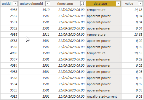
I have a data table containing among other a timestamp, a numerical data value, and a data type:
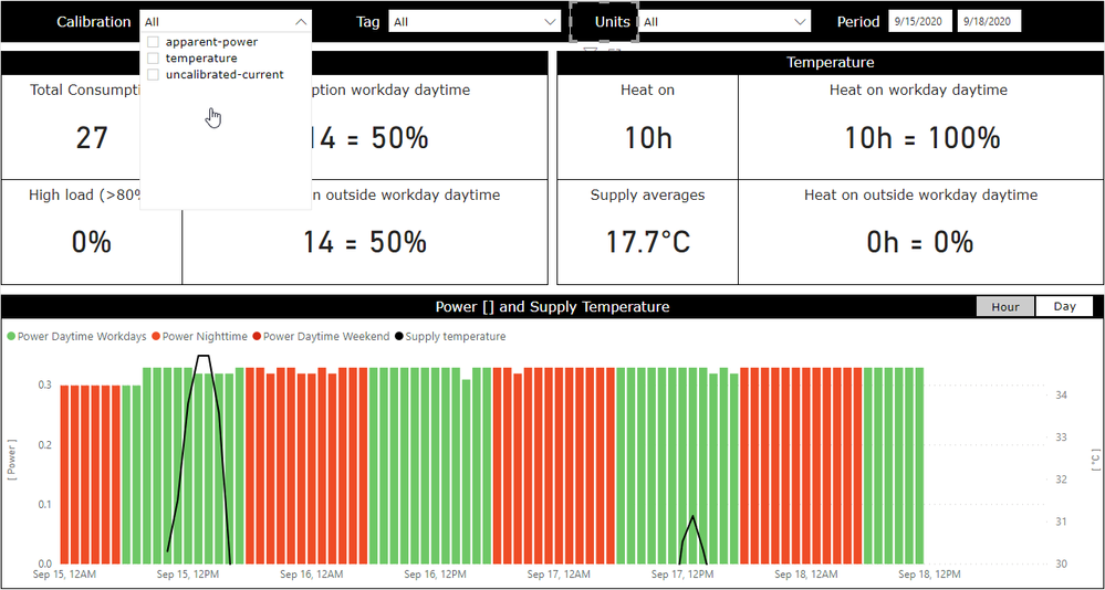
The data is displayed in a report:
In the "Calibration" drop down menu you can see the three present datatypes. Notice the black curve over the red/green bar graph. This is data of datatype temperature, which is shown using the following DAX measure:
Supply temperature = calculate( selectedvalue( 'Data'[value] ), 'Data'[unittypeinputid] = 1511 )
What I would like to do is to always show the temperature curve no matter what datatypes are selected i the "Calibration" menu.
I know there are ways to control filter context using the filter pane and DAX filter functions, but after several hours of researching and experimenting I haven't been able to crack this nut. Any help is appreciated.
Thanks in advance, Mike
Solved! Go to Solution.
- Mark as New
- Bookmark
- Subscribe
- Mute
- Subscribe to RSS Feed
- Permalink
- Report Inappropriate Content
Supply temperature =
    calculate(
        selectedvalue( 'Data'[value] ),
        'Data'[unittypeinputid] = 1511,
        ALL( 'Data'[datatype] )
)- Mark as New
- Bookmark
- Subscribe
- Mute
- Subscribe to RSS Feed
- Permalink
- Report Inappropriate Content
Supply temperature =
    calculate(
        selectedvalue( 'Data'[value] ),
        'Data'[unittypeinputid] = 1511,
        ALL( 'Data'[datatype] )
)- Mark as New
- Bookmark
- Subscribe
- Mute
- Subscribe to RSS Feed
- Permalink
- Report Inappropriate Content
It works exactly as it should! @Anonymous Thanks for helping me out on this. Now comes the harder part, figuring out *how* it works...
- Mark as New
- Bookmark
- Subscribe
- Mute
- Subscribe to RSS Feed
- Permalink
- Report Inappropriate Content
- Mark as New
- Bookmark
- Subscribe
- Mute
- Subscribe to RSS Feed
- Permalink
- Report Inappropriate Content
I have the book, I am just not through all of its 740 pages yet 🙂 Again, thanks for your help and time.
- Mark as New
- Bookmark
- Subscribe
- Mute
- Subscribe to RSS Feed
- Permalink
- Report Inappropriate Content
- Mark as New
- Bookmark
- Subscribe
- Mute
- Subscribe to RSS Feed
- Permalink
- Report Inappropriate Content
or:
Supply temperature =
    calculate(
        selectedvalue( 'Data'[value] ),
        'Data'[datatype] = "temperature"
    )
Helpful resources
| User | Count |
|---|---|
| 27 | |
| 12 | |
| 8 | |
| 8 | |
| 5 |
| User | Count |
|---|---|
| 31 | |
| 15 | |
| 12 | |
| 7 | |
| 7 |


