FabCon is coming to Atlanta
Join us at FabCon Atlanta from March 16 - 20, 2026, for the ultimate Fabric, Power BI, AI and SQL community-led event. Save $200 with code FABCOMM.
Register now!- Power BI forums
- Get Help with Power BI
- Desktop
- Service
- Report Server
- Power Query
- Mobile Apps
- Developer
- DAX Commands and Tips
- Custom Visuals Development Discussion
- Health and Life Sciences
- Power BI Spanish forums
- Translated Spanish Desktop
- Training and Consulting
- Instructor Led Training
- Dashboard in a Day for Women, by Women
- Galleries
- Data Stories Gallery
- Themes Gallery
- Contests Gallery
- QuickViz Gallery
- Quick Measures Gallery
- Visual Calculations Gallery
- Notebook Gallery
- Translytical Task Flow Gallery
- TMDL Gallery
- R Script Showcase
- Webinars and Video Gallery
- Ideas
- Custom Visuals Ideas (read-only)
- Issues
- Issues
- Events
- Upcoming Events
The Power BI Data Visualization World Championships is back! Get ahead of the game and start preparing now! Learn more
- Power BI forums
- Forums
- Get Help with Power BI
- DAX Commands and Tips
- DAX for a tooltip visual
- Subscribe to RSS Feed
- Mark Topic as New
- Mark Topic as Read
- Float this Topic for Current User
- Bookmark
- Subscribe
- Printer Friendly Page
- Mark as New
- Bookmark
- Subscribe
- Mute
- Subscribe to RSS Feed
- Permalink
- Report Inappropriate Content
DAX for a tooltip visual
Hello,
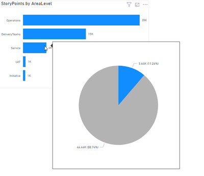
I have a horizontal bar chart displaying the number of story points completed by area.
I want to create a tooltip that includes a pie chart allowing the user to get a visual representation of the percentage of items that are in the area hovered for the tooltip.
So, if there are 5,000 items in the "Operations" area out of 20,000 total items and the user hovers over the "Operations" bar they will get a tooltip that includes a pie chart with a 25% slice for "Operations" and the remainder of the pie filled in a different color.
Hoping this makes sense. If anyone has an idea I would love to hear back.
Thanks!
Adam
Solved! Go to Solution.
- Mark as New
- Bookmark
- Subscribe
- Mute
- Subscribe to RSS Feed
- Permalink
- Report Inappropriate Content
I got this one figured out!
I created these 3 measures:
- Mark as New
- Bookmark
- Subscribe
- Mute
- Subscribe to RSS Feed
- Permalink
- Report Inappropriate Content
Hey @Anonymous ,
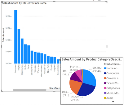
I'm wonderin if you are talking about something like this, I know you were asking about DAX, just to make sure that I understand "the output" you are looking for:
If so, pleae provide some sample data that allows to create the DAX.
Regards,
Tom
Did I answer your question? Mark my post as a solution, this will help others!
Proud to be a Super User!
I accept Kudos 😉
Hamburg, Germany
- Mark as New
- Bookmark
- Subscribe
- Mute
- Subscribe to RSS Feed
- Permalink
- Report Inappropriate Content
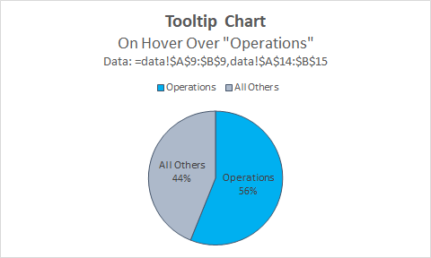
Hey @TomMartens , that's so close to what I was thinking. I was thinking DAX would be needed because in my perfect world the pie would show the percentage of, say "Computers" from your screenshot as dark blue and then, the rest of the pie would be grey for all others. The reason for wanting that is because the user is only interested in seeing how much of the total is "Computers" (again, just from your example) versus all other categories. It wouldn't be necessary to see all the slices of all the categories. I also think DAX would be helpful for a title on the tooltip to display the category being hovered over.
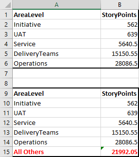
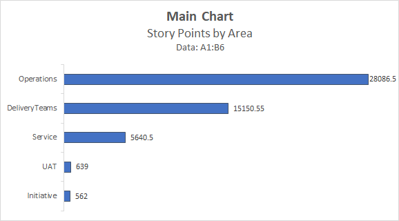
I have an Excel file with a small set of aggregated data. Can I send that to you? I don't see an option to add an attachment here so I'm including screenshots of the data and two charts. One horizontal bar chart for the Main Chart and a Tooltip Chart for what I'm thinking about. The Tooltip Chart is what you would see if you hovered over "Operations" from the Main chart.
Thanks for any guidance here!
Adam
- Mark as New
- Bookmark
- Subscribe
- Mute
- Subscribe to RSS Feed
- Permalink
- Report Inappropriate Content
Hello, just wanted to bump this one. Anyone have any ideas?
Thanks!
- Mark as New
- Bookmark
- Subscribe
- Mute
- Subscribe to RSS Feed
- Permalink
- Report Inappropriate Content
Hey @Anonymous ,
please upload the pbix with sample data to onedrive or dropbox and share the link.
Regards,
Tom
Did I answer your question? Mark my post as a solution, this will help others!
Proud to be a Super User!
I accept Kudos 😉
Hamburg, Germany
- Mark as New
- Bookmark
- Subscribe
- Mute
- Subscribe to RSS Feed
- Permalink
- Report Inappropriate Content
I got this one figured out!
I created these 3 measures:

Helpful resources

Power BI Monthly Update - November 2025
Check out the November 2025 Power BI update to learn about new features.

Fabric Data Days
Advance your Data & AI career with 50 days of live learning, contests, hands-on challenges, study groups & certifications and more!

| User | Count |
|---|---|
| 20 | |
| 10 | |
| 9 | |
| 4 | |
| 4 |
| User | Count |
|---|---|
| 33 | |
| 31 | |
| 19 | |
| 12 | |
| 10 |
