Party with Power BI’s own Guy in a Cube
Power BI is turning 10! Tune in for a special live episode on July 24 with behind-the-scenes stories, product evolution highlights, and a sneak peek at what’s in store for the future.
Save the date- Power BI forums
- Get Help with Power BI
- Desktop
- Service
- Report Server
- Power Query
- Mobile Apps
- Developer
- DAX Commands and Tips
- Custom Visuals Development Discussion
- Health and Life Sciences
- Power BI Spanish forums
- Translated Spanish Desktop
- Training and Consulting
- Instructor Led Training
- Dashboard in a Day for Women, by Women
- Galleries
- Data Stories Gallery
- Themes Gallery
- Contests Gallery
- Quick Measures Gallery
- Notebook Gallery
- Translytical Task Flow Gallery
- TMDL Gallery
- R Script Showcase
- Webinars and Video Gallery
- Ideas
- Custom Visuals Ideas (read-only)
- Issues
- Issues
- Events
- Upcoming Events
Enhance your career with this limited time 50% discount on Fabric and Power BI exams. Ends August 31st. Request your voucher.
- Power BI forums
- Forums
- Get Help with Power BI
- DAX Commands and Tips
- Re: DAX for Percent of Column Total in Stacked Col...
- Subscribe to RSS Feed
- Mark Topic as New
- Mark Topic as Read
- Float this Topic for Current User
- Bookmark
- Subscribe
- Printer Friendly Page
- Mark as New
- Bookmark
- Subscribe
- Mute
- Subscribe to RSS Feed
- Permalink
- Report Inappropriate Content
DAX for Percent of Column Total in Stacked Column Chart
Hi,
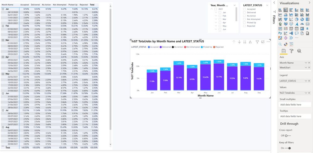
I just realized that the matrix table can show value as a percent of column total which is awesome. However when I made a copy of the same table and changed it to a stacked column chart, it didn't replicate same %values from the table. Also realized that the only option available in chart is "show value as a percent of grand total".
How do I make the stacked column chart replicate the table view with a dax measure? And also the values need to change dynamically based on slicer selections.
@VahidDM, @Greg_Deckler appreicate any help please. Thanks.
Solved! Go to Solution.
- Mark as New
- Bookmark
- Subscribe
- Mute
- Subscribe to RSS Feed
- Permalink
- Report Inappropriate Content
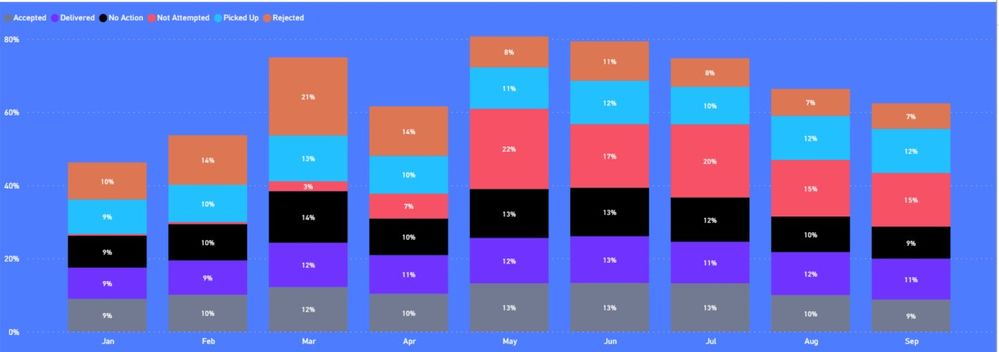
@VahidDMthank you that worked but not as intended i.e. values add up to 100% for all months. I need them to add up to 100% for the each month.
Also when applying filter on slicers, the numbers don't add up to 100%. How to incorporate slicer selection to ensure that the values add up to 100%?
- Mark as New
- Bookmark
- Subscribe
- Mute
- Subscribe to RSS Feed
- Permalink
- Report Inappropriate Content
Hi @Anonymous
Change the visual to 100% Stacked column chart.
If this post helps, please consider accepting it as the solution to help the other members find it more quickly.
Appreciate your Kudos!!
- Mark as New
- Bookmark
- Subscribe
- Mute
- Subscribe to RSS Feed
- Permalink
- Report Inappropriate Content
Hi @Anonymous
Try this measure:
Measure =
SUM ( 'Table'[TotalJobs] )
    / CALCULATE (
        SUM ( 'Table'[TotalJobs] ),
        ALLEXCEPT ( 'Table', 'Table'[LatestStatus] )
    )
If this post helps, please consider accepting it as the solution to help the other members find it more quickly.
Appreciate your Kudos!!
- Mark as New
- Bookmark
- Subscribe
- Mute
- Subscribe to RSS Feed
- Permalink
- Report Inappropriate Content
@VahidDMthank you that worked but not as intended i.e. values add up to 100% for all months. I need them to add up to 100% for the each month.
Also when applying filter on slicers, the numbers don't add up to 100%. How to incorporate slicer selection to ensure that the values add up to 100%?
- Mark as New
- Bookmark
- Subscribe
- Mute
- Subscribe to RSS Feed
- Permalink
- Report Inappropriate Content
Ah ok, perfect. Working now. Many thanks for your help @VahidDM , appreciate it
- Mark as New
- Bookmark
- Subscribe
- Mute
- Subscribe to RSS Feed
- Permalink
- Report Inappropriate Content
Hi @Anonymous
Change the visual to 100% Stacked column chart.
If this post helps, please consider accepting it as the solution to help the other members find it more quickly.
Appreciate your Kudos!!
Helpful resources
| User | Count |
|---|---|
| 25 | |
| 12 | |
| 8 | |
| 6 | |
| 6 |
| User | Count |
|---|---|
| 26 | |
| 12 | |
| 11 | |
| 10 | |
| 6 |


