Fabric Data Days starts November 4th!
Advance your Data & AI career with 50 days of live learning, dataviz contests, hands-on challenges, study groups & certifications and more!
Get registered- Power BI forums
- Get Help with Power BI
- Desktop
- Service
- Report Server
- Power Query
- Mobile Apps
- Developer
- DAX Commands and Tips
- Custom Visuals Development Discussion
- Health and Life Sciences
- Power BI Spanish forums
- Translated Spanish Desktop
- Training and Consulting
- Instructor Led Training
- Dashboard in a Day for Women, by Women
- Galleries
- Data Stories Gallery
- Themes Gallery
- Contests Gallery
- QuickViz Gallery
- Quick Measures Gallery
- Visual Calculations Gallery
- Notebook Gallery
- Translytical Task Flow Gallery
- TMDL Gallery
- R Script Showcase
- Webinars and Video Gallery
- Ideas
- Custom Visuals Ideas (read-only)
- Issues
- Issues
- Events
- Upcoming Events
Get Fabric Certified for FREE during Fabric Data Days. Don't miss your chance! Request now
- Power BI forums
- Forums
- Get Help with Power BI
- DAX Commands and Tips
- Re: DAX Formula to group categories in One column
- Subscribe to RSS Feed
- Mark Topic as New
- Mark Topic as Read
- Float this Topic for Current User
- Bookmark
- Subscribe
- Printer Friendly Page
- Mark as New
- Bookmark
- Subscribe
- Mute
- Subscribe to RSS Feed
- Permalink
- Report Inappropriate Content
DAX Formula to group categories in One column
I have an issue and trying to figure it out. I have two columns that need to somehow be assessed and it isnt working for me.
Column A is an ID column that has 1000's of unique IDS.
Column B has specific categories
Business Rules: When a category is selected, the end-user wants to know what the % of that category is alongside the % of all other categories that shared that ID.
The end-user wants to do some predicitive analysis and asked that we show them what % of each category. So in the below scenario, if someone selected DEF in a slicer, a pie chart would show DEF as 50% (2) and EFG as 50% (2). Basically if DEF is selected, what is the percentage of all other categories in that column sharing the same ID.
Sample Data
ID CATEGORY
1 ABC
2 DEF
2 EFG
3 DEF
3 EFG
I cant use ID as a slicer because there are 1000's and it just doesnt work. Was wondering if someone can get me in the right direction for some type of DAX formula or alteration of the data set to get this functioning.
Solved! Go to Solution.
- Mark as New
- Bookmark
- Subscribe
- Mute
- Subscribe to RSS Feed
- Permalink
- Report Inappropriate Content
Hi @common763,
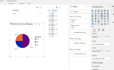
Okay, I've managed to build the pie chart you need with my toy data. Please try this approach with your production dataset.
The idea is:
1) You create a new table with the unique values from the Category column.
Cats = DISTINCT ( data[Category] )It should be standalone, not linked with the main table.
2) You create a measure like this:
Filtered Count =
VAR SelectedValues = VALUES ( data[ID] )
VAR ActiveCategory = MIN ( Cats[Category] )
RETURN COUNTX ( FILTER ( ALL ( data ), AND ( data[ID] IN SelectedValues, data[Category] = ActiveCategory ) ), [Category] )
3) You add a Category slicer on your dashboard based on the column of your main table.
4) You add a Pie Chart visual and use Cats[Category] and the measure from p. 2.
Voila:
Best Regards,
Alexander
- Mark as New
- Bookmark
- Subscribe
- Mute
- Subscribe to RSS Feed
- Permalink
- Report Inappropriate Content
Excellent. I will try this out. Thanks so much. Get back when I work it out on my end.
- Mark as New
- Bookmark
- Subscribe
- Mute
- Subscribe to RSS Feed
- Permalink
- Report Inappropriate Content
Excellent Job. Works perfectly. Thanks so much.
- Mark as New
- Bookmark
- Subscribe
- Mute
- Subscribe to RSS Feed
- Permalink
- Report Inappropriate Content
Hi @common763,
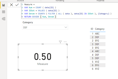
If I have correctly understood your task, you need a measure like this:
In text format for convenience:
Measure =
VAR Num = COUNT ( data[ID] )
VAR IDSet = VALUES ( data[ID] )
VAR Denom = COUNTX ( FILTER ( ALL ( data ), data[ID] IN IDSet ), [Category] )
RETURN DIVIDE ( Num, Denom )
Best Regards,
Alexander
- Mark as New
- Bookmark
- Subscribe
- Mute
- Subscribe to RSS Feed
- Permalink
- Report Inappropriate Content
Ok sorry for the late response. Our team had a solution but it seems like a band aid. This kind of gets me there but doesnt properly group based off the selection. The customer wants to single select a category, so say the select ABC in a slicer. They then want a pie graph to display the total for ABC and all other categories with the same ID. So with the below:
1-ABC
1-DDD
1-CCC
1-EEE
2-ABC
2-CCC
2-EEE
Output would equal ABC = 2 DDD = 1 CCC = 2 EEE = 2 or by % of those numbers
We ended up creating two replicated tables, then many to many relationships and it works in BI Desktop, but when I tried to redo it in Report Server I am getting errors and thinking there has to be a better way to handle this. Any information would be greatly appreciated. Thanks.
- Mark as New
- Bookmark
- Subscribe
- Mute
- Subscribe to RSS Feed
- Permalink
- Report Inappropriate Content
Hi @common763,
Okay, I've managed to build the pie chart you need with my toy data. Please try this approach with your production dataset.
The idea is:
1) You create a new table with the unique values from the Category column.
Cats = DISTINCT ( data[Category] )It should be standalone, not linked with the main table.
2) You create a measure like this:
Filtered Count =
VAR SelectedValues = VALUES ( data[ID] )
VAR ActiveCategory = MIN ( Cats[Category] )
RETURN COUNTX ( FILTER ( ALL ( data ), AND ( data[ID] IN SelectedValues, data[Category] = ActiveCategory ) ), [Category] )
3) You add a Category slicer on your dashboard based on the column of your main table.
4) You add a Pie Chart visual and use Cats[Category] and the measure from p. 2.
Voila:
Best Regards,
Alexander
- Mark as New
- Bookmark
- Subscribe
- Mute
- Subscribe to RSS Feed
- Permalink
- Report Inappropriate Content
Excellent. I will try this out. Thanks so much. Get back when I work it out on my end.
Helpful resources

Fabric Data Days
Advance your Data & AI career with 50 days of live learning, contests, hands-on challenges, study groups & certifications and more!

Power BI Monthly Update - October 2025
Check out the October 2025 Power BI update to learn about new features.

| User | Count |
|---|---|
| 7 | |
| 6 | |
| 4 | |
| 4 | |
| 4 |
| User | Count |
|---|---|
| 25 | |
| 17 | |
| 9 | |
| 8 | |
| 7 |


