FabCon is coming to Atlanta
Join us at FabCon Atlanta from March 16 - 20, 2026, for the ultimate Fabric, Power BI, AI and SQL community-led event. Save $200 with code FABCOMM.
Register now!- Power BI forums
- Get Help with Power BI
- Desktop
- Service
- Report Server
- Power Query
- Mobile Apps
- Developer
- DAX Commands and Tips
- Custom Visuals Development Discussion
- Health and Life Sciences
- Power BI Spanish forums
- Translated Spanish Desktop
- Training and Consulting
- Instructor Led Training
- Dashboard in a Day for Women, by Women
- Galleries
- Data Stories Gallery
- Themes Gallery
- Contests Gallery
- Quick Measures Gallery
- Visual Calculations Gallery
- Notebook Gallery
- Translytical Task Flow Gallery
- TMDL Gallery
- R Script Showcase
- Webinars and Video Gallery
- Ideas
- Custom Visuals Ideas (read-only)
- Issues
- Issues
- Events
- Upcoming Events
Calling all Data Engineers! Fabric Data Engineer (Exam DP-700) live sessions are back! Starting October 16th. Sign up.
- Power BI forums
- Forums
- Get Help with Power BI
- DAX Commands and Tips
- Creating visuals with measures
- Subscribe to RSS Feed
- Mark Topic as New
- Mark Topic as Read
- Float this Topic for Current User
- Bookmark
- Subscribe
- Printer Friendly Page
- Mark as New
- Bookmark
- Subscribe
- Mute
- Subscribe to RSS Feed
- Permalink
- Report Inappropriate Content
Creating visuals with measures
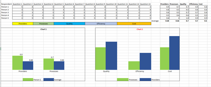
This is a sample dataset by repondent with answers from a survey (Range from 1 to 5). A group of 2 or more questions measures a dimenion (See colored cells below).
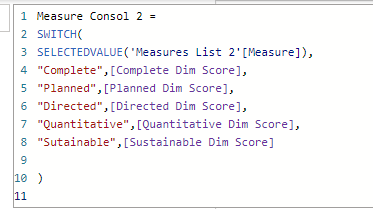
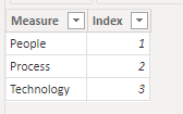
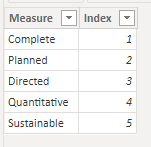
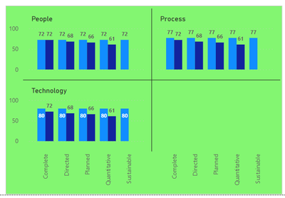
I am able to create basic visuals like the chart 1 below which shows the average of the total percentage of each respondant by dimension (colored cells below) by creating two measures, one to get the percentage of total points by dimension (i.e. (question1 + question2)/10 ) and the other to get the average of the first measure (total percentage by respondent). I need help creating a visual like the Chart 2 below that has different measures in the legend while using other measures in the axis. I have tried all I could find online including creating two measures that use values from two tables to make sure I can use those values in an axis (See measures and tables below) which works in part but the numbers just repet themself in each view of the chart. The idea is to get something like the chart 3 at the end of this post that will let me slice by dimension.
Measure 1
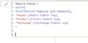
Measure 2
Table 1
Table 2
Your help and time will be appreciated as I already spent the entire week trying to find a solution with no success.
Helpful resources

FabCon Global Hackathon
Join the Fabric FabCon Global Hackathon—running virtually through Nov 3. Open to all skill levels. $10,000 in prizes!

Power BI Monthly Update - October 2025
Check out the October 2025 Power BI update to learn about new features.

| User | Count |
|---|---|
| 12 | |
| 11 | |
| 9 | |
| 9 | |
| 8 |
