FabCon is coming to Atlanta
Join us at FabCon Atlanta from March 16 - 20, 2026, for the ultimate Fabric, Power BI, AI and SQL community-led event. Save $200 with code FABCOMM.
Register now!- Power BI forums
- Get Help with Power BI
- Desktop
- Service
- Report Server
- Power Query
- Mobile Apps
- Developer
- DAX Commands and Tips
- Custom Visuals Development Discussion
- Health and Life Sciences
- Power BI Spanish forums
- Translated Spanish Desktop
- Training and Consulting
- Instructor Led Training
- Dashboard in a Day for Women, by Women
- Galleries
- Data Stories Gallery
- Themes Gallery
- Contests Gallery
- Quick Measures Gallery
- Notebook Gallery
- Translytical Task Flow Gallery
- TMDL Gallery
- R Script Showcase
- Webinars and Video Gallery
- Ideas
- Custom Visuals Ideas (read-only)
- Issues
- Issues
- Events
- Upcoming Events
To celebrate FabCon Vienna, we are offering 50% off select exams. Ends October 3rd. Request your discount now.
- Power BI forums
- Forums
- Get Help with Power BI
- DAX Commands and Tips
- Re: Create pie chart with categories using a measu...
- Subscribe to RSS Feed
- Mark Topic as New
- Mark Topic as Read
- Float this Topic for Current User
- Bookmark
- Subscribe
- Printer Friendly Page
- Mark as New
- Bookmark
- Subscribe
- Mute
- Subscribe to RSS Feed
- Permalink
- Report Inappropriate Content
Create pie chart with categories using a measure
Hi,
I have data with customer ids where each row represents transaction info. I am supposed to find average transaction per day for each customer. There is a slicer for date where I can choose last 30 days, or last 7 days. According to the chosen dates, avg per day gets changed. If I just use existing table, there exists an issue of correct average. For example, a customer did 10 transactions in only 5 days among our chosen 30 days. We get average here 10/5 instead of 10/30. The only way to solve this is by creating a measure using another table called calender, having one to many relationship with date of existing table. It solves the problem.
Now, I need to make a pie chart with categories like less than 0.5 transaction per day on avg, less than 1, less than 2, more than 5 etc. How can I create such categories using just the measure "avg per day". As we can not make a column in the table as avg per day because the avg values in the table doesnt change with slicer date (as discussed before eg, last 30 days or last 7 days). I could not figure out how to make categories in pie chart using just a measure here. Kindly help me in this!
- Mark as New
- Bookmark
- Subscribe
- Mute
- Subscribe to RSS Feed
- Permalink
- Report Inappropriate Content
Hi! Thanks for your reply. My problem is that, lets say in your example, the table you created will give me same result each time as when I choose different dates in my date slicer (like last 30 days or last 40 days). It can not be placed as a table with fixed values you just showed. This is my measure which say avg transactions per customer.
- Mark as New
- Bookmark
- Subscribe
- Mute
- Subscribe to RSS Feed
- Permalink
- Report Inappropriate Content
Hi,
One way to go about this is to create a SWITCH measure for categorizing. Then you can use this measure as a slicer or create a table containing the categories (if you want them to your pie chart legend).
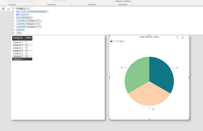
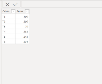
Here I created a measure for classifying my data. E.g. I want to know more than 300, less than 99 and less than 299.
Data:
Dax:
End result:

I hope this post helps to solve your issue and if it does consider accepting it as a solution and giving the post a thumbs up!
My LinkedIn: https://www.linkedin.com/in/n%C3%A4ttiahov-00001/
Did I answer your question? Mark my post as a solution!
Proud to be a Super User!


