FabCon is coming to Atlanta
Join us at FabCon Atlanta from March 16 - 20, 2026, for the ultimate Fabric, Power BI, AI and SQL community-led event. Save $200 with code FABCOMM.
Register now!- Power BI forums
- Get Help with Power BI
- Desktop
- Service
- Report Server
- Power Query
- Mobile Apps
- Developer
- DAX Commands and Tips
- Custom Visuals Development Discussion
- Health and Life Sciences
- Power BI Spanish forums
- Translated Spanish Desktop
- Training and Consulting
- Instructor Led Training
- Dashboard in a Day for Women, by Women
- Galleries
- Data Stories Gallery
- Themes Gallery
- Contests Gallery
- Quick Measures Gallery
- Notebook Gallery
- Translytical Task Flow Gallery
- TMDL Gallery
- R Script Showcase
- Webinars and Video Gallery
- Ideas
- Custom Visuals Ideas (read-only)
- Issues
- Issues
- Events
- Upcoming Events
To celebrate FabCon Vienna, we are offering 50% off select exams. Ends October 3rd. Request your discount now.
- Power BI forums
- Forums
- Get Help with Power BI
- DAX Commands and Tips
- Create bar graph of unpaid transactions having tra...
- Subscribe to RSS Feed
- Mark Topic as New
- Mark Topic as Read
- Float this Topic for Current User
- Bookmark
- Subscribe
- Printer Friendly Page
- Mark as New
- Bookmark
- Subscribe
- Mute
- Subscribe to RSS Feed
- Permalink
- Report Inappropriate Content
Create bar graph of unpaid transactions having transaction created and payment date
Hello,
I need to meet the following requirement and I am not sure what is the best way to do it.
At work, we have a table with transactions that may or may not have been paid. The date the transaction was made is indicated in the field created_date and the date the payment was made is indicated in the field completed_date (and it remains null if the payment was not made).
I am being asked for a report and also a filter that allows indicating for the close of each month the amount of unpaid transactions.
I made a simple dummy example with only 3 transactions to better explain the requirement:
Drive: https://drive.google.com/drive/folders/1IdWHQoiPgHx13HwRPV_8Nc4HvIRAGM_5?usp=sharing
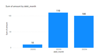
If I analyze the closing of the periods 202302, 202303, and 202304, I should get the following:
202302: $10 because there was a transaction created in period 202302.
202303: $110 because the transaction from 202302 of $10 is still unpaid and a $100 transaction was also created in period 202303.
202304: $100 because the $10 transaction was paid.
So I should get this:
Does anyone know if there's a DAX script or any transformations recommended to achieve this?
Thanks in advance!
- Mark as New
- Bookmark
- Subscribe
- Mute
- Subscribe to RSS Feed
- Permalink
- Report Inappropriate Content
Hello @Laocsulak,
There are many ways to tackle your problem. The one I propose below may not be optimal but it works.
The idea is to create an additional table and a measure.
The additional table is to be created with this [DAX] code:
NewTable =
UNION (
    SUMMARIZE ( data, [created_month], "amount", SUM (data[amount] ) ),
    SUMMARIZE ( FILTER ( data, NOT ISBLANK ( data[completed_month] ) ),
                [completed_month],
                "amount", -SUM ( data[amount] ) ))
It will look like that:
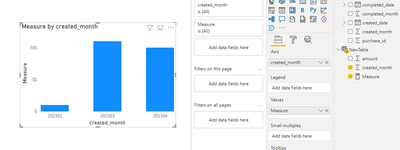
The measure should look like that:
Measure =
VAR CurrentMonth = MAX ( NewTable[created_month] )
RETURN CALCULATE ( SUM ( NewTable[amount] ), ALL ( NewTable ),NewTable[created_month] <= CurrentMonth )
Once done, you create a bar chart.
Then you can rename axis and enjoy the result.
Best Regards,
Alexander


