Join the #PBI10 DataViz contest
Power BI is turning 10, and we’re marking the occasion with a special community challenge. Use your creativity to tell a story, uncover trends, or highlight something unexpected.
Get started- Power BI forums
- Get Help with Power BI
- Desktop
- Service
- Report Server
- Power Query
- Mobile Apps
- Developer
- DAX Commands and Tips
- Custom Visuals Development Discussion
- Health and Life Sciences
- Power BI Spanish forums
- Translated Spanish Desktop
- Training and Consulting
- Instructor Led Training
- Dashboard in a Day for Women, by Women
- Galleries
- Webinars and Video Gallery
- Data Stories Gallery
- Themes Gallery
- Contests Gallery
- Quick Measures Gallery
- Notebook Gallery
- Translytical Task Flow Gallery
- R Script Showcase
- Ideas
- Custom Visuals Ideas (read-only)
- Issues
- Issues
- Events
- Upcoming Events
Join us for an expert-led overview of the tools and concepts you'll need to become a Certified Power BI Data Analyst and pass exam PL-300. Register now.
- Power BI forums
- Forums
- Get Help with Power BI
- DAX Commands and Tips
- Re: Create a custom static table using DAX
- Subscribe to RSS Feed
- Mark Topic as New
- Mark Topic as Read
- Float this Topic for Current User
- Bookmark
- Subscribe
- Printer Friendly Page
- Mark as New
- Bookmark
- Subscribe
- Mute
- Subscribe to RSS Feed
- Permalink
- Report Inappropriate Content
Create a custom static table using DAX
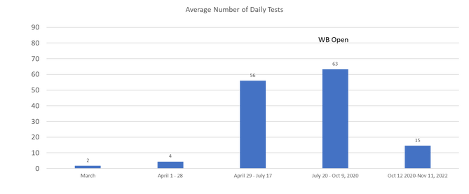
I am trying to design this chart in powerbi. The x axis contains different time limits.
Currently this is design in excel and the table below is the source of data
| Average Tests | |
| March | 2 |
| April 1 - 28 | 4 |
| April 29 - July 17 | 56 |
| July 20 - Oct 9, 2020 | 63 |
| Oct 12 2020-Nov 11, 2022 | 15 |
This table is created after getting average test from the same column on a different table below
| Date | Number of Tests |
| 03/09/20 | 1 |
| 03/10/20 | 2 |
| 03/11/20 | 1 |
| 03/12/20 | 0 |
Currently powerbi has access to the primary dataset below
Date | Name| Race/Ethnicity | Result
My inital thought was using DAX ROW or DATATABLE to create a Virtual or static table and use the average function to get the numbers. I am stuck!!! I will honestly appreciate any help provided.
Solved! Go to Solution.
- Mark as New
- Bookmark
- Subscribe
- Mute
- Subscribe to RSS Feed
- Permalink
- Report Inappropriate Content
hi @fnyameino
If your categorization is static, the easiest way would be to add a category column in your record table. Then you could pull the category column to your plotting x-axis.
the code to add the column looks like this:
Category =
SWICH(
TRUE(),
"March", TableName[Date]<=DATE(2020,3,31),
"April 1- 28", TableName[Date]<=DATE(2020,4,28),
"April 29- July 17", TableName[Date]<=DATE(2020,7,17),
"July 20- Oct 9 2020", TableName[Date]>=DATE(2020,7,20)&&TableName[Date]<=DATE(2020,10,9),
"Oct 12 2020- Nov 11, 2022", TableName[Date]>=DATE(2020,10,12)&&TableName[Date]<=DATE(2022,11,11)
)
if you have a dynamic grouping, say the way of categorization changes periodically and you find the change in DAX code is an issue, you may import the category table into Power BI and related with the record table.
- Mark as New
- Bookmark
- Subscribe
- Mute
- Subscribe to RSS Feed
- Permalink
- Report Inappropriate Content
This worked the magic
Helpful resources

Join our Fabric User Panel
This is your chance to engage directly with the engineering team behind Fabric and Power BI. Share your experiences and shape the future.

Power BI Monthly Update - June 2025
Check out the June 2025 Power BI update to learn about new features.

| User | Count |
|---|---|
| 10 | |
| 9 | |
| 8 | |
| 6 | |
| 5 |
| User | Count |
|---|---|
| 20 | |
| 14 | |
| 10 | |
| 9 | |
| 6 |

