FabCon is coming to Atlanta
Join us at FabCon Atlanta from March 16 - 20, 2026, for the ultimate Fabric, Power BI, AI and SQL community-led event. Save $200 with code FABCOMM.
Register now!- Power BI forums
- Get Help with Power BI
- Desktop
- Service
- Report Server
- Power Query
- Mobile Apps
- Developer
- DAX Commands and Tips
- Custom Visuals Development Discussion
- Health and Life Sciences
- Power BI Spanish forums
- Translated Spanish Desktop
- Training and Consulting
- Instructor Led Training
- Dashboard in a Day for Women, by Women
- Galleries
- Data Stories Gallery
- Themes Gallery
- Contests Gallery
- Quick Measures Gallery
- Notebook Gallery
- Translytical Task Flow Gallery
- TMDL Gallery
- R Script Showcase
- Webinars and Video Gallery
- Ideas
- Custom Visuals Ideas (read-only)
- Issues
- Issues
- Events
- Upcoming Events
To celebrate FabCon Vienna, we are offering 50% off select exams. Ends October 3rd. Request your discount now.
- Power BI forums
- Forums
- Get Help with Power BI
- DAX Commands and Tips
- Re: Create Calculated Column for each ID (to be us...
- Subscribe to RSS Feed
- Mark Topic as New
- Mark Topic as Read
- Float this Topic for Current User
- Bookmark
- Subscribe
- Printer Friendly Page
- Mark as New
- Bookmark
- Subscribe
- Mute
- Subscribe to RSS Feed
- Permalink
- Report Inappropriate Content
Create Calculated Column for each ID (to be used in x-axis of a bar and with a date slicer)
Hello folks,
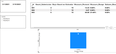
We have a table 'Submission' containing on which days a person submitted a record. We would like to show percentage range of the submission on a bar chart, based on slicers (of date range selected and county selected). 'County' won't change for a person.
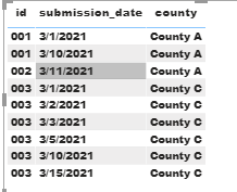
1. Table: Submission
2. A date table is created in Power BI desktop:

3. One to many relationship on DateTable[Date] and Submission[Submission_date] has been defined in PBI desktop:


4. The calculation I did in table 'Submission':
1) a Measure to count how many submissions for each person during selected date range (in the slicer in step 2):
2) A measure to calculate the submission percentage (for example, if 003 submitted 6 times during 3/1/21 through 3/15/21, the percentage is 6 times/15 days = 40%.

5. Next I want to use a bar chart to present the percentage range, but 'Measure_range' can't be used in x-axis of a bar.
So I create a calculated column 'Column_Range', but the range is not right because it is calculate for each row instead of each id. The bar has 'Column_Range' in x-axis and 'count of Column_Range' in value. It shows '0-20%' only. It still changes with the selections in both slicers.

So, the question is, how can I make the column calculate for each ID instead of each row? If that is not possible, is there any other ways to achieve what I want to do?
- Mark as New
- Bookmark
- Subscribe
- Mute
- Subscribe to RSS Feed
- Permalink
- Report Inappropriate Content
Don't have an answer (maybe you can provide sample data in usable form?) but be aware that your SWITCH statement can be simplified, and also should be extended to cover situations over 100%
- Mark as New
- Bookmark
- Subscribe
- Mute
- Subscribe to RSS Feed
- Permalink
- Report Inappropriate Content
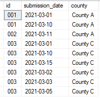
Thanks! Here is the data:


