FabCon is coming to Atlanta
Join us at FabCon Atlanta from March 16 - 20, 2026, for the ultimate Fabric, Power BI, AI and SQL community-led event. Save $200 with code FABCOMM.
Register now!- Power BI forums
- Get Help with Power BI
- Desktop
- Service
- Report Server
- Power Query
- Mobile Apps
- Developer
- DAX Commands and Tips
- Custom Visuals Development Discussion
- Health and Life Sciences
- Power BI Spanish forums
- Translated Spanish Desktop
- Training and Consulting
- Instructor Led Training
- Dashboard in a Day for Women, by Women
- Galleries
- Data Stories Gallery
- Themes Gallery
- Contests Gallery
- QuickViz Gallery
- Quick Measures Gallery
- Visual Calculations Gallery
- Notebook Gallery
- Translytical Task Flow Gallery
- TMDL Gallery
- R Script Showcase
- Webinars and Video Gallery
- Ideas
- Custom Visuals Ideas (read-only)
- Issues
- Issues
- Events
- Upcoming Events
The Power BI Data Visualization World Championships is back! Get ahead of the game and start preparing now! Learn more
- Power BI forums
- Forums
- Get Help with Power BI
- DAX Commands and Tips
- Control chart shows months
- Subscribe to RSS Feed
- Mark Topic as New
- Mark Topic as Read
- Float this Topic for Current User
- Bookmark
- Subscribe
- Printer Friendly Page
- Mark as New
- Bookmark
- Subscribe
- Mute
- Subscribe to RSS Feed
- Permalink
- Report Inappropriate Content
Control chart shows months
Hi experts,
I have a control chart which shows data by data point but I want to add grouped by months data to X axis as well.
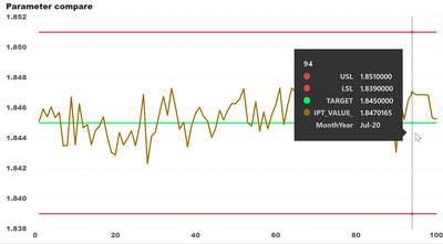
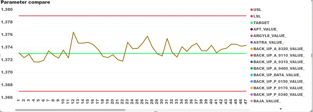
Existing: only have data point as X axis
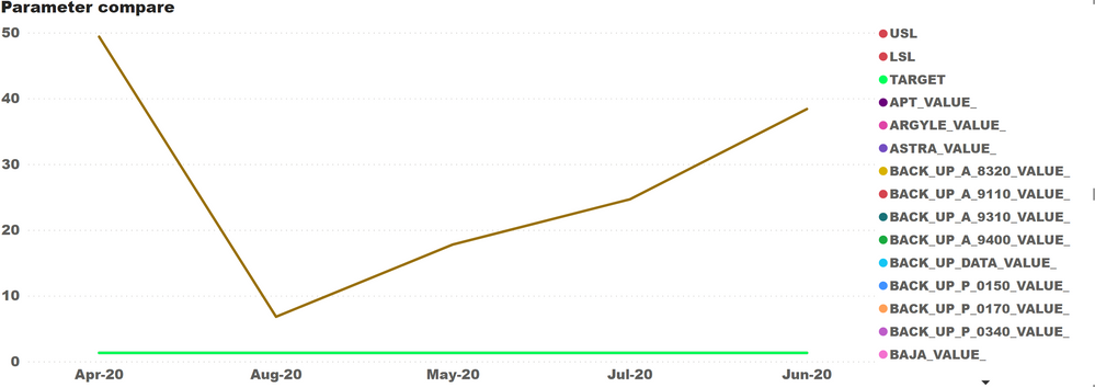
I would like my control chart to show months of the data like this:
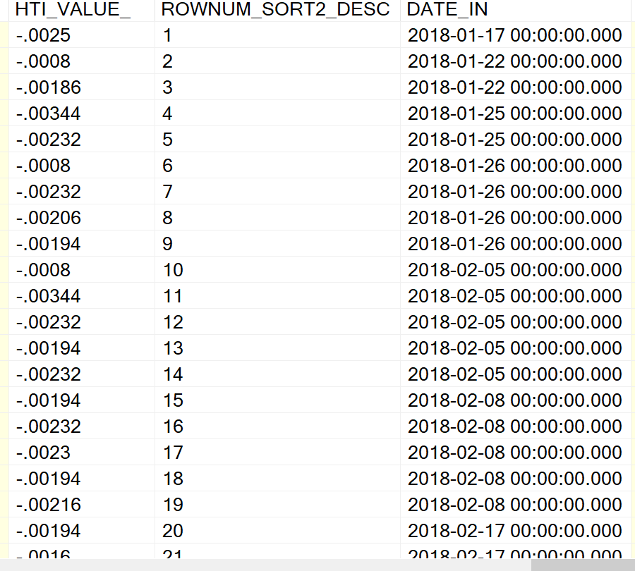
My data looks like this where 1st col is value, 2nd col is data point, and 3rd col is date
Any recommendation would be appreciated
Regards,
KL
Solved! Go to Solution.
- Mark as New
- Bookmark
- Subscribe
- Mute
- Subscribe to RSS Feed
- Permalink
- Report Inappropriate Content
Add a calculated column with dax formula is :
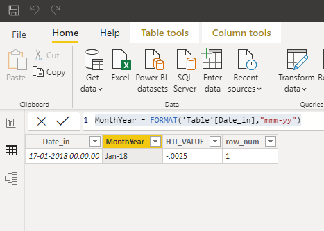 Date_in(data type must be date/time)
Then use this column in the visual for the reporting.
- Mark as New
- Bookmark
- Subscribe
- Mute
- Subscribe to RSS Feed
- Permalink
- Report Inappropriate Content
Hi All,
I have tried but the result is still not satisfied. However, I negotiated with users to just have a tooltip for showing month, year.
And this, I used @Anonymous's calculated column to be on the tooltip.
Thanks all for your suggestion,
KL
- Mark as New
- Bookmark
- Subscribe
- Mute
- Subscribe to RSS Feed
- Permalink
- Report Inappropriate Content
Add a calculated column with dax formula is :
 Date_in(data type must be date/time)
Then use this column in the visual for the reporting.
- Mark as New
- Bookmark
- Subscribe
- Mute
- Subscribe to RSS Feed
- Permalink
- Report Inappropriate Content
@Anonymous
I just did it but the result is not what I want.
Original result with data point
Result with MonthYear
I want the data to show like the data point capture but the X axis shown as MonthYear capture. Could you please help?
Regards,
KL
- Mark as New
- Bookmark
- Subscribe
- Mute
- Subscribe to RSS Feed
- Permalink
- Report Inappropriate Content
@kitti , Create a date hierarchy as per your need. And then in drill down use expand(reverse square Y) and try
create a new hierarchy
https://www.tutorialgateway.org/create-hierarchy-in-power-bi/
https://www.youtube.com/watch?v=x6vXVJZ_eTY
- Mark as New
- Bookmark
- Subscribe
- Mute
- Subscribe to RSS Feed
- Permalink
- Report Inappropriate Content
Hi All,
I have tried but the result is still not satisfied. However, I negotiated with users to just have a tooltip for showing month, year.
And this, I used @Anonymous's calculated column to be on the tooltip.
Thanks all for your suggestion,
KL
Helpful resources

Power BI Dataviz World Championships
The Power BI Data Visualization World Championships is back! Get ahead of the game and start preparing now!

| User | Count |
|---|---|
| 14 | |
| 7 | |
| 4 | |
| 4 | |
| 3 |
| User | Count |
|---|---|
| 23 | |
| 10 | |
| 10 | |
| 6 | |
| 5 |


