Fabric Data Days starts November 4th!
Advance your Data & AI career with 50 days of live learning, dataviz contests, hands-on challenges, study groups & certifications and more!
Get registered- Power BI forums
- Get Help with Power BI
- Desktop
- Service
- Report Server
- Power Query
- Mobile Apps
- Developer
- DAX Commands and Tips
- Custom Visuals Development Discussion
- Health and Life Sciences
- Power BI Spanish forums
- Translated Spanish Desktop
- Training and Consulting
- Instructor Led Training
- Dashboard in a Day for Women, by Women
- Galleries
- Data Stories Gallery
- Themes Gallery
- Contests Gallery
- QuickViz Gallery
- Quick Measures Gallery
- Visual Calculations Gallery
- Notebook Gallery
- Translytical Task Flow Gallery
- TMDL Gallery
- R Script Showcase
- Webinars and Video Gallery
- Ideas
- Custom Visuals Ideas (read-only)
- Issues
- Issues
- Events
- Upcoming Events
Get Fabric Certified for FREE during Fabric Data Days. Don't miss your chance! Request now
- Power BI forums
- Forums
- Get Help with Power BI
- DAX Commands and Tips
- Re: Control chart shows months
- Subscribe to RSS Feed
- Mark Topic as New
- Mark Topic as Read
- Float this Topic for Current User
- Bookmark
- Subscribe
- Printer Friendly Page
- Mark as New
- Bookmark
- Subscribe
- Mute
- Subscribe to RSS Feed
- Permalink
- Report Inappropriate Content
Control chart shows months
Hi experts,
I have a control chart which shows data by data point but I want to add grouped by months data to X axis as well.
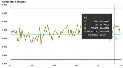
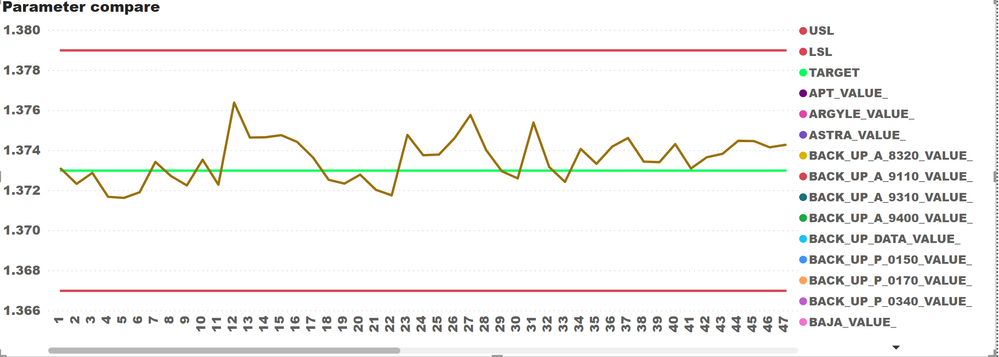
Existing: only have data point as X axis
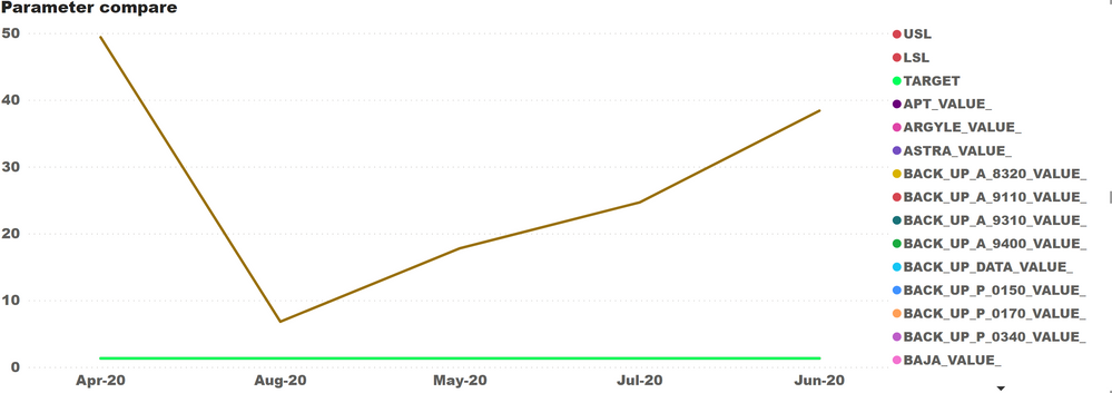
I would like my control chart to show months of the data like this:
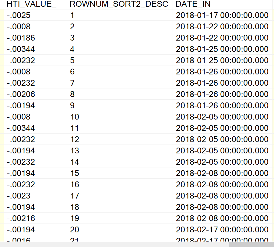
My data looks like this where 1st col is value, 2nd col is data point, and 3rd col is date
Any recommendation would be appreciated
Regards,
KL
Solved! Go to Solution.
- Mark as New
- Bookmark
- Subscribe
- Mute
- Subscribe to RSS Feed
- Permalink
- Report Inappropriate Content
Add a calculated column with dax formula is :
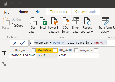 Date_in(data type must be date/time)
Then use this column in the visual for the reporting.
- Mark as New
- Bookmark
- Subscribe
- Mute
- Subscribe to RSS Feed
- Permalink
- Report Inappropriate Content
Hi All,
I have tried but the result is still not satisfied. However, I negotiated with users to just have a tooltip for showing month, year.
And this, I used @Anonymous's calculated column to be on the tooltip.
Thanks all for your suggestion,
KL
- Mark as New
- Bookmark
- Subscribe
- Mute
- Subscribe to RSS Feed
- Permalink
- Report Inappropriate Content
Add a calculated column with dax formula is :
 Date_in(data type must be date/time)
Then use this column in the visual for the reporting.
- Mark as New
- Bookmark
- Subscribe
- Mute
- Subscribe to RSS Feed
- Permalink
- Report Inappropriate Content
@Anonymous
I just did it but the result is not what I want.
Original result with data point
Result with MonthYear
I want the data to show like the data point capture but the X axis shown as MonthYear capture. Could you please help?
Regards,
KL
- Mark as New
- Bookmark
- Subscribe
- Mute
- Subscribe to RSS Feed
- Permalink
- Report Inappropriate Content
@kitti , Create a date hierarchy as per your need. And then in drill down use expand(reverse square Y) and try
create a new hierarchy
https://www.tutorialgateway.org/create-hierarchy-in-power-bi/
https://www.youtube.com/watch?v=x6vXVJZ_eTY
- Mark as New
- Bookmark
- Subscribe
- Mute
- Subscribe to RSS Feed
- Permalink
- Report Inappropriate Content
Hi All,
I have tried but the result is still not satisfied. However, I negotiated with users to just have a tooltip for showing month, year.
And this, I used @Anonymous's calculated column to be on the tooltip.
Thanks all for your suggestion,
KL
Helpful resources

Fabric Data Days
Advance your Data & AI career with 50 days of live learning, contests, hands-on challenges, study groups & certifications and more!

Power BI Monthly Update - October 2025
Check out the October 2025 Power BI update to learn about new features.

| User | Count |
|---|---|
| 8 | |
| 7 | |
| 6 | |
| 5 | |
| 5 |
| User | Count |
|---|---|
| 24 | |
| 11 | |
| 9 | |
| 9 | |
| 8 |


