FabCon is coming to Atlanta
Join us at FabCon Atlanta from March 16 - 20, 2026, for the ultimate Fabric, Power BI, AI and SQL community-led event. Save $200 with code FABCOMM.
Register now!- Power BI forums
- Get Help with Power BI
- Desktop
- Service
- Report Server
- Power Query
- Mobile Apps
- Developer
- DAX Commands and Tips
- Custom Visuals Development Discussion
- Health and Life Sciences
- Power BI Spanish forums
- Translated Spanish Desktop
- Training and Consulting
- Instructor Led Training
- Dashboard in a Day for Women, by Women
- Galleries
- Data Stories Gallery
- Themes Gallery
- Contests Gallery
- Quick Measures Gallery
- Notebook Gallery
- Translytical Task Flow Gallery
- TMDL Gallery
- R Script Showcase
- Webinars and Video Gallery
- Ideas
- Custom Visuals Ideas (read-only)
- Issues
- Issues
- Events
- Upcoming Events
To celebrate FabCon Vienna, we are offering 50% off select exams. Ends October 3rd. Request your discount now.
- Power BI forums
- Forums
- Get Help with Power BI
- DAX Commands and Tips
- Conditionally formatting chart
- Subscribe to RSS Feed
- Mark Topic as New
- Mark Topic as Read
- Float this Topic for Current User
- Bookmark
- Subscribe
- Printer Friendly Page
- Mark as New
- Bookmark
- Subscribe
- Mute
- Subscribe to RSS Feed
- Permalink
- Report Inappropriate Content
Conditionally formatting chart
Hello,
I want to format my chart in two colours, red and green.
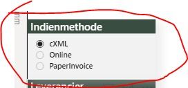
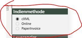
In one column there are three options to select. For the options cXML and Online is a positive bar in green needed, and red if the percentage is negative. For the paperinvoice it is the opposite. Green bar if the percentage is negative and red if the bar is positive.
How do i fix this?


- Mark as New
- Bookmark
- Subscribe
- Mute
- Subscribe to RSS Feed
- Permalink
- Report Inappropriate Content
Hello,
I cant share the PBI file, because it contains copmany data. I have made an Excel file, with random data.
One measure is needed what the difference is between the quarters for each method how many invoices there are. For cXML and Online it have to be red if the percentage is negative and green if it is positive. If the Paperinvoice percentage is negative it must be green and if the percentage is positive it must be red. I hope you have enough information.
The difference have for each quarter needs to be in a bar chart
https://we.tl/t-JI9YFqhada
- Mark as New
- Bookmark
- Subscribe
- Mute
- Subscribe to RSS Feed
- Permalink
- Report Inappropriate Content
Hi Matthijs,
There are two ways to solve this issue. Click on your graph and select the format option on the right side of your screen. You could set rules for data labels by clicking on the (fx) button. Change the format style to rules and choose the appropriate field on which you would like to base your rules.
Hence you could say if < 0 percent then (color) red etc...
Follow this link for more help: https://community.powerbi.com/t5/Desktop/Conditionally-format-bar-chart-column-colour-based-on-slice...
Adjusting this slightly will help solving your issues.
Goodluck
- Mark as New
- Bookmark
- Subscribe
- Mute
- Subscribe to RSS Feed
- Permalink
- Report Inappropriate Content
This is not the right answer. I have three options:
In one column there are three options to select. For the options cXML and Online is a positive bar in green needed, and red if the percentage is negative. For the paperinvoice it is the opposite. Green bar if the percentage is negative and red if the bar is positive.
The graph has a dynamic title
- Mark as New
- Bookmark
- Subscribe
- Mute
- Subscribe to RSS Feed
- Permalink
- Report Inappropriate Content
Initially I misunderstood your question. If you could share your pbix file, I can help you out with this.
I just have to try a few DAX to solve it.
Helpful resources
| User | Count |
|---|---|
| 14 | |
| 10 | |
| 7 | |
| 6 | |
| 5 |
| User | Count |
|---|---|
| 30 | |
| 19 | |
| 12 | |
| 7 | |
| 5 |


