Join us at FabCon Vienna from September 15-18, 2025
The ultimate Fabric, Power BI, SQL, and AI community-led learning event. Save €200 with code FABCOMM.
Get registered- Power BI forums
- Get Help with Power BI
- Desktop
- Service
- Report Server
- Power Query
- Mobile Apps
- Developer
- DAX Commands and Tips
- Custom Visuals Development Discussion
- Health and Life Sciences
- Power BI Spanish forums
- Translated Spanish Desktop
- Training and Consulting
- Instructor Led Training
- Dashboard in a Day for Women, by Women
- Galleries
- Data Stories Gallery
- Themes Gallery
- Contests Gallery
- Quick Measures Gallery
- Notebook Gallery
- Translytical Task Flow Gallery
- TMDL Gallery
- R Script Showcase
- Webinars and Video Gallery
- Ideas
- Custom Visuals Ideas (read-only)
- Issues
- Issues
- Events
- Upcoming Events
Enhance your career with this limited time 50% discount on Fabric and Power BI exams. Ends August 31st. Request your voucher.
- Power BI forums
- Forums
- Get Help with Power BI
- DAX Commands and Tips
- Conditional formatting of measure color in DAX
- Subscribe to RSS Feed
- Mark Topic as New
- Mark Topic as Read
- Float this Topic for Current User
- Bookmark
- Subscribe
- Printer Friendly Page
- Mark as New
- Bookmark
- Subscribe
- Mute
- Subscribe to RSS Feed
- Permalink
- Report Inappropriate Content
Conditional formatting of measure color in DAX
HI all,
I have 2 measures [sales untill today] and [forecast after today]. Which I combine in one measure to get the cumulative total of the actual sales and the remaining forecast Sales+Remaining Forecast = ([sales until today] + [forecast after today]).
Now I want to present this measure in a Bar chart with a month axis and I want the [sales unitil today] to be a diffrent color than [forecast after today]. With normal conditional formatting this is not possible because there is only one measure in the bar chart.
Can you help me achieve this?
- Mark as New
- Bookmark
- Subscribe
- Mute
- Subscribe to RSS Feed
- Permalink
- Report Inappropriate Content
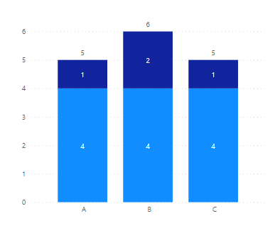
Hi @BobKoenen - have you tried a stacked column chart? You can put each measure in with a different assigned color, and then turn on the "Total Label" that will show the sum. You could also put the total sum in a tooltip so the user can see if when they hover over it.
Hope this helps
David
Helpful resources
| User | Count |
|---|---|
| 11 | |
| 9 | |
| 6 | |
| 6 | |
| 5 |
| User | Count |
|---|---|
| 23 | |
| 14 | |
| 14 | |
| 9 | |
| 7 |


