FabCon is coming to Atlanta
Join us at FabCon Atlanta from March 16 - 20, 2026, for the ultimate Fabric, Power BI, AI and SQL community-led event. Save $200 with code FABCOMM.
Register now!- Power BI forums
- Get Help with Power BI
- Desktop
- Service
- Report Server
- Power Query
- Mobile Apps
- Developer
- DAX Commands and Tips
- Custom Visuals Development Discussion
- Health and Life Sciences
- Power BI Spanish forums
- Translated Spanish Desktop
- Training and Consulting
- Instructor Led Training
- Dashboard in a Day for Women, by Women
- Galleries
- Data Stories Gallery
- Themes Gallery
- Contests Gallery
- QuickViz Gallery
- Quick Measures Gallery
- Visual Calculations Gallery
- Notebook Gallery
- Translytical Task Flow Gallery
- TMDL Gallery
- R Script Showcase
- Webinars and Video Gallery
- Ideas
- Custom Visuals Ideas (read-only)
- Issues
- Issues
- Events
- Upcoming Events
The Power BI Data Visualization World Championships is back! Get ahead of the game and start preparing now! Learn more
- Power BI forums
- Forums
- Get Help with Power BI
- DAX Commands and Tips
- Re: Conditional formatting help
- Subscribe to RSS Feed
- Mark Topic as New
- Mark Topic as Read
- Float this Topic for Current User
- Bookmark
- Subscribe
- Printer Friendly Page
- Mark as New
- Bookmark
- Subscribe
- Mute
- Subscribe to RSS Feed
- Permalink
- Report Inappropriate Content
Conditional formatting help
Hi all,
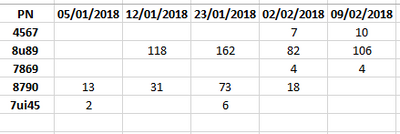
actually ,above is my matrix visual in my power bi(PN is part number ,and values are usage of part number in every week of (2018,2019,2020,2021....)
i need some help in conditional formatting
1.dynamically it should show the latest week(9/2/2018) - Top 15 usage values.
2.There is lot of empty values are there in matrix values - need to bring zeros in empty places
3.dynamically,every week compare the previous week usage values (i) If the value is higher than previous week value - it should show some different font color or different back ground colour/symbol (ii) If the value is equal to previous week value - it should show some different font color or different back ground colour/symbol (iii) If the value is less than previous week value - it should show some different font color or different back ground colour/symbol
4.If the usage of PN for continous three weeks - it should show all three values in different color/symbol
can you all please help me in this ?
Solved! Go to Solution.
- Mark as New
- Bookmark
- Subscribe
- Mute
- Subscribe to RSS Feed
- Permalink
- Report Inappropriate Content
Hi, @sarath_chandra
You can try the following methods.
Measure:
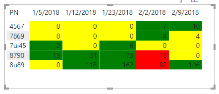
Current value = SUM('Table'[usage value])+0Previous value = CALCULATE([Current value],FILTER(ALL('Table'),[Weeknum]=SELECTEDVALUE('Table'[Weeknum])-1&&[PN]=SELECTEDVALUE('Table'[PN])))Diff = [Current value]-[Previous value]Color = IF([Diff]=0,"Yellow",IF([Diff]>0,"Green","Red"))Is this the result you expect? The last question is what kind of output you expect it to be, and can you show it in pictures.
Best Regards,
Community Support Team _Charlotte
If this post helps, then please consider Accept it as the solution to help the other members find it more quickly.
- Mark as New
- Bookmark
- Subscribe
- Mute
- Subscribe to RSS Feed
- Permalink
- Report Inappropriate Content
every week i will get the data with date ,part numbers and usage values like this format @BeaBF .
please help me out 🙏
- Mark as New
- Bookmark
- Subscribe
- Mute
- Subscribe to RSS Feed
- Permalink
- Report Inappropriate Content
@sarath_chandra Hi! Can you attack a pbix file with the same sample data above in order to provide you the expected results?
BBF
- Mark as New
- Bookmark
- Subscribe
- Mute
- Subscribe to RSS Feed
- Permalink
- Report Inappropriate Content
Thank you so much for your quick response. Im not able to attach the pbix file in this power bi community . options are not available for me .sorry for inconvience.
above image is in matrix visual of power bi .
date is in columns
PN is in rows
values is in value
- Mark as New
- Bookmark
- Subscribe
- Mute
- Subscribe to RSS Feed
- Permalink
- Report Inappropriate Content
- Mark as New
- Bookmark
- Subscribe
- Mute
- Subscribe to RSS Feed
- Permalink
- Report Inappropriate Content
| Date | PN | usage value |
| 05/01/2018 | 7ui45 | 2 |
| 12/01/2018 | 8u89 | 118 |
| 23/01/2018 | 8u89 | 162 |
| 02/02/2018 | 4567 | 7 |
| 09/02/2018 | 4567 | 10 |
| 02/02/2018 | 8u89 | 82 |
| 09/02/2018 | 8u89 | 106 |
| 23/01/2018 | 7ui45 | 6 |
| 02/02/2018 | 7869 | 4 |
| 09/02/2018 | 7869 | 4 |
| 05/01/2018 | 8790 | 13 |
| 12/01/2018 | 8790 | 31 |
| 23/01/2018 | 8790 | 73 |
| 02/02/2018 | 8790 | 18 |
- Mark as New
- Bookmark
- Subscribe
- Mute
- Subscribe to RSS Feed
- Permalink
- Report Inappropriate Content
@sarath_chandra ok, let's start from point 2, the blank values.
You have to create a table starting from the native, making a distinct on the Date field, then create a relationship between the two tables and use the Date field of the new table in the matrix. At this point in "values" put a new measure that makes the sum of the usage field +0.
I am attaching a pbix with this point done with example data. Let me know if you have any questions, in the meantime I'll sort out the remaining points.
BBF
Helpful resources

Power BI Dataviz World Championships
The Power BI Data Visualization World Championships is back! Get ahead of the game and start preparing now!

| User | Count |
|---|---|
| 7 | |
| 5 | |
| 4 | |
| 4 | |
| 3 |
| User | Count |
|---|---|
| 14 | |
| 12 | |
| 9 | |
| 8 | |
| 7 |


