FabCon is coming to Atlanta
Join us at FabCon Atlanta from March 16 - 20, 2026, for the ultimate Fabric, Power BI, AI and SQL community-led event. Save $200 with code FABCOMM.
Register now!- Power BI forums
- Get Help with Power BI
- Desktop
- Service
- Report Server
- Power Query
- Mobile Apps
- Developer
- DAX Commands and Tips
- Custom Visuals Development Discussion
- Health and Life Sciences
- Power BI Spanish forums
- Translated Spanish Desktop
- Training and Consulting
- Instructor Led Training
- Dashboard in a Day for Women, by Women
- Galleries
- Data Stories Gallery
- Themes Gallery
- Contests Gallery
- QuickViz Gallery
- Quick Measures Gallery
- Visual Calculations Gallery
- Notebook Gallery
- Translytical Task Flow Gallery
- TMDL Gallery
- R Script Showcase
- Webinars and Video Gallery
- Ideas
- Custom Visuals Ideas (read-only)
- Issues
- Issues
- Events
- Upcoming Events
The Power BI Data Visualization World Championships is back! Get ahead of the game and start preparing now! Learn more
- Power BI forums
- Forums
- Get Help with Power BI
- DAX Commands and Tips
- Conditional formatting for Decline Down Trend
- Subscribe to RSS Feed
- Mark Topic as New
- Mark Topic as Read
- Float this Topic for Current User
- Bookmark
- Subscribe
- Printer Friendly Page
- Mark as New
- Bookmark
- Subscribe
- Mute
- Subscribe to RSS Feed
- Permalink
- Report Inappropriate Content
Conditional formatting for Decline Down Trend
I have the data table . its having forur columns like
Attributename Feb March April
CFG 96% 96% 99%
CBL 96% 98% 97%
I want to use up and down arrow for decline and increase based on month .
for Example CFG attribute March value same compare with both same value so its should be yellow dash April Month its creased its should be up arrow . suppose april month if decline compare with march its should be down arrow .
Looking for support . thanks in advance
Solved! Go to Solution.
- Mark as New
- Bookmark
- Subscribe
- Mute
- Subscribe to RSS Feed
- Permalink
- Report Inappropriate Content
Hi @Anonymous
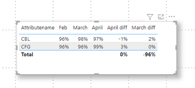
You can create two measures to count the diff between two months , and then set conditional formatting for the measures .
March diff = SWITCH(true,SELECTEDVALUE('Table'[Attributename])=SELECTEDVALUE('Table'[Attributename]) && SELECTEDVALUE('Table'[March])=SELECTEDVALUE('Table'[Feb]),0,SELECTEDVALUE('Table'[March])-SELECTEDVALUE('Table'[Feb]))April diff = SWITCH(true,SELECTEDVALUE('Table'[Attributename])=SELECTEDVALUE('Table'[Attributename]) && SELECTEDVALUE('Table'[April])=SELECTEDVALUE('Table'[March]),0,SELECTEDVALUE('Table'[April])-SELECTEDVALUE('Table'[March]))You will get a result like this :
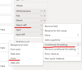
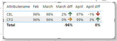
Then set conditional formatting for these two measures . Let's take [March diff] as an example . When the difference value is > 0, the rising arrow is displayed. If =0, parallel arrows are displayed. If < 0, show a falling arrow .
The other measure has the same settings. The final result is shown in Fig.
I have attached my pbix file , you can refer to it .
Best Regards,
Community Support Team _ Ailsa Tao
If this post helps, then please consider Accept it as the solution to help the other members find it more quickly.
Helpful resources

Power BI Monthly Update - November 2025
Check out the November 2025 Power BI update to learn about new features.

Fabric Data Days
Advance your Data & AI career with 50 days of live learning, contests, hands-on challenges, study groups & certifications and more!

| User | Count |
|---|---|
| 21 | |
| 10 | |
| 9 | |
| 4 | |
| 4 |
| User | Count |
|---|---|
| 32 | |
| 31 | |
| 20 | |
| 12 | |
| 12 |


