A new Data Days event is coming soon!
This time we’re going bigger than ever. Fabric, Power BI, SQL, AI and more. We're covering it all. You won't want to miss it.
Learn more- Power BI forums
- Get Help with Power BI
- Desktop
- Service
- Report Server
- Power Query
- Mobile Apps
- Developer
- DAX Commands and Tips
- Custom Visuals Development Discussion
- Health and Life Sciences
- Power BI Spanish forums
- Translated Spanish Desktop
- Training and Consulting
- Instructor Led Training
- Dashboard in a Day for Women, by Women
- Galleries
- Data Stories Gallery
- Themes Gallery
- Contests Gallery
- QuickViz Gallery
- Quick Measures Gallery
- Visual Calculations Gallery
- Notebook Gallery
- Translytical Task Flow Gallery
- TMDL Gallery
- R Script Showcase
- Webinars and Video Gallery
- Ideas
- Custom Visuals Ideas (read-only)
- Issues
- Issues
- Events
- Upcoming Events
Did you hear? There's a new SQL AI Developer certification (DP-800). Start preparing now and be one of the first to get certified. Register now
- Power BI forums
- Forums
- Get Help with Power BI
- DAX Commands and Tips
- Conditional Formatting
- Subscribe to RSS Feed
- Mark Topic as New
- Mark Topic as Read
- Float this Topic for Current User
- Bookmark
- Subscribe
- Printer Friendly Page
- Mark as New
- Bookmark
- Subscribe
- Mute
- Subscribe to RSS Feed
- Permalink
- Report Inappropriate Content
Conditional Formatting
Hi all,
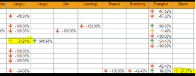
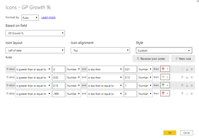
I want to ask why my conditional formatting is not working. This is my matrix and the conditional formatting. The orange arrow should be in green as it exceeds 15%. Thank you so much.
Solved! Go to Solution.
- Mark as New
- Bookmark
- Subscribe
- Mute
- Subscribe to RSS Feed
- Permalink
- Report Inappropriate Content
@Anonymous
try to compare with Number, not Percent
- Mark as New
- Bookmark
- Subscribe
- Mute
- Subscribe to RSS Feed
- Permalink
- Report Inappropriate Content
Hi @Anonymous
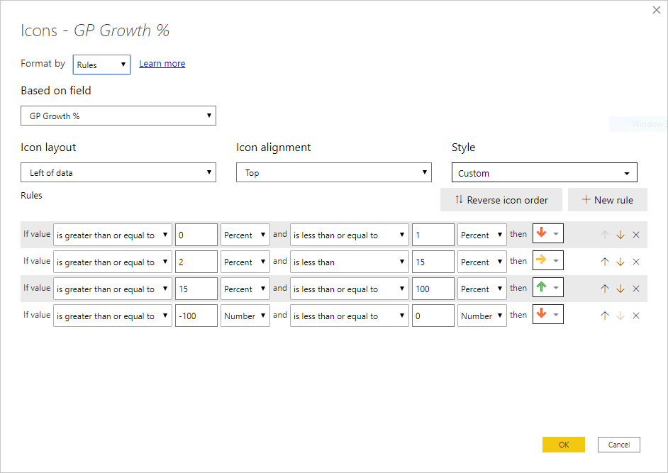
there are much more in Conditional Formatting dialog box, please show.
Bytheway, I see your last row has Number as Unit, not percent. Im not sure it will work correct
- Mark as New
- Bookmark
- Subscribe
- Mute
- Subscribe to RSS Feed
- Permalink
- Report Inappropriate Content
Hi @az38, here is the full conditional formatting dialog box. The number at the end of the condition does not affect the icon/colors even if I remove it. I've tried it before w/o the last condition and it still doesn't work. The only problem is the numbers greater than 15 are marked as orange icon while it should be green icon.
- Mark as New
- Bookmark
- Subscribe
- Mute
- Subscribe to RSS Feed
- Permalink
- Report Inappropriate Content
@Anonymous
what is [GP Growth %] field? is it a measure? do you use CALCULATE()?
and do you like green arrows in values like 900%? your rule should cut it off
- Mark as New
- Bookmark
- Subscribe
- Mute
- Subscribe to RSS Feed
- Permalink
- Report Inappropriate Content
Yes it is a measure field. Here is the formula and yes I do use the CALCULATE() function. GP YTD and GP LY also are measure field.
Green arrow stopped at 100% btw.
GP Growth % = if(and([GP YTD] =0,[GP LY]=0),0,if(and([GP YTD] >=1,[GP LY]=0),1 ,if(and([GP YTD] =0,[GP LY]<=0),1,if(and([GP YTD] <=-1,[GP LY]>=0),-1,if(and([GP YTD] >=1,[GP LY]<=0),CALCULATE(([GP YTD]-[GP LY])/-([GP LY])),CALCULATE(([GP YTD]-[GP LY])/[GP LY]))))))
- Mark as New
- Bookmark
- Subscribe
- Mute
- Subscribe to RSS Feed
- Permalink
- Report Inappropriate Content
@Anonymous
I see values 154% and green arrow. I dont see any rules which describes >100% case.
So, I sure the problem is in measure interpretation.
Show data example, GP YTD and GP LY statements
are you sure you dont use any additional aggregations?
- Mark as New
- Bookmark
- Subscribe
- Mute
- Subscribe to RSS Feed
- Permalink
- Report Inappropriate Content
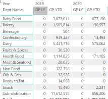
@az38there is no way we can put >100% condition as Power BI doesn't allow that. The logic allowed is between 0 to 100%. That's why I put the number in the condition to make negative percentage becomes red arrow. Here is some of the data sample for GP YTD and GP LY.
- Mark as New
- Bookmark
- Subscribe
- Mute
- Subscribe to RSS Feed
- Permalink
- Report Inappropriate Content
@Anonymous
could you remove sensitive data and share your pbix-file to cloud-service in order to help you?
- Mark as New
- Bookmark
- Subscribe
- Mute
- Subscribe to RSS Feed
- Permalink
- Report Inappropriate Content
@Anonymous
try to compare with Number, not Percent
Helpful resources

Power BI Monthly Update - April 2026
Check out the April 2026 Power BI update to learn about new features.

Data Days 2026 coming soon!
Sign up to receive a private message when registration opens and key events begin.

New to Fabric Survey
If you have recently started exploring Fabric, we'd love to hear how it's going. Your feedback can help with product improvements.

| User | Count |
|---|---|
| 6 | |
| 5 | |
| 5 | |
| 2 | |
| 1 |
| User | Count |
|---|---|
| 14 | |
| 7 | |
| 6 | |
| 6 | |
| 5 |


