Join the Fabric User Panel to shape the future of Fabric.
Share feedback directly with Fabric product managers, participate in targeted research studies and influence the Fabric roadmap.
Sign up now- Power BI forums
- Get Help with Power BI
- Desktop
- Service
- Report Server
- Power Query
- Mobile Apps
- Developer
- DAX Commands and Tips
- Custom Visuals Development Discussion
- Health and Life Sciences
- Power BI Spanish forums
- Translated Spanish Desktop
- Training and Consulting
- Instructor Led Training
- Dashboard in a Day for Women, by Women
- Galleries
- Data Stories Gallery
- Themes Gallery
- Contests Gallery
- QuickViz Gallery
- Quick Measures Gallery
- Visual Calculations Gallery
- Notebook Gallery
- Translytical Task Flow Gallery
- TMDL Gallery
- R Script Showcase
- Webinars and Video Gallery
- Ideas
- Custom Visuals Ideas (read-only)
- Issues
- Issues
- Events
- Upcoming Events
Get Fabric certified for FREE! Don't miss your chance! Learn more
- Power BI forums
- Forums
- Get Help with Power BI
- DAX Commands and Tips
- Conditional Formatting in Table
- Subscribe to RSS Feed
- Mark Topic as New
- Mark Topic as Read
- Float this Topic for Current User
- Bookmark
- Subscribe
- Printer Friendly Page
- Mark as New
- Bookmark
- Subscribe
- Mute
- Subscribe to RSS Feed
- Permalink
- Report Inappropriate Content
Conditional Formatting in Table
Hi,
I have a set of data similar to the table below that I am looking to provide conditional formatting on. However I would like this to be linked to the Region, so for example the conditional formatting for North only looks at 34.2, 33.8, 32.7 and applies the colour gradient to those values. The same conditional formatting is then applied for East, West, etc.
Is this possible whilst keeping all the percentages in the same column?
Thank you
| Region | % From World Average |
| North | 34.2% |
| North | 33.8% |
| North | 32.7% |
| East | 12.1% |
| East | 16.5% |
| East | 8.4% |
| West | 66.1% |
| West | 62.9% |
Solved! Go to Solution.
- Mark as New
- Bookmark
- Subscribe
- Mute
- Subscribe to RSS Feed
- Permalink
- Report Inappropriate Content
Hi,
According to your description, I can roughly understand your requirement, you want to apply the color gradient on the conditional formatting for each region within your dataset, right? I think you can try this method:
First, create a calculated column in the table like this:
Rank = RANKX(FILTER(ALL('Table'),[Region]=EARLIER('Table'[Region])),[% From World Average],,ASC,Dense)Then you can create a measure like this:
Color =

SWITCH(

    MAX('Table'[Rank]),

    1,"White",

    2,"Light Blue",

    3,"Blue")
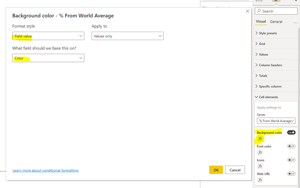
Then go to the conditional formatting setting of this chart and set it like this:
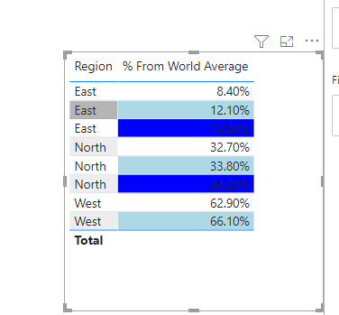
And you can get what you want, like this:
You can download my test pbix file below
If this result is not what you want, you can post some sample data(without sensitive data) and your expected result.
How to Get Your Question Answered Quickly
Thank you very much!
Best Regards,
Community Support Team _Robert Qin
If this post helps, then please consider Accept it as the solution to help the other members find it more quickly.
- Mark as New
- Bookmark
- Subscribe
- Mute
- Subscribe to RSS Feed
- Permalink
- Report Inappropriate Content
Thank you, I am just looking into transposing this onto my datafile
- Mark as New
- Bookmark
- Subscribe
- Mute
- Subscribe to RSS Feed
- Permalink
- Report Inappropriate Content
Hi, @tomshaw83
Has my reply helped you to find the solution to this problem? If so, would you like to mark my reply as the solution?
If this result is not what you want, you can post the download link of your data file and your expected result.
How to Get Your Question Answered Quickly
Thank you very much!
Best Regards,
Community Support Team _Robert Qin
If this post helps, then please consider Accept it as the solution to help the other members find it more quickly.
- Mark as New
- Bookmark
- Subscribe
- Mute
- Subscribe to RSS Feed
- Permalink
- Report Inappropriate Content
Hi,
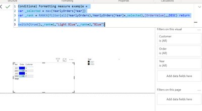
This can be accomplished by using measures for conditional formatting:
Dax example:


So here I am ranking [ordervalue] based on selected year (in your example region and % measure). Then I use switch + true to give these ranks colors -> you can use text or hexacodes. These colors then work as a gradient.
I hope this post helps to solve your issue and if it does consider accepting it as a solution and giving the post a thumbs up!
Did I answer your question? Mark my post as a solution!
Proud to be a Super User!
- Mark as New
- Bookmark
- Subscribe
- Mute
- Subscribe to RSS Feed
- Permalink
- Report Inappropriate Content
Thank you, this is really helpful. I've implemented and tried to understand the code. I believe I have 2 problems that you may be able to help
1) you use max on the variable _selected, as dealing in years. As I have text is there something else I can use, at present it seems to return everything as Rank 1 - light blue
2) I've followed the implementation of the colour format, but these don't update the % world average column as in your example. If I add in the 'conditional formatting' as a new column it then updates the world average data colour (as in pic below). I'm not sure how to get this to be the background of the % values.
- Mark as New
- Bookmark
- Subscribe
- Mute
- Subscribe to RSS Feed
- Permalink
- Report Inappropriate Content
@tomshaw83 , With gradient , you can use a measure that can give region
But you can create a color measure like and use that in conditional formatting using field value option
color = Switch( True() ,
max(Table[Region]) = "Region 1" && [% From World Average] <.30 , "Red",
max(Table[Region]) = "Region 1" && [% From World Average] <.50 , "Yellow",
max(Table[Region]) = "Region 2" && [% From World Average] <.50 , "Red",
max(Table[Region]) = "Region 2" && [% From World Average] <.50 , "Yellow",
// add other conditions
"Green"
)
How to do conditional formatting by measure and apply it on pie?: https://youtu.be/RqBb5eBf_I4
)
Helpful resources

Join our Community Sticker Challenge 2026
If you love stickers, then you will definitely want to check out our Community Sticker Challenge!

Power BI Monthly Update - January 2026
Check out the January 2026 Power BI update to learn about new features.

| User | Count |
|---|---|
| 5 | |
| 4 | |
| 4 | |
| 3 | |
| 2 |
| User | Count |
|---|---|
| 12 | |
| 9 | |
| 8 | |
| 7 | |
| 5 |


