Fabric Data Days starts November 4th!
Advance your Data & AI career with 50 days of live learning, dataviz contests, hands-on challenges, study groups & certifications and more!
Get registered- Power BI forums
- Get Help with Power BI
- Desktop
- Service
- Report Server
- Power Query
- Mobile Apps
- Developer
- DAX Commands and Tips
- Custom Visuals Development Discussion
- Health and Life Sciences
- Power BI Spanish forums
- Translated Spanish Desktop
- Training and Consulting
- Instructor Led Training
- Dashboard in a Day for Women, by Women
- Galleries
- Data Stories Gallery
- Themes Gallery
- Contests Gallery
- QuickViz Gallery
- Quick Measures Gallery
- Visual Calculations Gallery
- Notebook Gallery
- Translytical Task Flow Gallery
- TMDL Gallery
- R Script Showcase
- Webinars and Video Gallery
- Ideas
- Custom Visuals Ideas (read-only)
- Issues
- Issues
- Events
- Upcoming Events
Get Fabric Certified for FREE during Fabric Data Days. Don't miss your chance! Request now
- Power BI forums
- Forums
- Get Help with Power BI
- DAX Commands and Tips
- Re: Comparing customers sharing same products in t...
- Subscribe to RSS Feed
- Mark Topic as New
- Mark Topic as Read
- Float this Topic for Current User
- Bookmark
- Subscribe
- Printer Friendly Page
- Mark as New
- Bookmark
- Subscribe
- Mute
- Subscribe to RSS Feed
- Permalink
- Report Inappropriate Content
Comparing customers sharing same products in their assortment
Hi,
I'm trying to do the following sales analysis:
1. user selects 2 (or more, but for simplicity, let's stick with 2) products with a slicer.
2. visuals filter only the customers having both of the products in their assortment.
3. we get the number of customers in which product A sells better, and number in which B sells better.
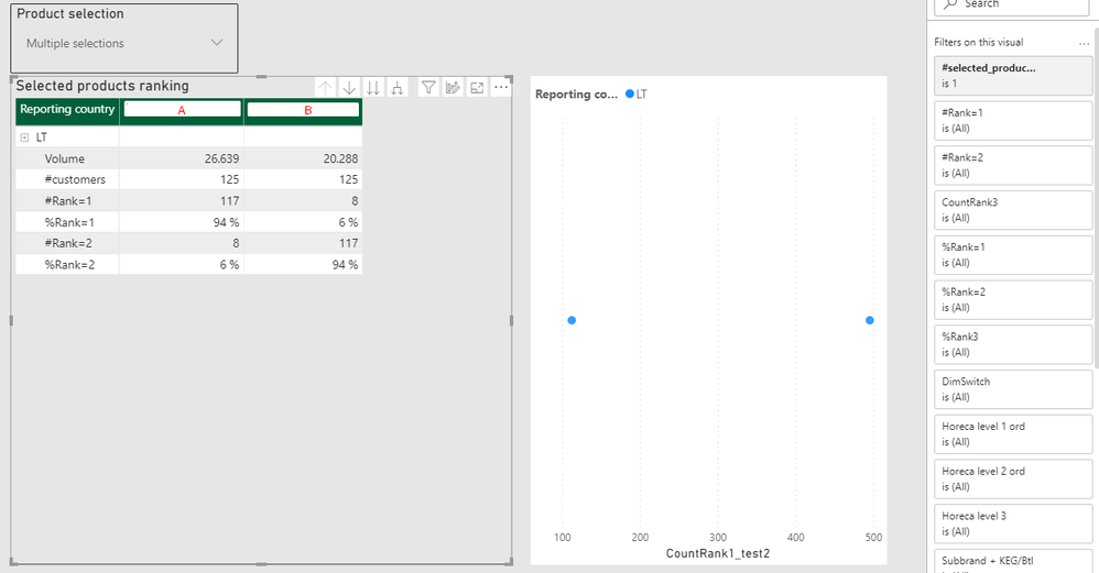
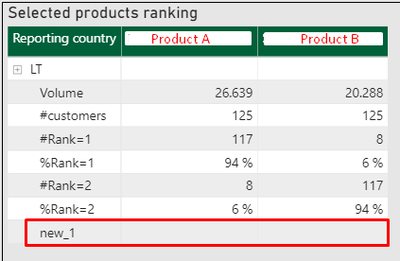
I have managed to do this as a workaround with a filter. However, it only works in a table, when customers are on rows, and not in other visuals (e.g. scatter plot) - so it's hard to compare different customer groups.
My solution below:
1. Create product ranking
Product rank = RANKX( ALLSELECTED('Prod_selection_1v1'[Subbrand + KEG/Btl]), [Volume] ) |
2. Count number of customers where Rank=1
CountRank1 = SUMX( VALUES(WSDcalc[Ship-To Party name]), IF([Product rank]=1,1,0) ) |
3. Apply the following filter to the visual, so it filters only customers with both products sold.
#selected_products_filter = IF([#products]=[#products(max)], 1, 0) #products = DISTINCTCOUNT('Prod_selection_1v1'[Subbrand + KEG/Btl]) #products(max) = CALCULATE( DISTINCTCOUNT('Prod_selection_1v1'[Subbrand + KEG/Btl]), ALLSELECTED(Customers) ) |
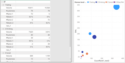
The result:
As you can see, scatter plot shows different number (just as any other visual besides table), because the filter (step 3) doesn't work, which would make a really meanningful analysis here.
I would appreciate any help on how to solve this a lot.
- Mark as New
- Bookmark
- Subscribe
- Mute
- Subscribe to RSS Feed
- Permalink
- Report Inappropriate Content
Hi again, @amitchandak , @AlB ,
I tried to recreate the problem in a new pbix with random numbers, but somehow I don't succed, even though I'm copying everything - can't find what's different in my data model.
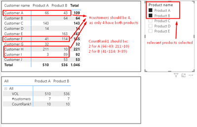
However, I reckon it could be even more clear starting from scratch. Please find my screenshot below with the problem, the logic and the desired result.
Also, please find this pbix file in the link below.
- Mark as New
- Bookmark
- Subscribe
- Mute
- Subscribe to RSS Feed
- Permalink
- Report Inappropriate Content
Hi @Anonymous
- What would you want the scatter plot to show exactly? I get lost there. Since you mention that your approach works on the table visual, can you explain what info from the table visual you show would need to be on the scattered plot and how it should be shown?
- Is all that you show on the rows of the visual measures (Volume, #Customers...)
- Can you by any chance share the pbix (by PM if necessary)?
Please mark the question solved when done and consider giving a thumbs up if posts are helpful.
Contact me privately for support with any larger-scale BI needs, tutoring, etc.
Cheers
- Mark as New
- Bookmark
- Subscribe
- Mute
- Subscribe to RSS Feed
- Permalink
- Report Inappropriate Content
Hi, @AlB ,
Thanks for the reply.
1. Table is good enough for a total level, however it's difficult to compare customer groups.
On the scatter plot I would like to have, as one quick example:
- X - CountRank1 (count of customers where Product Rank = 1);
- Y - any other measure, e.g. Volume;
- Details: Product;
- Legend: customer group (e.g. customer segment, customer location, etc).
In that way it would be a lot easier to compare customer groups compared to a table.
2. For the table, yes - but everything else works fine as well. For scatter plot, though, the result is not as desired, because my workaround filter doesn't work and I get the numbers for all the customers (not only the ones with both products in their assortment).
3. Unfortunately I cannot, but if we don't manage to work out the solution without it, I'll try to recreate a similiar pbix.
- Mark as New
- Bookmark
- Subscribe
- Mute
- Subscribe to RSS Feed
- Permalink
- Report Inappropriate Content
@Anonymous , The 2nd , customer who buys both product
measure =
var _all = calculate(distinctcount(Prod_selection_1v1[Product]) ,allselected(Prod_selection_1v1))
return
countx(filter(summarize(Customers, Customers[Customers ID],"_1" ,distinctcount(Prod_selection_1v1[Product])), [_1] = _all),[Customers])
for the third one have the rank of distinct count of customer on all selected product
- Mark as New
- Bookmark
- Subscribe
- Mute
- Subscribe to RSS Feed
- Permalink
- Report Inappropriate Content
Hi, @amitchandak ,
Thanks for the reply.
I've spent good 30+ minutes exploring your suggestion, but I couldn't make it work.
It correctly gives me the number of Customer Count, where both Products are sold. However, the formula won't work once it's getting sliced by a product.
The result that I'm seeking is:
Let's say we have 1000 customers. But only 100 of them have both Product A and B in their assortment. What I need to see is: e.g. Product A sells better (has higher Volume) in 70 (70%) of the customers, and Product B sells better in 30 (30%) of the customers. As in the table rows above (which worked with an extra filter on the visual), but I'd need to see it in a scatter plot instead.
Helpful resources

Power BI Monthly Update - November 2025
Check out the November 2025 Power BI update to learn about new features.

Fabric Data Days
Advance your Data & AI career with 50 days of live learning, contests, hands-on challenges, study groups & certifications and more!

| User | Count |
|---|---|
| 5 | |
| 5 | |
| 4 | |
| 4 | |
| 4 |
| User | Count |
|---|---|
| 24 | |
| 21 | |
| 13 | |
| 10 | |
| 8 |


