Fabric Data Days starts November 4th!
Advance your Data & AI career with 50 days of live learning, dataviz contests, hands-on challenges, study groups & certifications and more!
Get registered- Power BI forums
- Get Help with Power BI
- Desktop
- Service
- Report Server
- Power Query
- Mobile Apps
- Developer
- DAX Commands and Tips
- Custom Visuals Development Discussion
- Health and Life Sciences
- Power BI Spanish forums
- Translated Spanish Desktop
- Training and Consulting
- Instructor Led Training
- Dashboard in a Day for Women, by Women
- Galleries
- Data Stories Gallery
- Themes Gallery
- Contests Gallery
- QuickViz Gallery
- Quick Measures Gallery
- Visual Calculations Gallery
- Notebook Gallery
- Translytical Task Flow Gallery
- TMDL Gallery
- R Script Showcase
- Webinars and Video Gallery
- Ideas
- Custom Visuals Ideas (read-only)
- Issues
- Issues
- Events
- Upcoming Events
Get Fabric Certified for FREE during Fabric Data Days. Don't miss your chance! Request now
- Power BI forums
- Forums
- Get Help with Power BI
- DAX Commands and Tips
- Chart with last 4 weeks' data and secondary chart ...
- Subscribe to RSS Feed
- Mark Topic as New
- Mark Topic as Read
- Float this Topic for Current User
- Bookmark
- Subscribe
- Printer Friendly Page
- Mark as New
- Bookmark
- Subscribe
- Mute
- Subscribe to RSS Feed
- Permalink
- Report Inappropriate Content
Chart with last 4 weeks' data and secondary chart with just last week's data
Hello! This is my first forum post so please be understanding if I post too much info, I want to be 'easy' to help 🙂
I am trying to show 4 weeks of data in a chart, which is easy, but on the same power bi page in a different chart, show the most recent week worth of data too. I have the data automatically uploading from a database source.
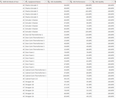
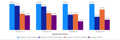
The data I have currently looks like this in my query, with the current chart showing the equipment name on x axis, and the OEE percentages on Y. There is a slider that is linked to Shift ISO column so that the last 4 weeks of data can be displayed.
Is there any way to make a chart that only shows the last week's worth of data based on the time of accessing the power bi? thank you!
Solved! Go to Solution.
- Mark as New
- Bookmark
- Subscribe
- Mute
- Subscribe to RSS Feed
- Permalink
- Report Inappropriate Content
Hi @Anonymous ,
You can create a measure, measures can change dynamically with filtering
Measure SUMX(FILTER('Table (2)','Table (2)'[Shift ISO Week of Year]=WEEKNUM(NOW(),2)-1),[%OEE])
This measure is to filter out the list based on the time before to find the relevant value of the previous week
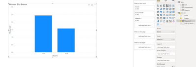
Then create the chart and put the measure in Y axis, the values of the previous week are displayed
Best Regards,
Yolo Zhu
If this post helps, then please consider Accept it as the solution to help the other members find it more quickly.
Helpful resources

Fabric Data Days
Advance your Data & AI career with 50 days of live learning, contests, hands-on challenges, study groups & certifications and more!

Power BI Monthly Update - October 2025
Check out the October 2025 Power BI update to learn about new features.

| User | Count |
|---|---|
| 8 | |
| 6 | |
| 6 | |
| 4 | |
| 4 |
| User | Count |
|---|---|
| 25 | |
| 16 | |
| 8 | |
| 7 | |
| 7 |


