FabCon is coming to Atlanta
Join us at FabCon Atlanta from March 16 - 20, 2026, for the ultimate Fabric, Power BI, AI and SQL community-led event. Save $200 with code FABCOMM.
Register now!- Power BI forums
- Get Help with Power BI
- Desktop
- Service
- Report Server
- Power Query
- Mobile Apps
- Developer
- DAX Commands and Tips
- Custom Visuals Development Discussion
- Health and Life Sciences
- Power BI Spanish forums
- Translated Spanish Desktop
- Training and Consulting
- Instructor Led Training
- Dashboard in a Day for Women, by Women
- Galleries
- Data Stories Gallery
- Themes Gallery
- Contests Gallery
- Quick Measures Gallery
- Notebook Gallery
- Translytical Task Flow Gallery
- TMDL Gallery
- R Script Showcase
- Webinars and Video Gallery
- Ideas
- Custom Visuals Ideas (read-only)
- Issues
- Issues
- Events
- Upcoming Events
Calling all Data Engineers! Fabric Data Engineer (Exam DP-700) live sessions are back! Starting October 16th. Sign up.
- Power BI forums
- Forums
- Get Help with Power BI
- DAX Commands and Tips
- Calculate a moving percentage over time based on l...
- Subscribe to RSS Feed
- Mark Topic as New
- Mark Topic as Read
- Float this Topic for Current User
- Bookmark
- Subscribe
- Printer Friendly Page
- Mark as New
- Bookmark
- Subscribe
- Mute
- Subscribe to RSS Feed
- Permalink
- Report Inappropriate Content
Calculate a moving percentage over time based on last items not last time period
Hello,
I'm trying to produce a graph showing a moving percentage based on the last number of items, as when I produced a graph based on the last period of time it had some very sharp edges (due to low production quantity over time)
The desired output graph is in the style as follows. So for a specific day it takes the last 10 items produced, counts how many items had a Defect (from the Defect column) and divides by the last 10 items to give a percentage with the defect
The data is as follows
I have a relationship between my Calendar and the Inspection Date column.
Defect Rate Last X =
VAR NoItems = 10

RETURN
DIVIDE(
    CALCULATE(
        COUNTX(
            FILTER(
                ALL('Calendar'),
                [Date] <= MAX('Calendar'[Date])
            ),
            COUNTX(
                FILTER(
                    TOPN (NoItems, ALL('Inspections'[Defect],'Inspections'[Inspection Date]), Inspections[Inspection Date], DESC),
                    'Inspections'[Defect] = "Yes"
                ),
                'Inspections'[Defect])
        )
    ),
NoItems
)
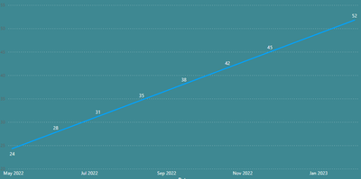
Currently the output is as follows:
Thank you
Helpful resources

FabCon Global Hackathon
Join the Fabric FabCon Global Hackathon—running virtually through Nov 3. Open to all skill levels. $10,000 in prizes!

Power BI Monthly Update - October 2025
Check out the October 2025 Power BI update to learn about new features.


