Fabric Data Days starts November 4th!
Advance your Data & AI career with 50 days of live learning, dataviz contests, hands-on challenges, study groups & certifications and more!
Get registered- Power BI forums
- Get Help with Power BI
- Desktop
- Service
- Report Server
- Power Query
- Mobile Apps
- Developer
- DAX Commands and Tips
- Custom Visuals Development Discussion
- Health and Life Sciences
- Power BI Spanish forums
- Translated Spanish Desktop
- Training and Consulting
- Instructor Led Training
- Dashboard in a Day for Women, by Women
- Galleries
- Data Stories Gallery
- Themes Gallery
- Contests Gallery
- QuickViz Gallery
- Quick Measures Gallery
- Visual Calculations Gallery
- Notebook Gallery
- Translytical Task Flow Gallery
- TMDL Gallery
- R Script Showcase
- Webinars and Video Gallery
- Ideas
- Custom Visuals Ideas (read-only)
- Issues
- Issues
- Events
- Upcoming Events
Get Fabric Certified for FREE during Fabric Data Days. Don't miss your chance! Request now
- Power BI forums
- Forums
- Get Help with Power BI
- DAX Commands and Tips
- Re: Average tasks opened closed each day in specif...
- Subscribe to RSS Feed
- Mark Topic as New
- Mark Topic as Read
- Float this Topic for Current User
- Bookmark
- Subscribe
- Printer Friendly Page
- Mark as New
- Bookmark
- Subscribe
- Mute
- Subscribe to RSS Feed
- Permalink
- Report Inappropriate Content
Average tasks opened closed each day in specific month
I am trying to plot the monthly average of # of tasks created and closed each day. My data gives the date of Task Creation and, if closed, the date of Task Closure. I have an area chart that shows the count of opened and closed each day. It looks great! I'd like to add a SPECIFIC month's daily average # of Opened and Closed. (e.g. for image below, I'd like the average # opened/closed per day in June).
I added "Average Lines" to the graph (the 2 horizontal lines), but the values do not change when I change the scale of the graph, so I think it's giving me the daily average for ALL the data, not just the month in the graph. I'd like to be able to determine the rates for May, June, July, etc. independently.
Thank you!
- Mark as New
- Bookmark
- Subscribe
- Mute
- Subscribe to RSS Feed
- Permalink
- Report Inappropriate Content
@amitchandak Thanks! The formulas seem to work. I am not sure how to get the average line to appear on the daily graph, unless I create a constant line and manually enter the value. Can you advise?
- Mark as New
- Bookmark
- Subscribe
- Mute
- Subscribe to RSS Feed
- Permalink
- Report Inappropriate Content
Hi @dodonald ,
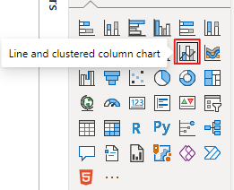
The line value is not supported in area chart, have you tried to use the line and clustered column chart instead?
Best Regards,
Community Support Team _ kalyj
If this post helps, then please considerAccept it as the solution to help the other members find it more quickly.
- Mark as New
- Bookmark
- Subscribe
- Mute
- Subscribe to RSS Feed
- Permalink
- Report Inappropriate Content
@dodonald , Assume you already have formula for measure open task and close task
Then Avg is
Averagex(Values('Date'[Date]), [Open Task])
Averagex(Values('Date'[Date]), [Close Task])
How get open task and close work with same date table refer
Helpful resources

Fabric Data Days
Advance your Data & AI career with 50 days of live learning, contests, hands-on challenges, study groups & certifications and more!

Power BI Monthly Update - October 2025
Check out the October 2025 Power BI update to learn about new features.

| User | Count |
|---|---|
| 6 | |
| 6 | |
| 4 | |
| 4 | |
| 4 |
| User | Count |
|---|---|
| 25 | |
| 17 | |
| 9 | |
| 8 | |
| 7 |


