FabCon is coming to Atlanta
Join us at FabCon Atlanta from March 16 - 20, 2026, for the ultimate Fabric, Power BI, AI and SQL community-led event. Save $200 with code FABCOMM.
Register now!- Power BI forums
- Get Help with Power BI
- Desktop
- Service
- Report Server
- Power Query
- Mobile Apps
- Developer
- DAX Commands and Tips
- Custom Visuals Development Discussion
- Health and Life Sciences
- Power BI Spanish forums
- Translated Spanish Desktop
- Training and Consulting
- Instructor Led Training
- Dashboard in a Day for Women, by Women
- Galleries
- Data Stories Gallery
- Themes Gallery
- Contests Gallery
- Quick Measures Gallery
- Notebook Gallery
- Translytical Task Flow Gallery
- TMDL Gallery
- R Script Showcase
- Webinars and Video Gallery
- Ideas
- Custom Visuals Ideas (read-only)
- Issues
- Issues
- Events
- Upcoming Events
To celebrate FabCon Vienna, we are offering 50% off select exams. Ends October 3rd. Request your discount now.
- Power BI forums
- Forums
- Get Help with Power BI
- DAX Commands and Tips
- Re: Average of Open>End Date - MoM
- Subscribe to RSS Feed
- Mark Topic as New
- Mark Topic as Read
- Float this Topic for Current User
- Bookmark
- Subscribe
- Printer Friendly Page
- Mark as New
- Bookmark
- Subscribe
- Mute
- Subscribe to RSS Feed
- Permalink
- Report Inappropriate Content
Average of Open>End Date - MoM
Hi.
I cannot attach a workbook as yet, so I will have to use visuals.
Example data:-
| Case # | Open | End | Networkdays
|
| 123 | 01-Mar | 20-Mar | 14 |
| 456 | 01-Feb | 05-Apr | 47 |
| 789 | 01-Apr | 11-Apr | 9 |
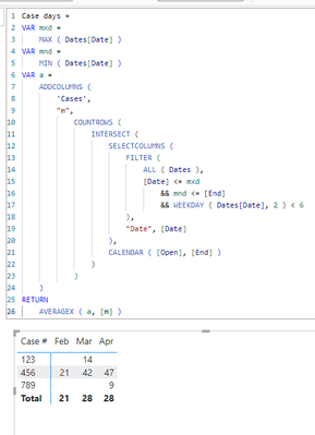
By month, I want to calculate a "no of days average" of all cases that fall between OPEN and END dates. For example, the below table shows a breakdown of the numbers:-
| Case # | Feb | Mar | Apr |
| 123 | 14 | ||
| 456 | 21 | 42 | 47 |
| 789 | 9 | ||
| Avg | 21 | 28 | 28 |
Let's take case #456. It was opened on 01-Feb and closed 05-Apr. Therefore, the calcs are as follows:-
For FEB: 01-Feb to 29-Feb = 21 days
For MAR: 01-Feb to 31-Mar = 42 days
For APR: 01-Feb to 05-Apr (End Date) = 47
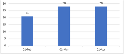
I would then average the sum of all numbers by month to give me this graph:-
How can I make a DAX calc do this?
Many thanks in advance.
Solved! Go to Solution.
- Mark as New
- Bookmark
- Subscribe
- Mute
- Subscribe to RSS Feed
- Permalink
- Report Inappropriate Content
- Mark as New
- Bookmark
- Subscribe
- Mute
- Subscribe to RSS Feed
- Permalink
- Report Inappropriate Content
- Mark as New
- Bookmark
- Subscribe
- Mute
- Subscribe to RSS Feed
- Permalink
- Report Inappropriate Content
Hi again @lbendlin .
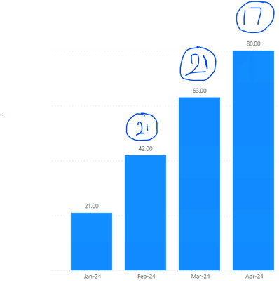
Is there a way in which we can show the difference from the previous month, rather than cumulative?, i.e. 21, 21, 17
Many thanks again.
- Mark as New
- Bookmark
- Subscribe
- Mute
- Subscribe to RSS Feed
- Permalink
- Report Inappropriate Content
You mean show the actual value by month without cumulation?
- Mark as New
- Bookmark
- Subscribe
- Mute
- Subscribe to RSS Feed
- Permalink
- Report Inappropriate Content
@lbendlin I actually found the solution. I enabled Visual Calculations and added the "Versus Previous" function to the bar chart using your super calculation! Many thanks again. 🙂
EDIT: Actually that "kind of" works, but not quite. Back to the drawing board. The "New Calculation" option in Bi is similar to the "Add Table Calculation" in Tableau, so learnt something new there.
- Mark as New
- Bookmark
- Subscribe
- Mute
- Subscribe to RSS Feed
- Permalink
- Report Inappropriate Content
Yes that's it.
- Mark as New
- Bookmark
- Subscribe
- Mute
- Subscribe to RSS Feed
- Permalink
- Report Inappropriate Content
Hi @lbendlin . Thank you so much for this. Your solution worked a treat for my dashboard purposes! 🙂


