FabCon is coming to Atlanta
Join us at FabCon Atlanta from March 16 - 20, 2026, for the ultimate Fabric, Power BI, AI and SQL community-led event. Save $200 with code FABCOMM.
Register now!- Power BI forums
- Get Help with Power BI
- Desktop
- Service
- Report Server
- Power Query
- Mobile Apps
- Developer
- DAX Commands and Tips
- Custom Visuals Development Discussion
- Health and Life Sciences
- Power BI Spanish forums
- Translated Spanish Desktop
- Training and Consulting
- Instructor Led Training
- Dashboard in a Day for Women, by Women
- Galleries
- Data Stories Gallery
- Themes Gallery
- Contests Gallery
- Quick Measures Gallery
- Notebook Gallery
- Translytical Task Flow Gallery
- TMDL Gallery
- R Script Showcase
- Webinars and Video Gallery
- Ideas
- Custom Visuals Ideas (read-only)
- Issues
- Issues
- Events
- Upcoming Events
To celebrate FabCon Vienna, we are offering 50% off select exams. Ends October 3rd. Request your discount now.
- Power BI forums
- Forums
- Get Help with Power BI
- DAX Commands and Tips
- Additional average bar on a clustered bar chart
- Subscribe to RSS Feed
- Mark Topic as New
- Mark Topic as Read
- Float this Topic for Current User
- Bookmark
- Subscribe
- Printer Friendly Page
- Mark as New
- Bookmark
- Subscribe
- Mute
- Subscribe to RSS Feed
- Permalink
- Report Inappropriate Content
Additional average bar on a clustered bar chart
I have a dataset for Australia for various variables. The data is at suburb label with data on states as well. I have created a clustered bar chart in powerbi for all the variables for a selected suburb. I want to add bars for average values in overall Australia and the state of the selected suburb as well. How do i do this in powerbi?
Example DataSets:
SubUrb | State| Age under 18 | age 18-60 | age 60+
ABC |DEF | 10 | 20 | 30
Steps and demonstration highly welcome!
- Mark as New
- Bookmark
- Subscribe
- Mute
- Subscribe to RSS Feed
- Permalink
- Report Inappropriate Content
hi @ujjwalkc
supposing your table looks like:
| State | SubUrg | 0-18 | 18-60 | 60+ |
| A | A1 | 10 | 20 | 30 |
| A | A2 | 100 | 200 | 300 |
| B | B1 | 1 | 2 | 3 |
try to:
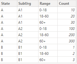
1) unpivot it to a table like:
About unpivot: https://learn.microsoft.com/en-us/power-query/unpivot-column
2) plot a slicer with the suburb column
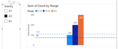
3) plot a clustered column chart with necessary columns and feed two measures as constant line like:
StateAvg =
CALCULATE(
    AVERAGE(data[Count]),
    ALL(data),
    data[State]=MAX(data[State])
)
CountryAvg =
CALCULATE(
AVERAGE(data[Count]),
ALL(data)
)
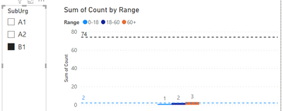
it worked like:
- Mark as New
- Bookmark
- Subscribe
- Mute
- Subscribe to RSS Feed
- Permalink
- Report Inappropriate Content
Thanks so much! But, I wanted the values for the state and the country as an additional bar in the clustered bar chart. On top of that, I want the legend to have the selected suburb, state and Australia as legend items. CHeers!


