Join us at FabCon Vienna from September 15-18, 2025
The ultimate Fabric, Power BI, SQL, and AI community-led learning event. Save €200 with code FABCOMM.
Get registered- Power BI forums
- Get Help with Power BI
- Desktop
- Service
- Report Server
- Power Query
- Mobile Apps
- Developer
- DAX Commands and Tips
- Custom Visuals Development Discussion
- Health and Life Sciences
- Power BI Spanish forums
- Translated Spanish Desktop
- Training and Consulting
- Instructor Led Training
- Dashboard in a Day for Women, by Women
- Galleries
- Data Stories Gallery
- Themes Gallery
- Contests Gallery
- Quick Measures Gallery
- Notebook Gallery
- Translytical Task Flow Gallery
- TMDL Gallery
- R Script Showcase
- Webinars and Video Gallery
- Ideas
- Custom Visuals Ideas (read-only)
- Issues
- Issues
- Events
- Upcoming Events
Compete to become Power BI Data Viz World Champion! First round ends August 18th. Get started.
- Power BI forums
- Forums
- Get Help with Power BI
- DAX Commands and Tips
- Re: Adding a filtered column to a data set
- Subscribe to RSS Feed
- Mark Topic as New
- Mark Topic as Read
- Float this Topic for Current User
- Bookmark
- Subscribe
- Printer Friendly Page
- Mark as New
- Bookmark
- Subscribe
- Mute
- Subscribe to RSS Feed
- Permalink
- Report Inappropriate Content
Adding a filtered column to a data set
Is this possible?
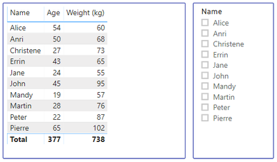
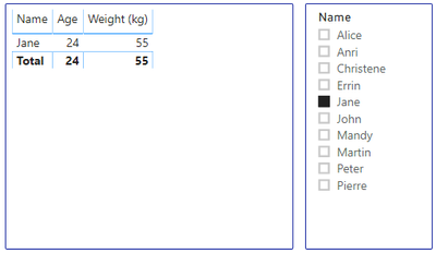
This is what normally happens:
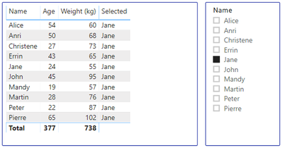
This is what I want to happen:
Background:
I have a R - Visual that accepts data points to draw a graph. It has to draw a graph that wil draw the filter selected data point in a different color. If the whole dataset is filtered the graph looks wonky. This way the first value of the "Selected" column can be used in R to identify the data point that has to be drawn in a different color.
Solved! Go to Solution.
- Mark as New
- Bookmark
- Subscribe
- Mute
- Subscribe to RSS Feed
- Permalink
- Report Inappropriate Content
Sure, create a table like this:
SlicerTable = DISTINCT('Table'[Name])
Make sure this is disconnected from any other tables. Use this in your slicer.
Create measure:
Selected = SELECTEDVALUE('SlicerTable'[Name])
Put that measure in your table visualization
Follow on LinkedIn
@ me in replies or I'll lose your thread!!!
Instead of a Kudo, please vote for this idea
Become an expert!: Enterprise DNA
External Tools: MSHGQM
YouTube Channel!: Microsoft Hates Greg
Latest book!: DAX For Humans
DAX is easy, CALCULATE makes DAX hard...
- Mark as New
- Bookmark
- Subscribe
- Mute
- Subscribe to RSS Feed
- Permalink
- Report Inappropriate Content
I knew it had to be easy 😋
It's perfect!
I added to it to remind me if I perhaps selected more than one value
Thank you Greg!
Helpful resources
| User | Count |
|---|---|
| 28 | |
| 11 | |
| 8 | |
| 6 | |
| 5 |
| User | Count |
|---|---|
| 35 | |
| 14 | |
| 12 | |
| 9 | |
| 7 |


