Fabric Data Days starts November 4th!
Advance your Data & AI career with 50 days of live learning, dataviz contests, hands-on challenges, study groups & certifications and more!
Get registered- Power BI forums
- Get Help with Power BI
- Desktop
- Service
- Report Server
- Power Query
- Mobile Apps
- Developer
- DAX Commands and Tips
- Custom Visuals Development Discussion
- Health and Life Sciences
- Power BI Spanish forums
- Translated Spanish Desktop
- Training and Consulting
- Instructor Led Training
- Dashboard in a Day for Women, by Women
- Galleries
- Data Stories Gallery
- Themes Gallery
- Contests Gallery
- Quick Measures Gallery
- Visual Calculations Gallery
- Notebook Gallery
- Translytical Task Flow Gallery
- TMDL Gallery
- R Script Showcase
- Webinars and Video Gallery
- Ideas
- Custom Visuals Ideas (read-only)
- Issues
- Issues
- Events
- Upcoming Events
Join us at FabCon Atlanta from March 16 - 20, 2026, for the ultimate Fabric, Power BI, AI and SQL community-led event. Save $200 with code FABCOMM. Register now.
- Power BI forums
- Forums
- Get Help with Power BI
- DAX Commands and Tips
- Re: Adding Total Line in the same Line Chart that ...
- Subscribe to RSS Feed
- Mark Topic as New
- Mark Topic as Read
- Float this Topic for Current User
- Bookmark
- Subscribe
- Printer Friendly Page
- Mark as New
- Bookmark
- Subscribe
- Mute
- Subscribe to RSS Feed
- Permalink
- Report Inappropriate Content
Adding Total Line in the same Line Chart that is broken down by different Attributes
Hi there,
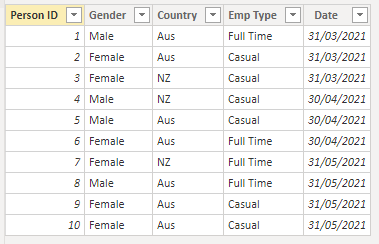
Just want to understand if there is a way to show a total % line in the same line chart that break downs the data with different attributes. Just created a dummy data table to explain further. thanks in advance
Table Name: Person Data
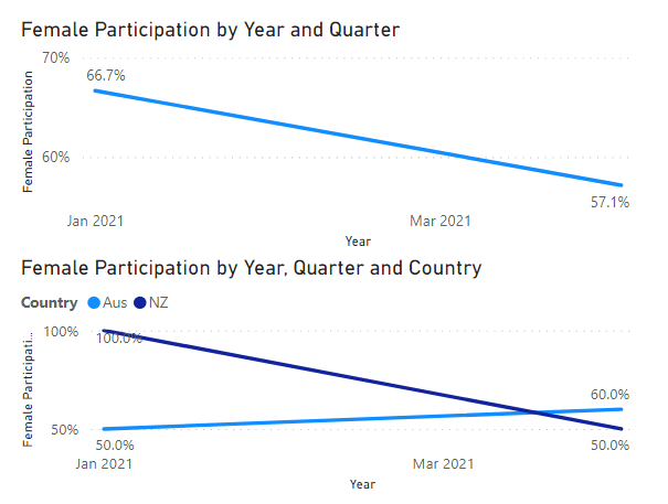
Metric required: Female participation rate in each attiribute i.e. counrty, emp type etc. pls see follwoing example
Measure: Female Participation =DIVIDE(CALCULATE(DISTINCTCOUNT('Person Data'[Person ID]),'Person Data'[Gender]="Female"),DISTINCTCOUNT('Person Data'[Person ID]))
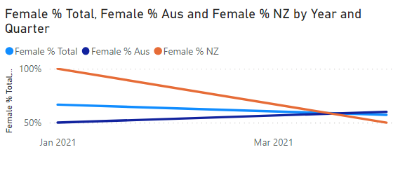
with this measure I can show total line or break it down by some categories but can't show all in one line chart.
To include Total line in same chart I need to create seperate measures:
Female %: DIVIDE(CALCULATE(DISTINCTCOUNT('Person Data'[Person ID]),'Person Data'[Gender]="Female"),DISTINCTCOUNT('Person Data'[Person ID]))

- Mark as New
- Bookmark
- Subscribe
- Mute
- Subscribe to RSS Feed
- Permalink
- Report Inappropriate Content
You can use Calculation Groups to create versions of all measures that will be insensitive to any set of attributes you want. This would be the simplest and most elegant solution out there.
- Mark as New
- Bookmark
- Subscribe
- Mute
- Subscribe to RSS Feed
- Permalink
- Report Inappropriate Content
@daxer-almighty thank you for the response I will read the article and try to apply it to my model.
- Mark as New
- Bookmark
- Subscribe
- Mute
- Subscribe to RSS Feed
- Permalink
- Report Inappropriate Content
Here's something more about Calculation Groups and it's live: https://www.youtube.com/watch?v=a4zYT-N-zsU
- Mark as New
- Bookmark
- Subscribe
- Mute
- Subscribe to RSS Feed
- Permalink
- Report Inappropriate Content
Helpful resources

FabCon Global Hackathon
Join the Fabric FabCon Global Hackathon—running virtually through Nov 3. Open to all skill levels. $10,000 in prizes!

Power BI Monthly Update - October 2025
Check out the October 2025 Power BI update to learn about new features.

| User | Count |
|---|---|
| 10 | |
| 6 | |
| 4 | |
| 3 | |
| 3 |
| User | Count |
|---|---|
| 13 | |
| 11 | |
| 8 | |
| 8 | |
| 8 |


