FabCon is coming to Atlanta
Join us at FabCon Atlanta from March 16 - 20, 2026, for the ultimate Fabric, Power BI, AI and SQL community-led event. Save $200 with code FABCOMM.
Register now!- Power BI forums
- Get Help with Power BI
- Desktop
- Service
- Report Server
- Power Query
- Mobile Apps
- Developer
- DAX Commands and Tips
- Custom Visuals Development Discussion
- Health and Life Sciences
- Power BI Spanish forums
- Translated Spanish Desktop
- Training and Consulting
- Instructor Led Training
- Dashboard in a Day for Women, by Women
- Galleries
- Data Stories Gallery
- Themes Gallery
- Contests Gallery
- Quick Measures Gallery
- Visual Calculations Gallery
- Notebook Gallery
- Translytical Task Flow Gallery
- TMDL Gallery
- R Script Showcase
- Webinars and Video Gallery
- Ideas
- Custom Visuals Ideas (read-only)
- Issues
- Issues
- Events
- Upcoming Events
Calling all Data Engineers! Fabric Data Engineer (Exam DP-700) live sessions are back! Starting October 16th. Sign up.
- Power BI forums
- Forums
- Get Help with Power BI
- DAX Commands and Tips
- A toggle checkbox on PowerBI
- Subscribe to RSS Feed
- Mark Topic as New
- Mark Topic as Read
- Float this Topic for Current User
- Bookmark
- Subscribe
- Printer Friendly Page
- Mark as New
- Bookmark
- Subscribe
- Mute
- Subscribe to RSS Feed
- Permalink
- Report Inappropriate Content
A toggle checkbox on PowerBI
One of the requirement for my small PowerBI project is a toggle checkbox. For example, here is 'salesperson' table

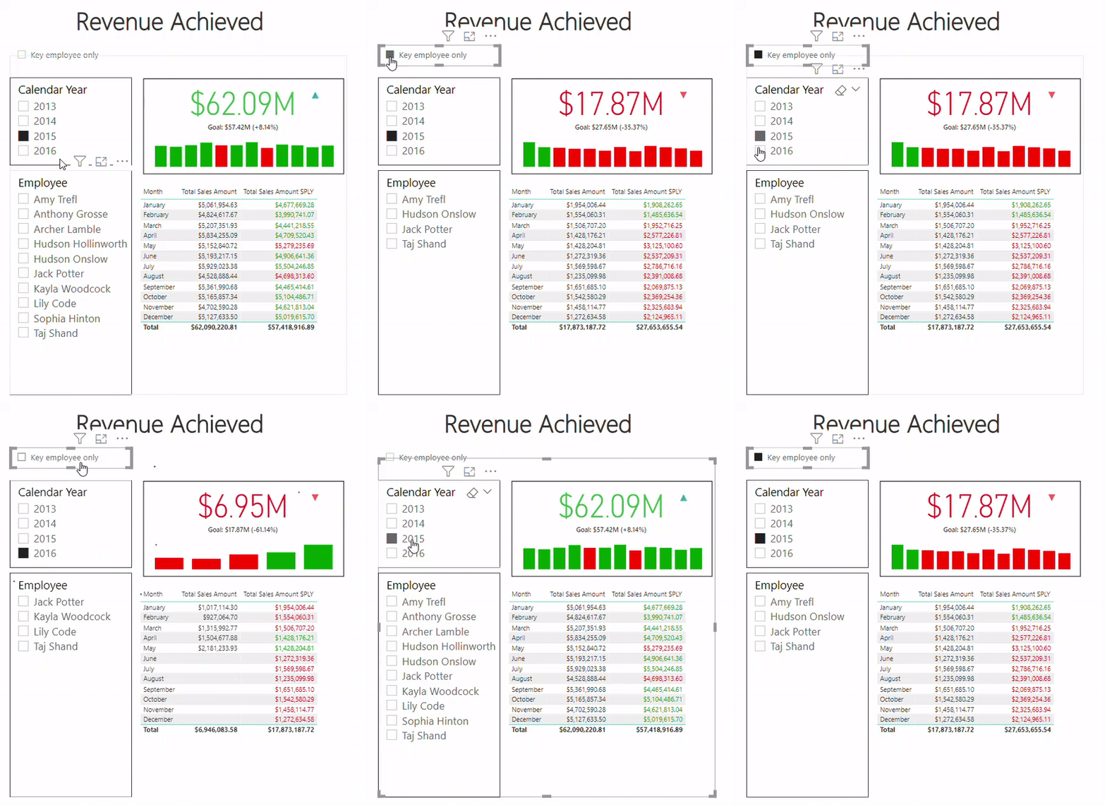
When the checkbox is checked, only 'KeyEmployee' will display on the dashboard, otherwise everyone will display. Lets see hows it looks in final solution:

I have successfully make it works as you can see above by using a temporary table and help from DAX:

My question is: Do we have any build-in visualization from Power BI to achieve my requirement? Or any better way for this?
P/S: I've written a blog post for my solution (sorry, this is not in English) based on the data model from Guy in a Cube, please correct me if my solution is a bad solution.
- Mark as New
- Bookmark
- Subscribe
- Mute
- Subscribe to RSS Feed
- Permalink
- Report Inappropriate Content
- Mark as New
- Bookmark
- Subscribe
- Mute
- Subscribe to RSS Feed
- Permalink
- Report Inappropriate Content
TotalSales=CALCULATE(SUM(Sales[Sales Amount]),IF(SELECTEDVALUE(Checkbox[Id])=1,Salesperson[KeyEmployee]=1,TRUE()))
Helpful resources

FabCon Global Hackathon
Join the Fabric FabCon Global Hackathon—running virtually through Nov 3. Open to all skill levels. $10,000 in prizes!

Power BI Monthly Update - October 2025
Check out the October 2025 Power BI update to learn about new features.

| User | Count |
|---|---|
| 10 | |
| 7 | |
| 5 | |
| 4 | |
| 3 |
| User | Count |
|---|---|
| 13 | |
| 11 | |
| 9 | |
| 8 | |
| 8 |
