A new Data Days event is coming soon!
This time we’re going bigger than ever. Fabric, Power BI, SQL, AI and more. We're covering it all. You won't want to miss it.
Learn more- Power BI forums
- Get Help with Power BI
- Desktop
- Service
- Report Server
- Power Query
- Mobile Apps
- Developer
- DAX Commands and Tips
- Custom Visuals Development Discussion
- Health and Life Sciences
- Power BI Spanish forums
- Translated Spanish Desktop
- Training and Consulting
- Instructor Led Training
- Dashboard in a Day for Women, by Women
- Galleries
- Data Stories Gallery
- Themes Gallery
- Contests Gallery
- QuickViz Gallery
- Quick Measures Gallery
- Visual Calculations Gallery
- Notebook Gallery
- Translytical Task Flow Gallery
- TMDL Gallery
- R Script Showcase
- Webinars and Video Gallery
- Ideas
- Custom Visuals Ideas (read-only)
- Issues
- Issues
- Events
- Upcoming Events
Level up your Power BI skills this month - build one visual each week and tell better stories with data! Get started
- Power BI forums
- Forums
- Get Help with Power BI
- Custom Visuals Development Discussion
- Re: power kpi matrix
- Subscribe to RSS Feed
- Mark Topic as New
- Mark Topic as Read
- Float this Topic for Current User
- Bookmark
- Subscribe
- Printer Friendly Page
- Mark as New
- Bookmark
- Subscribe
- Mute
- Subscribe to RSS Feed
- Permalink
- Report Inappropriate Content
power kpi matrix
Not sure whether this is the correct location to post this, but here goes...
I downloaded the new Power KPI Matrix today. It provides the balanced scorecard reporting that I had been looking for. I got it all configured and customized in Power BI Desktop, then published the report to the Power BI service. All of the customizations I had done to format Current Value and set colors for the Sparkline charts were lost. I had to re-do them in the Power BI service and save them there.
Is anyone else experiencing this issue?
Solved! Go to Solution.
- Mark as New
- Bookmark
- Subscribe
- Mute
- Subscribe to RSS Feed
- Permalink
- Report Inappropriate Content
Power KPI Matrix supports zero values now by enabling a toggle at Actual Value group of Formatting Panel.
Ignat Vilesov,
Software Engineer
Microsoft Power BI Custom Visuals
- Mark as New
- Bookmark
- Subscribe
- Mute
- Subscribe to RSS Feed
- Permalink
- Report Inappropriate Content
I'm a big fan of the Matrix, and I've been doing testing for our own business purposes. However, I'm trying to change the KPI colors, and they will not "stick". I select a color, and it changes back to what it was. When I click on "Revert to default", nothing happens. When I try to turn off the indicator for one metric, the slider moves back to "On".
Any ideas?
- Mark as New
- Bookmark
- Subscribe
- Mute
- Subscribe to RSS Feed
- Permalink
- Report Inappropriate Content
@v-viig @v-evelk Hi team, loving the Power KPI Matrix. Quick question. In row based configuration, is there any way you can have the current value format settings hold (be maintained) across multiple months? We need to have a month selection in our balanced scorecard due to the nature of out business and the format customisations currently reset with each month selected.
E.g. If we configure a value such as Gross Profit to display (format) as $,0 (e.g. $500,000) in July 2019, if we select June 2019, the field is back to displaying 500000 (if it had the same value of course). To add clarity, the months which have been customised, do not lose their customisation, it's just that it is not applying to the field regardless of the date range selected so if we have the option of 24 months, we need to go in and format it 24 times.
We have had some success in selecting a very old date and applying the formatting, which sometimes carries through to all newer values, but it's hit or miss. Is there any way around this issue, or could we potentially see it sorted in a future release?
Thanks for your help!
- Mark as New
- Bookmark
- Subscribe
- Mute
- Subscribe to RSS Feed
- Permalink
- Report Inappropriate Content
Hi,
Do I correctly understand that you want that some custom fromatting automatically applies for new metrics that has been added recently? Is it the case?
Kind Regards,
Evgenii Elkin,
Software Engineer
Microsoft Power BI Custom Visuals
pbicvsupport@microsoft.com
- Mark as New
- Bookmark
- Subscribe
- Mute
- Subscribe to RSS Feed
- Permalink
- Report Inappropriate Content
It's the same measure, just a different date (month). We are using direct query, row based Power KPI Matrix. When we format a parameter, e.g. gross profit so that it displays in the conventional format (e.g. $500,000), that formating is only being applied to that field on the month that was selected when the formating was done. So if the formatting of $500,000 was made with January 2019 selected, when we select February 2019, the same field now shows as 500000 (missing the $ and ,). If you return to January 2019 the filed displays as $500,000 again.
We are selecting the (each, individually) measure in the current value section of the format pane and applying the correct styling based on the field type, e.g. currency or percentage as well as managing the decimal places shown:
The only difference between the images above is that I have changed the date on the page.
Hope this helps to clarify
___________________________________________________________________________________________________________________
Update - We just tried the same report with Import, rather than direct query and the field formating appears to hold fine (from the testing we have been able to do). So the issue with the fields losing their formating only appears to be an issue with direct query. For us, direct query is the preferred approach for this report, rather than the import method.
- Mark as New
- Bookmark
- Subscribe
- Mute
- Subscribe to RSS Feed
- Permalink
- Report Inappropriate Content
Thanks for the explanation.
It is probalby a bug, but I have to check and reproduce it before add it to a visual backlog.
Could you please send us your report (to pbicvsupport@microsoft.com) with fake data (if data are confidential) and connection through the import? It will help me to understand the issue better. I will change the type of connection on my side and will try to reproduce it.
Kind Regards,
Evgenii Elkin,
Software Engineer
Microsoft Power BI Custom Visuals
pbicvsupport@microsoft.com
- Mark as New
- Bookmark
- Subscribe
- Mute
- Subscribe to RSS Feed
- Permalink
- Report Inappropriate Content
I have data that has one value per year. Is there any way to make the sparkline display at the year level? To make my date work for other metrics that are computed I have a full date table. Right now it wants to put in the months and my lines are super choppy. It didn't matter if null was recognized as zero or not - all settings were doing it.
- Mark as New
- Bookmark
- Subscribe
- Mute
- Subscribe to RSS Feed
- Permalink
- Report Inappropriate Content
Hello,
To consider it as a feature request we have to to clearly undertand what is an issue about.
Could you please provide more details and screens?
Kind Regards!
Evgenii Elkin,
Software Engineer
Microsoft Power BI Custom Visuals
pbicvsupport@microsoft.com
- Mark as New
- Bookmark
- Subscribe
- Mute
- Subscribe to RSS Feed
- Permalink
- Report Inappropriate Content
@v-viig Good morning,
I'm using the Power KPI Matrix and it seems to have all the features I need, but I'm unable to figure out how to display the KPI indicator symbol on the Second KPI Status column. Any ideas?
- Mark as New
- Bookmark
- Subscribe
- Mute
- Subscribe to RSS Feed
- Permalink
- Report Inappropriate Content
HI Guys
Please help me... i have been struggling the whole day with this formula.
How do i change the hilighted formula (Red) to give a percentage of row total.
My current formula is giving the sum of selected Level5 for the selected Month.
Current formula answer = 2 (hilighted Orange)
Requested formula = 2 (hilighted Orange) / 5 (hilighted Blue)
Kind regards
Nocha
- Mark as New
- Bookmark
- Subscribe
- Mute
- Subscribe to RSS Feed
- Permalink
- Report Inappropriate Content
Hi @Mvumelwano,
We'd recommend to ask this question in this thread instead.
Ignat Vilesov,
Software Engineer
Microsoft Power BI Custom Visuals
- Mark as New
- Bookmark
- Subscribe
- Mute
- Subscribe to RSS Feed
- Permalink
- Report Inappropriate Content
@v-viigDo you have any tutorial for the power kpi matrix?
as I will build a monitoring dashboard for my company KPI.
I got the information as in picture, can you give any advice?
Thank you in advance
- Mark as New
- Bookmark
- Subscribe
- Mute
- Subscribe to RSS Feed
- Permalink
- Report Inappropriate Content
Download the Power KPI Matrix Sample from the below link, (Examples)
https://visuals.azureedge.net/app-store/PowerKPIMatrix.2.0.0.0.pbix
Kind regards
- Mark as New
- Bookmark
- Subscribe
- Mute
- Subscribe to RSS Feed
- Permalink
- Report Inappropriate Content
- Mark as New
- Bookmark
- Subscribe
- Mute
- Subscribe to RSS Feed
- Permalink
- Report Inappropriate Content
HI , @iNuii
Download the Power KPI Matrix Sample from the below link, (Examples)
https://visuals.azureedge.net/app-store/PowerKPIMatrix.2.0.0.0.pbix
Kind regards
- Mark as New
- Bookmark
- Subscribe
- Mute
- Subscribe to RSS Feed
- Permalink
- Report Inappropriate Content
Thanks for this great visual, it works pretty well for me.
Only one thing is a bit annoying. It always shows the data for the last value of the selected date field. In the Actual and Comparison values I would like to show an average for the selected dates (which is exactly what my underlying measure calculates), but this is not working now because it now only takes the "average" for the last date.
Could you consider adding the option to show the "total" for the selected date fields instead of only the last one?
Or provide an option to use a different field in the spark line than the one in Date, that would be even better perhaps.
- Mark as New
- Bookmark
- Subscribe
- Mute
- Subscribe to RSS Feed
- Permalink
- Report Inappropriate Content
@fbeekvel Thanks for the feedback. An ability to use another data field for sparkline has been added to the backlog (#26424).
Ignat Vilesov,
Software Engineer
Microsoft Power BI Custom Visuals
- Mark as New
- Bookmark
- Subscribe
- Mute
- Subscribe to RSS Feed
- Permalink
- Report Inappropriate Content
Hello,
I always end up with this issue.
The status symbols wont show up at all.
However when I import same data source in to the sample file provided on the site and plot matrix it works fine.
Is there a component I'm missing here?
Thanks,
Sujith.
- Mark as New
- Bookmark
- Subscribe
- Mute
- Subscribe to RSS Feed
- Permalink
- Report Inappropriate Content
Hi @Anonymous ,
Though the "Icons color" does not display by itself, there is an alternative solution for the same.
You can try the solution mentioned in this link:
https://community.powerbi.com/t5/Desktop/KPI-STATUS-in-POWER-KPI-MATRIX/m-p/720784
I found it useful as it worked for my Data Tables.
Hoping that it will be useful for you as well.
Thank you,
Susmitha
- Mark as New
- Bookmark
- Subscribe
- Mute
- Subscribe to RSS Feed
- Permalink
- Report Inappropriate Content
Hello @Anonymous,
Have you faced this issue in Power BI Desktop or Power BI Report Server?
Ignat Vilesov,
Software Engineer
Microsoft Power BI Custom Visuals
- Mark as New
- Bookmark
- Subscribe
- Mute
- Subscribe to RSS Feed
- Permalink
- Report Inappropriate Content
Hi @v-viig,
How do i attach pibx file. I do not see any option.
I have another issue with KPIMatrix.
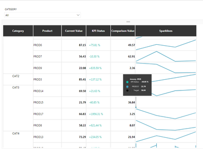
In the below image there is data for four months from jan 2018 to Apr 2018.
However for some Products, i do not see the sparkline for afour months e.g CAT3 and PROD15.
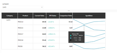
But whenever i apply filter on CAT3, it shows four values in the sparkline for PROD15.
Not sure why it behaves that way.
Am I missing something here?
Thanks,
Sujith.
Helpful resources

Power BI Monthly Update - April 2026
Check out the April 2026 Power BI update to learn about new features.

Data Days 2026 coming soon!
Sign up to receive a private message when registration opens and key events begin.

New to Fabric Survey
If you have recently started exploring Fabric, we'd love to hear how it's going. Your feedback can help with product improvements.


