FabCon is coming to Atlanta
Join us at FabCon Atlanta from March 16 - 20, 2026, for the ultimate Fabric, Power BI, AI and SQL community-led event. Save $200 with code FABCOMM.
Register now!- Power BI forums
- Get Help with Power BI
- Desktop
- Service
- Report Server
- Power Query
- Mobile Apps
- Developer
- DAX Commands and Tips
- Custom Visuals Development Discussion
- Health and Life Sciences
- Power BI Spanish forums
- Translated Spanish Desktop
- Training and Consulting
- Instructor Led Training
- Dashboard in a Day for Women, by Women
- Galleries
- Data Stories Gallery
- Themes Gallery
- Contests Gallery
- QuickViz Gallery
- Quick Measures Gallery
- Visual Calculations Gallery
- Notebook Gallery
- Translytical Task Flow Gallery
- TMDL Gallery
- R Script Showcase
- Webinars and Video Gallery
- Ideas
- Custom Visuals Ideas (read-only)
- Issues
- Issues
- Events
- Upcoming Events
The Power BI Data Visualization World Championships is back! Get ahead of the game and start preparing now! Learn more
- Power BI forums
- Forums
- Get Help with Power BI
- Custom Visuals Development Discussion
- Visualise distributions with pre-summarised data
- Subscribe to RSS Feed
- Mark Topic as New
- Mark Topic as Read
- Float this Topic for Current User
- Bookmark
- Subscribe
- Printer Friendly Page
- Mark as New
- Bookmark
- Subscribe
- Mute
- Subscribe to RSS Feed
- Permalink
- Report Inappropriate Content
Visualise distributions with pre-summarised data
G’day everyone,
New user of Power BI and first-time poster.
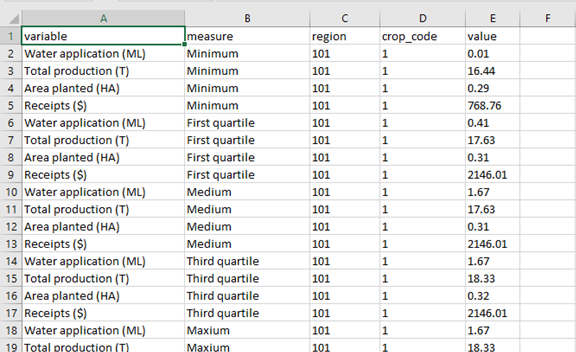
I want to know how I can create a visualisation of key distribution statistics (e.g. minimum, first quartile, medium, third quartile and maximum) using data that has already been summarised?
For example, consider the data example in the first screenshot below. I can use excel to show these statistics as a box and whisker plot that dynamically responds to the filters I’ve applied (see second screenshot below).


Is it possible to do something similar in Power BI? The only non-negotiable constraint is that the data is already summarised (like the example in the first screenshot). The visualisation doesn’t have to be a box and whisker plot, just something that highlights the distribution. The structure of the data set can also be different (e.g. the summary statistics can be restructured as columns rather than rows as they are in the example attached).
Thanks in advance for all your help!
PS: This forum would be even better if members could post files so responders had access to sample data or other reference material.
Helpful resources

Power BI Dataviz World Championships
The Power BI Data Visualization World Championships is back! Get ahead of the game and start preparing now!

| User | Count |
|---|---|
| 1 | |
| 1 | |
| 1 | |
| 1 | |
| 1 |

