FabCon is coming to Atlanta
Join us at FabCon Atlanta from March 16 - 20, 2026, for the ultimate Fabric, Power BI, AI and SQL community-led event. Save $200 with code FABCOMM.
Register now!- Power BI forums
- Get Help with Power BI
- Desktop
- Service
- Report Server
- Power Query
- Mobile Apps
- Developer
- DAX Commands and Tips
- Custom Visuals Development Discussion
- Health and Life Sciences
- Power BI Spanish forums
- Translated Spanish Desktop
- Training and Consulting
- Instructor Led Training
- Dashboard in a Day for Women, by Women
- Galleries
- Data Stories Gallery
- Themes Gallery
- Contests Gallery
- QuickViz Gallery
- Quick Measures Gallery
- Visual Calculations Gallery
- Notebook Gallery
- Translytical Task Flow Gallery
- TMDL Gallery
- R Script Showcase
- Webinars and Video Gallery
- Ideas
- Custom Visuals Ideas (read-only)
- Issues
- Issues
- Events
- Upcoming Events
The Power BI Data Visualization World Championships is back! Get ahead of the game and start preparing now! Learn more
- Power BI forums
- Forums
- Get Help with Power BI
- Custom Visuals Development Discussion
- Request for Support - Creation of a Chart with Spe...
- Subscribe to RSS Feed
- Mark Topic as New
- Mark Topic as Read
- Float this Topic for Current User
- Bookmark
- Subscribe
- Printer Friendly Page
- Mark as New
- Bookmark
- Subscribe
- Mute
- Subscribe to RSS Feed
- Permalink
- Report Inappropriate Content
Request for Support - Creation of a Chart with Specific Requirements (Bubble Chart)
Team,
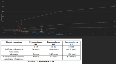
Your support is kindly requested to create a chart similar to the one in image 01. I have found a scatter plot chart and 2 add-ons that are similar (image 02). The detail is that in the original image, 3 lines need to be placed indicating the limits that each point should have. However, I am unable to do this. Please provide your assistance in suggesting any add-on that can create this chart.
Note: This chart uses the DIN 4150 meteorological standard in Peru.
Image 01: chart DIN 4150
Image 02: Add-ons
(GraphoMate Bubbles)
(Bubble/Scatter Chart - xViz)
Have a graet day!
Solved! Go to Solution.
- Mark as New
- Bookmark
- Subscribe
- Mute
- Subscribe to RSS Feed
- Permalink
- Report Inappropriate Content
Have you tried the PlotlyJS visual? If not, it could be made with the Deneb visual.
Intro To Low Code Custom Visuals in Power BI - YouTube
Pat
- Mark as New
- Bookmark
- Subscribe
- Mute
- Subscribe to RSS Feed
- Permalink
- Report Inappropriate Content
Have you tried the PlotlyJS visual? If not, it could be made with the Deneb visual.
Intro To Low Code Custom Visuals in Power BI - YouTube
Pat
- Mark as New
- Bookmark
- Subscribe
- Mute
- Subscribe to RSS Feed
- Permalink
- Report Inappropriate Content
Hello @ppm1,
Thank you for your response. I will now check it and confirm if I have managed to solve it. Thank you again.
Have a great day!!!!
Helpful resources

Power BI Dataviz World Championships
The Power BI Data Visualization World Championships is back! Get ahead of the game and start preparing now!

| User | Count |
|---|---|
| 1 | |
| 1 | |
| 1 | |
| 1 | |
| 1 |


