FabCon is coming to Atlanta
Join us at FabCon Atlanta from March 16 - 20, 2026, for the ultimate Fabric, Power BI, AI and SQL community-led event. Save $200 with code FABCOMM.
Register now!- Power BI forums
- Get Help with Power BI
- Desktop
- Service
- Report Server
- Power Query
- Mobile Apps
- Developer
- DAX Commands and Tips
- Custom Visuals Development Discussion
- Health and Life Sciences
- Power BI Spanish forums
- Translated Spanish Desktop
- Training and Consulting
- Instructor Led Training
- Dashboard in a Day for Women, by Women
- Galleries
- Data Stories Gallery
- Themes Gallery
- Contests Gallery
- QuickViz Gallery
- Quick Measures Gallery
- Visual Calculations Gallery
- Notebook Gallery
- Translytical Task Flow Gallery
- TMDL Gallery
- R Script Showcase
- Webinars and Video Gallery
- Ideas
- Custom Visuals Ideas (read-only)
- Issues
- Issues
- Events
- Upcoming Events
The Power BI Data Visualization World Championships is back! Get ahead of the game and start preparing now! Learn more
- Power BI forums
- Forums
- Get Help with Power BI
- Custom Visuals Development Discussion
- Productivity Visual from Excel in PowerBI
- Subscribe to RSS Feed
- Mark Topic as New
- Mark Topic as Read
- Float this Topic for Current User
- Bookmark
- Subscribe
- Printer Friendly Page
- Mark as New
- Bookmark
- Subscribe
- Mute
- Subscribe to RSS Feed
- Permalink
- Report Inappropriate Content
Productivity Visual from Excel in PowerBI
Hello everyone,
I'm new to PowerBI. I've completed the DIAD course and watched a few videos on youtube. I'm fluent in Tableau but am working on transitioning my reporting into PowerBI. I've never built anything like this in either program and was curious if you could help me build this in PowerBI.
I know I can use a matrix to display employee name, day, and values similar to the first 8 columns, but that's as far as I can go.
Can I create a column in Power Query or something for the Objective column? Or should I create a reference table with employee name and objective to connect to and add the Objective column after values?
Hours absent is a column that requires the manager to manually enter data. Can this be done in PowerBI? My thought was to offer a dropdown for values 0 - 40. In Tableau, I'd use a parameter but I'm not sure how to do this in PowerBI.
Total Tasks is just the sum of daily values. Objective - Absence is the Objective minus (Hours Absent * Objective/40). The final column is the total tasks / objective - absence. Should I create a new measure or new column for these calculations?
Lastly, is it possible to format the matrix in a similar fashion?
- Mark as New
- Bookmark
- Subscribe
- Mute
- Subscribe to RSS Feed
- Permalink
- Report Inappropriate Content
You can format your matrix in a lot of ways, but not all of these make sense or are user friendly. Coming from Tableau you should be used to a more disciplined approach.
In your case you would use a matrix visual without column fields, only with row fields and individual measures for each of the columns. Are you sure you want to do that?
- Mark as New
- Bookmark
- Subscribe
- Mute
- Subscribe to RSS Feed
- Permalink
- Report Inappropriate Content
Oh, to be clear: this is not what I want to do. This is an attempt to appease the management that is adverse to major changes while also allowing us to automate the reporting by importing the data via SQL database. My plan is to keep at this till I eventually hit a wall because 1) it will be a learning experience and 2) it will show me my limitations. I'm expecting to have a discussion regarding reformatting the visualization into something more conducive to Power BI, but many people in the organization prefer spreadsheets to KPI gauges or objective funnels and the like.
Currently, the data is a table consisting of employees, Entity IDs (what they receive credit for), the date, and the team per employee.
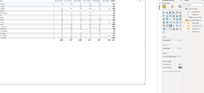
The matrix visual and cards look like this:
Let's start with one piece at a time. For the objective column, my idea was to create a table with employee name and their corresponding objectives. I've verified the relationship works but is it possible to use that value as a column past the date but before the total that will not add to the total similar to how it exists in the initial screenshot? Also, is there a way to stretch the matrix to fit the box it is in?
- Mark as New
- Bookmark
- Subscribe
- Mute
- Subscribe to RSS Feed
- Permalink
- Report Inappropriate Content
No to both. That's not how matrix visuals are designed. You will need to look into creating your own custom visual, with Deneb, or Charticulator for example.
Helpful resources

Power BI Dataviz World Championships
The Power BI Data Visualization World Championships is back! Get ahead of the game and start preparing now!


