FabCon is coming to Atlanta
Join us at FabCon Atlanta from March 16 - 20, 2026, for the ultimate Fabric, Power BI, AI and SQL community-led event. Save $200 with code FABCOMM.
Register now!- Power BI forums
- Get Help with Power BI
- Desktop
- Service
- Report Server
- Power Query
- Mobile Apps
- Developer
- DAX Commands and Tips
- Custom Visuals Development Discussion
- Health and Life Sciences
- Power BI Spanish forums
- Translated Spanish Desktop
- Training and Consulting
- Instructor Led Training
- Dashboard in a Day for Women, by Women
- Galleries
- Data Stories Gallery
- Themes Gallery
- Contests Gallery
- QuickViz Gallery
- Quick Measures Gallery
- Visual Calculations Gallery
- Notebook Gallery
- Translytical Task Flow Gallery
- TMDL Gallery
- R Script Showcase
- Webinars and Video Gallery
- Ideas
- Custom Visuals Ideas (read-only)
- Issues
- Issues
- Events
- Upcoming Events
The Power BI Data Visualization World Championships is back! Get ahead of the game and start preparing now! Learn more
- Power BI forums
- Forums
- Get Help with Power BI
- Custom Visuals Development Discussion
- Producing a line graph with countifs
- Subscribe to RSS Feed
- Mark Topic as New
- Mark Topic as Read
- Float this Topic for Current User
- Bookmark
- Subscribe
- Printer Friendly Page
- Mark as New
- Bookmark
- Subscribe
- Mute
- Subscribe to RSS Feed
- Permalink
- Report Inappropriate Content
Producing a line graph with countifs
Hello all,
I'm relatively new to PowerBI, so i'm not really used to the DAX syntax yet, which is the reason i'm posting this question.
Normally i make reports based on excel-made graphs. I am currently trying to reproduce a report in Powerbi. Most charts are working fine, but i have one graph i cannot seem to make.
The problem:
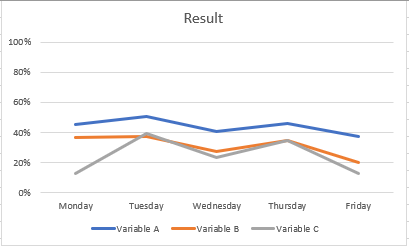
I want to make a line graph with values based on multiple filters. An example of said line graph in excel.
The graph is based on a summary made out of a set of data consisting out of three columns:
columns(values)
- Weekday (monday,tuesday,wednesday,thursday,friday)
- type(Variable A, Variable B, Variable C)
- Status(In use, Temporarily not in use, Not in use)
From this set of data i produced the following table:
Monday Tuesday Wednesday Thursday Friday
Variable A 45% 50% 41% 46% 38%
Variable B 36% 38% 27% 35% 20%
Variable C 13% 39% 23% 34% %13
The formula i used to produce the summary above is:
used variables for example("Monday", "Variable A", "In use")
=COUNTIFS(Data[Weekday];"Monday"
;Data[Type];"Variable A"
;Data[Status];"In use")
/
COUNTIFS(Data[Weekday]"Monday"
;Data[Type];"Variable A")
From the summary i made the graph. I tried several things in powerbi, but i cannot seem to make it work. Can anyone explain to me how to produce the same graph in Powerbi?
Best Regards,
Pim Schoeman
- Mark as New
- Bookmark
- Subscribe
- Mute
- Subscribe to RSS Feed
- Permalink
- Report Inappropriate Content
Hello Pim Schoeman,
DAX is out of our expertise because it is a feature of Desktop so, it is more efficient to ask all the questions regarding DAX in the Desktop thread.
Kind Regards,
Evgenii Elkin,
Software Engineer
Microsoft Power BI Custom Visuals
pbicvsupport@microsoft.com
Helpful resources

Power BI Dataviz World Championships
The Power BI Data Visualization World Championships is back! Get ahead of the game and start preparing now!


