Get Fabric certified for FREE!
Don't miss your chance to take the Fabric Data Engineer (DP-700) exam on us!
Learn more- Power BI forums
- Get Help with Power BI
- Desktop
- Service
- Report Server
- Power Query
- Mobile Apps
- Developer
- DAX Commands and Tips
- Custom Visuals Development Discussion
- Health and Life Sciences
- Power BI Spanish forums
- Translated Spanish Desktop
- Training and Consulting
- Instructor Led Training
- Dashboard in a Day for Women, by Women
- Galleries
- Data Stories Gallery
- Themes Gallery
- Contests Gallery
- QuickViz Gallery
- Quick Measures Gallery
- Visual Calculations Gallery
- Notebook Gallery
- Translytical Task Flow Gallery
- TMDL Gallery
- R Script Showcase
- Webinars and Video Gallery
- Ideas
- Custom Visuals Ideas (read-only)
- Issues
- Issues
- Events
- Upcoming Events
We've captured the moments from FabCon & SQLCon that everyone is talking about, and we are bringing them to the community, live and on-demand. Starts on April 14th. Register now
- Power BI forums
- Forums
- Get Help with Power BI
- Custom Visuals Development Discussion
- Re: Power BI Custom Visuals' Community
- Subscribe to RSS Feed
- Mark Topic as New
- Mark Topic as Read
- Float this Topic for Current User
- Bookmark
- Subscribe
- Printer Friendly Page
- Mark as New
- Bookmark
- Subscribe
- Mute
- Subscribe to RSS Feed
- Permalink
- Report Inappropriate Content
Power BI Custom Visuals' Community
Welcome to Power BI Custom Visuals Community!
Power BI custom visuals is all about community. We are very excited to announce that custom visuals now have a special place in the Power BI community site, to share knowledge, ideas and news!
- Custom visuals development discussion – Ask questions and share knowledge about developing custom visuals.
- Custom visuals ideas – Share your ideas, ask for features, propose new custom visuals.
- Custom visuals community blog – Community news and announcements for new custom visuals available, new APIs released, tips & tricks from developers and users.
Power BI custom visuals useful links for developers
- Developer documents - find here all documents you need
- Step-by-step tutorial
- Looking for advanced tutorial? Find it here
- Visit also our github
- Find here Power BI visuals' Samples
- Custom visual's webinar
- For technichal questions and help please reach out pbicvsupport@microsoft.com
- Mark as New
- Bookmark
- Subscribe
- Mute
- Subscribe to RSS Feed
- Permalink
- Report Inappropriate Content
Can you add vertical grid lines for the visual "Gantt" version 2.2.3.0. And respectively a setting toggle switch to turn it on or off. Currently there are only horizontal grid lines, however it's usefull to visually relate to the date in the header. Thank you.
- Mark as New
- Bookmark
- Subscribe
- Mute
- Subscribe to RSS Feed
- Permalink
- Report Inappropriate Content
Dear Madam/Sir,
the card browser custom visual support link took me here.
https://appsource.microsoft.com/en-us/product/power-bi-visuals/WA104381278?src=office&tab=Overview
I have issue to add more than 4 images in title image section.
is there a limit here? anyway to overcome it?
thanks
Wenlei
- Mark as New
- Bookmark
- Subscribe
- Mute
- Subscribe to RSS Feed
- Permalink
- Report Inappropriate Content
Hello,
Yes, you're right.
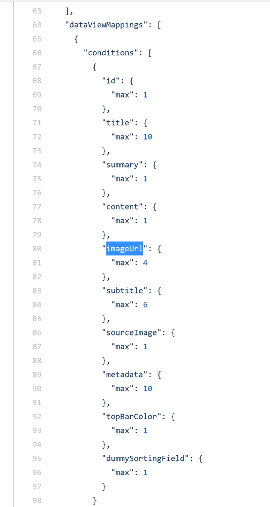
There is a limitation for this bucket (see the following picture)
As a solution, you can fork the visual repository, adjust condition inside cpabilities.json, change a visual GUID iside pbiviz.json, build a new package using npm run package script and import a package file into your report.
Kind Regards,
Evgenii Elkin,
Software Engineer
Microsoft Power BI Custom Visuals
pbicvsupport@microsoft.com
- Mark as New
- Bookmark
- Subscribe
- Mute
- Subscribe to RSS Feed
- Permalink
- Report Inappropriate Content
Dear Evgenii,
I have installed the custom visual dev environment on my computer.
and about go through the following tutor.
https://docs.microsoft.com/en-us/power-bi/developer/visuals/custom-visual-develop-tutorial
I download the card browser package from the github and unzip to C:\Windows\System32
I switch working directory to the card browser folder. and start the project in powershell
but I come across this error, do you know why?
I have tried the following solution, but with no luck.
https://github.com/Microsoft/PowerBI-visuals-ForceGraph/issues/43
thanks for your help.
Best regards,
Wenlei
- Mark as New
- Bookmark
- Subscribe
- Mute
- Subscribe to RSS Feed
- Permalink
- Report Inappropriate Content
Thanks a lot, Evgenii. This is very helpful.
I will give a try.
Wenlei
- Mark as New
- Bookmark
- Subscribe
- Mute
- Subscribe to RSS Feed
- Permalink
- Report Inappropriate Content
Hi. I'm using the Gantt 2.2.3 and have an issue. When I edit the report in Power BI desktop, the legend colors are correct, however when I publish in my workspace the legend colors dissapear.
- Mark as New
- Bookmark
- Subscribe
- Mute
- Subscribe to RSS Feed
- Permalink
- Report Inappropriate Content
- Mark as New
- Bookmark
- Subscribe
- Mute
- Subscribe to RSS Feed
- Permalink
- Report Inappropriate Content
Hello,
Could you send your report for analysis to pbicvsupport@microsoft.com please?
Kind Regards,
Evgenii Elkin,
Software Engineer
Microsoft Power BI Custom Visuals
pbicvsupport@microsoft.com
- Mark as New
- Bookmark
- Subscribe
- Mute
- Subscribe to RSS Feed
- Permalink
- Report Inappropriate Content
Text Filter no longer works with part of a value in my tenant.
So, for example, I cant search for "user.na" and get "user.name@company.com"
- Mark as New
- Bookmark
- Subscribe
- Mute
- Subscribe to RSS Feed
- Permalink
- Report Inappropriate Content
Hi Everyone,
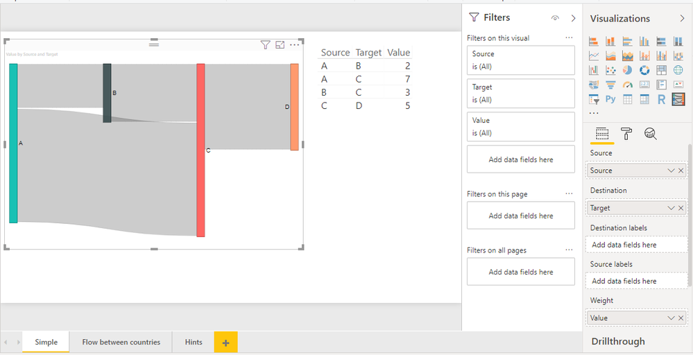
The custom visual Sankey Chart does not allow tooltip customization at all. Does anyone know a workaround ? or any other visusal that I can use as its alternate.
Any help will be much appreciated.
Thanks.
- Mark as New
- Bookmark
- Subscribe
- Mute
- Subscribe to RSS Feed
- Permalink
- Report Inappropriate Content
Hi,
The visual provides standard tooltip style as many other MS visuals.
Could you clarify please what do you mean under tooltip customization?
Kind Regards,
Evgenii Elkin,
Software Engineer
Microsoft Power BI Custom Visuals
pbicvsupport@microsoft.com
- Mark as New
- Bookmark
- Subscribe
- Mute
- Subscribe to RSS Feed
- Permalink
- Report Inappropriate Content
Thanks for replying @v-evelk
What I meant was that the tooltip only shows the name of the node and count. I also want to be able to show percentage of previous in it. The tooltips can not be configured as there is not option to add more measures to display in tooltip.
I hope I have clearified my query
- Mark as New
- Bookmark
- Subscribe
- Mute
- Subscribe to RSS Feed
- Permalink
- Report Inappropriate Content
Hi,
We will consider this changes in the next visual release but there isn't any ETA for a while.
Kind Regards,
Evgenii Elkin,
Software Engineer
Microsoft Power BI Custom Visuals
pbicvsupport@microsoft.com
- Mark as New
- Bookmark
- Subscribe
- Mute
- Subscribe to RSS Feed
- Permalink
- Report Inappropriate Content
The Timeline Slicer took me here for it's support URL: https://appsource.microsoft.com/en-us/product/power-bi-visuals/WA104380786?src=office&tab=Overview
I have a problem with this visual, when publish to Report Server (Sept 2019 edition) when viewing this visual on the report server Chrome/Edge/Firefox on multiple PC's that I've tested. The visual does not filter the data, it does work in PowerBI Desktop, but not when it's published.
I need to use this Microsoft Visual addon, where do I go to get support?
- Mark as New
- Bookmark
- Subscribe
- Mute
- Subscribe to RSS Feed
- Permalink
- Report Inappropriate Content
- Mark as New
- Bookmark
- Subscribe
- Mute
- Subscribe to RSS Feed
- Permalink
- Report Inappropriate Content
Hi,
On powerbi.microsoft.com/en-us/custom-visuals I read that Microsoft finally has decided to share the source code of all the visuals that ship with Power BI:
"We want you to be ready to extend Power BI. So we've provided the source code for all the visuals we ship in Power BI. You can quickly create high quality custom visuals for Power BI."
I checked github but cannot find a complete repository of the source codes.
Could someone please tell me the location of the source code of e.g. the 'matrix' and 'scatter chart' visual?
Thank you,
Martijn
- Mark as New
- Bookmark
- Subscribe
- Mute
- Subscribe to RSS Feed
- Permalink
- Report Inappropriate Content
Hi Martijn,
This landing page is temporary and contains obsolete info.
We will update it soon.
The source code for core visuals is private, hovever, we have got a collection of visuals with open source code. You can find them on that page.
Kind Regards,
Evgenii Elkin,
Software Engineer
Microsoft Power BI Custom Visuals
pbicvsupport@microsoft.com
- Mark as New
- Bookmark
- Subscribe
- Mute
- Subscribe to RSS Feed
- Permalink
- Report Inappropriate Content
Hello!
Im using the enhanced scatter chart and I want to place a background on it, when clicking on the option backdrop, no place for the hyperlink appears. Only a revert to original button appears that when selecting it only turns off the backdrop option. HELP PLEASE
- Mark as New
- Bookmark
- Subscribe
- Mute
- Subscribe to RSS Feed
- Permalink
- Report Inappropriate Content
How can one find the visualName of a custom visual for JSON editing if the format painter is insufficient?
- Mark as New
- Bookmark
- Subscribe
- Mute
- Subscribe to RSS Feed
- Permalink
- Report Inappropriate Content
Hello,
Your question is unclear.
Please, describe it with more details and create a separate topic for this.
Kind Regards,
Evgenii Elkin,
Software Engineer
Microsoft Power BI Custom Visuals
pbicvsupport@microsoft.com
- Mark as New
- Bookmark
- Subscribe
- Mute
- Subscribe to RSS Feed
- Permalink
- Report Inappropriate Content
Hello,
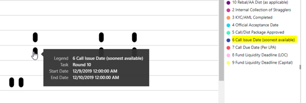
I am creating a Gantt Chart, but for some reason some events are show up black when the Legend does not black to label any events. Does anyone know why they are back and how to get the event to show the correct color according to the legend.
Below is a screen shot.
For Example: according to the legend this event should be blue:
Thanks in advanced.
Helpful resources

New to Fabric Survey
If you have recently started exploring Fabric, we'd love to hear how it's going. Your feedback can help with product improvements.

Power BI DataViz World Championships - June 2026
A new Power BI DataViz World Championship is coming this June! Don't miss out on submitting your entry.

Join our Fabric User Panel
Share feedback directly with Fabric product managers, participate in targeted research studies and influence the Fabric roadmap.

| User | Count |
|---|---|
| 5 | |
| 4 | |
| 2 | |
| 2 | |
| 2 |


