Join us at FabCon Vienna from September 15-18, 2025
The ultimate Fabric, Power BI, SQL, and AI community-led learning event. Save €200 with code FABCOMM.
Get registered- Power BI forums
- Get Help with Power BI
- Desktop
- Service
- Report Server
- Power Query
- Mobile Apps
- Developer
- DAX Commands and Tips
- Custom Visuals Development Discussion
- Health and Life Sciences
- Power BI Spanish forums
- Translated Spanish Desktop
- Training and Consulting
- Instructor Led Training
- Dashboard in a Day for Women, by Women
- Galleries
- Data Stories Gallery
- Themes Gallery
- Contests Gallery
- Quick Measures Gallery
- Notebook Gallery
- Translytical Task Flow Gallery
- TMDL Gallery
- R Script Showcase
- Webinars and Video Gallery
- Ideas
- Custom Visuals Ideas (read-only)
- Issues
- Issues
- Events
- Upcoming Events
Compete to become Power BI Data Viz World Champion! First round ends August 18th. Get started.
- Power BI forums
- Forums
- Get Help with Power BI
- Custom Visuals Development Discussion
- Re: How to sort X-axis and Y-axis in custom order ...
- Subscribe to RSS Feed
- Mark Topic as New
- Mark Topic as Read
- Float this Topic for Current User
- Bookmark
- Subscribe
- Printer Friendly Page
- Mark as New
- Bookmark
- Subscribe
- Mute
- Subscribe to RSS Feed
- Permalink
- Report Inappropriate Content
How to sort X-axis and Y-axis in custom order for my custom visualisation using Deneb?
{
"data": {"name": "dataset"},
"layer": [{
"mark": {
"type": "point",
"size": 1000,
"tooltip": true
},
"encoding": {
"y": {
"field": "Residual_Risk",
"type": "ordinal",
"sort": "Y"
},
"x": {
"field": "Risk Appetite",
"type": "nominal",
"axis": {
"labelAngle": 0
}
},
"size": {
"field": "Count of Risk_ID",
"legend": null,
"scale": {"rangeMax": 15000},
"type" : "quantitative"
},
"color": {
"field": "Count of Risk_ID",
"legend": null,
"scale": {"range": ["#F0E199", "#6D5A00"]},
"type" : "quantitative"
}
}
},
{
"mark": {
"type": "text",
"fontSize": 16,
"fontWeight": "400",
"color": "black"
},
"encoding": {
"y": {
"field": "Residual_Risk",
"type": "ordinal",
"sort": "-Y"
},
"x": {
"field": "Risk Appetite",
"type": "ordinal",
"axis": {
"labelAngle": 0
}
},
"text": {
"field": "Count of Risk_ID",
"type": "quantitative"
}
}
}
]
}
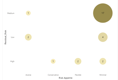
this the Visualisation and this the code for the visualistion
I need to Sort the X-axis Averse, minimal, conservative,Flexible in that order and
I need to sort Y axis from Low to high
Solved! Go to Solution.
- Mark as New
- Bookmark
- Subscribe
- Mute
- Subscribe to RSS Feed
- Permalink
- Report Inappropriate Content
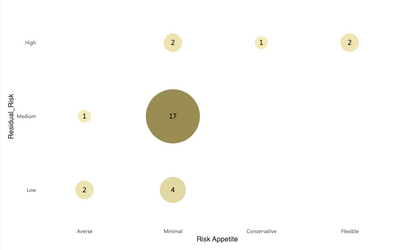
@Junato47, if you don't expect the axes values to change, you can use the following spec. There is also a way to implement a data-driven solution, but I believe this hard-coded method should suffice.
I removed the y sort from the text mark and also added top-level encoding for the sorting. If you need more help, just let me know, happy to help. If this gives you what you need, please mark this as the solution.
{
  "data": {"name": "dataset"},
  "encoding": {
    "x": {"sort": ["Averse", "Minimal", "Conservative", "Flexible"]},
    "y": {"sort": ["High", "Medium", "Low"]}
  },
  "layer": [
    {
      "mark": {"type": "point", "size": 1000, "tooltip": true},
      "encoding": {
        "y": {"field": "Residual_Risk", "type": "ordinal", "sort": "Y"},
        "x": {
          "field": "Risk Appetite",
          "type": "nominal",
          "axis": {"labelAngle": 0}
        },
        "size": {
          "field": "Count of Risk_ID",
          "legend": null,
          "scale": {"rangeMax": 15000},
          "type": "quantitative"
        },
        "color": {
          "field": "Count of Risk_ID",
          "legend": null,
          "scale": {"range": ["#F0E199", "#6D5A00"]},
          "type": "quantitative"
        }
      }
    },
    {
      "mark": {
        "type": "text",
        "fontSize": 16,
        "fontWeight": "400",
        "color": "black"
      },
      "encoding": {
        "y": {"field": "Residual_Risk", "type": "ordinal"},
        "x": {
          "field": "Risk Appetite",
          "type": "ordinal",
          "axis": {"labelAngle": 0}
        },
        "text": {"field": "Count of Risk_ID", "type": "quantitative"}
      }
    }
  ]
}
Madison Giammaria
Proud to be a Super User 😄
Do you frequently use Deneb to provide insights to your stakeholders? Have you considered sponsoring this free and open source custom visual? More info here!
- Mark as New
- Bookmark
- Subscribe
- Mute
- Subscribe to RSS Feed
- Permalink
- Report Inappropriate Content
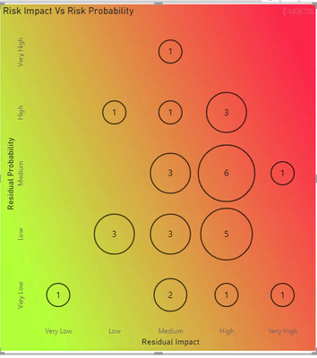
@giammariam hi could you help me in this code, i would like to swap the axis, but more than that the color of the bubble should change not as per the size of the bubble, but instead we should use a color gradient. For eg:"If the residual Impact is "Very Low" and residual probability is "Very Low" it should be Green and if it is high it should be Red. i will show you an example
Here i have used a background, but i want the color change inside the bubble and the backgroud should be white. For the visualisation i used i have made the bubble fill color as transperent. Is it possible to change the colors of the bubble just like the background.
- Mark as New
- Bookmark
- Subscribe
- Mute
- Subscribe to RSS Feed
- Permalink
- Report Inappropriate Content
Hey @Junato47. I'd be happy to help. Can you do two things for me first?
- Start a new post and tag me so people that are also trying to apply gradients in a mark can have an easier time finding help
- Provide a sanitized dummy dataset (here's how). Since the original solution was a while ago, I mainly want to make sure that I have the field names right. Also, I want to have a conclusive list of all axis values.
Madison Giammaria
Proud to be a Super User 😄
Do you frequently use Deneb to provide insights to your stakeholders? Have you considered sponsoring this free and open source custom visual? More info here!
- Mark as New
- Bookmark
- Subscribe
- Mute
- Subscribe to RSS Feed
- Permalink
- Report Inappropriate Content
@Junato47, if you don't expect the axes values to change, you can use the following spec. There is also a way to implement a data-driven solution, but I believe this hard-coded method should suffice.
I removed the y sort from the text mark and also added top-level encoding for the sorting. If you need more help, just let me know, happy to help. If this gives you what you need, please mark this as the solution.
{
  "data": {"name": "dataset"},
  "encoding": {
    "x": {"sort": ["Averse", "Minimal", "Conservative", "Flexible"]},
    "y": {"sort": ["High", "Medium", "Low"]}
  },
  "layer": [
    {
      "mark": {"type": "point", "size": 1000, "tooltip": true},
      "encoding": {
        "y": {"field": "Residual_Risk", "type": "ordinal", "sort": "Y"},
        "x": {
          "field": "Risk Appetite",
          "type": "nominal",
          "axis": {"labelAngle": 0}
        },
        "size": {
          "field": "Count of Risk_ID",
          "legend": null,
          "scale": {"rangeMax": 15000},
          "type": "quantitative"
        },
        "color": {
          "field": "Count of Risk_ID",
          "legend": null,
          "scale": {"range": ["#F0E199", "#6D5A00"]},
          "type": "quantitative"
        }
      }
    },
    {
      "mark": {
        "type": "text",
        "fontSize": 16,
        "fontWeight": "400",
        "color": "black"
      },
      "encoding": {
        "y": {"field": "Residual_Risk", "type": "ordinal"},
        "x": {
          "field": "Risk Appetite",
          "type": "ordinal",
          "axis": {"labelAngle": 0}
        },
        "text": {"field": "Count of Risk_ID", "type": "quantitative"}
      }
    }
  ]
}
Madison Giammaria
Proud to be a Super User 😄
Do you frequently use Deneb to provide insights to your stakeholders? Have you considered sponsoring this free and open source custom visual? More info here!
- Mark as New
- Bookmark
- Subscribe
- Mute
- Subscribe to RSS Feed
- Permalink
- Report Inappropriate Content
Hi @giammariam ,
Many thanks; everything went smoothly.
I don't know a lot about coding and I'm new to making custom visuals. Just curious if there are any other values, like: If there is Very High and Very Low on the Y-axis, will the code function if I add "y": "sort": ["Very High," "High," "Medium," "Low," "Very Low"]?
- Mark as New
- Bookmark
- Subscribe
- Mute
- Subscribe to RSS Feed
- Permalink
- Report Inappropriate Content
Yes that should work. Basically you want to add all the posible values for the axis into the sort array. Feel free to reach out if you need help on any deneb visuals in the future
Madison Giammaria
Proud to be a Super User 😄
Do you frequently use Deneb to provide insights to your stakeholders? Have you considered sponsoring this free and open source custom visual? More info here!
- Mark as New
- Bookmark
- Subscribe
- Mute
- Subscribe to RSS Feed
- Permalink
- Report Inappropriate Content
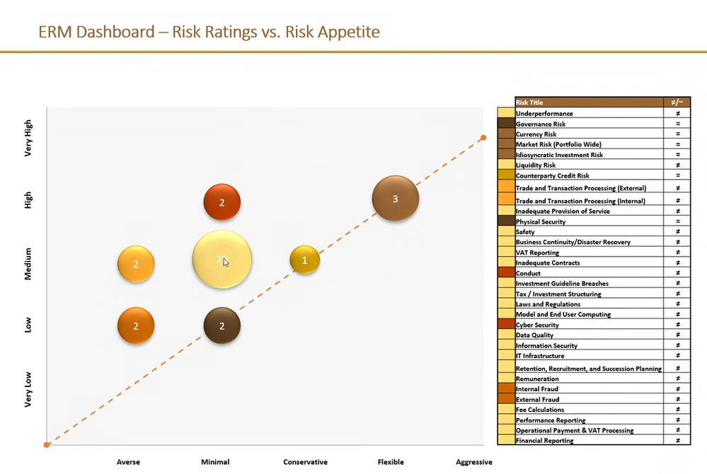
i have one more thing to add this to this visual, i would need a 45 degree dashed line starting from the origin of the graph. i will show a reference image
- Mark as New
- Bookmark
- Subscribe
- Mute
- Subscribe to RSS Feed
- Permalink
- Report Inappropriate Content
@Junato47, try this:
{
  "data": {"name": "dataset"},
 "encoding": {
    "x": {"sort": ["Averse", "Minimal", "Conservative", "Flexible"]},
    "y": {"sort": ["High", "Medium", "Low"]}
  },
  "layer": [
    {
      "mark": {"type": "line", "color": "orange", "strokeDash": [7,10], "strokeDashOffset": 9, "strokeWidth": 1},
      "data": {"values": [{"x": 0, "y": 0}, {"x": 1, "y": 1}]},
      "encoding": {
        "x": {"type": "quantitative", "field": "x", "axis": null},
        "y": {"type": "quantitative", "field": "y", "axis": null}
      }
    },
    {
      "mark": {"type": "circle", "color": "orange", "size": 35},
      "data": {"values": [{"x": 0, "y": 0}, {"x": 1, "y": 1}]},
      "encoding": {
        "x": {"type": "quantitative", "field": "x", "axis": null},
        "y": {"type": "quantitative", "field": "y", "axis": null}
      }
    },
    {
      "layer": [
        {
          "mark": {"type": "point", "size": 1000, "tooltip": true},
          "encoding": {
            "y": {"field": "Residual_Risk", "type": "ordinal", "sort": "Y"},
            "x": {
              "field": "Risk Appetite",
              "type": "nominal",
              "axis": {"labelAngle": 0}
            },
            "size": {
              "field": "Count of Risk_ID",
              "legend": null,
              "scale": {"rangeMax": 15000},
              "type": "quantitative"
            },
            "color": {
              "field": "Count of Risk_ID",
              "legend": null,
              "scale": {"range": ["#F0E199", "#6D5A00"]},
              "type": "quantitative"
            }
          }
        },
        {
          "mark": {
            "type": "text",
            "fontSize": 16,
            "fontWeight": "400",
            "color": "black"
          },
          "encoding": {
            "y": {"field": "Residual_Risk", "type": "ordinal"},
            "x": {
              "field": "Risk Appetite",
              "type": "ordinal",
              "axis": {"labelAngle": 0}
            },
            "text": {"field": "Count of Risk_ID", "type": "quantitative"}
          }
        }
      ]
    }
  ]
}
Madison Giammaria
Proud to be a Super User 😄
Do you frequently use Deneb to provide insights to your stakeholders? Have you considered sponsoring this free and open source custom visual? More info here!
- Mark as New
- Bookmark
- Subscribe
- Mute
- Subscribe to RSS Feed
- Permalink
- Report Inappropriate Content
hi @giammariam , I am aware that my doubts are giving you a lot of trouble.
Another question I have is whether it is possible to determine whether the risks that cross the diagonal dashed line inside the graph are "within appetite" or "out of appetite." The risks (i.e., the data field that the bubble represents) are "out of appetite" if they are over the dashed line. The risk is "within appetite" if they are crossing the dashed line. You can gain a better understanding of the issue if you refer to the accompanying photograph.
- Mark as New
- Bookmark
- Subscribe
- Mute
- Subscribe to RSS Feed
- Permalink
- Report Inappropriate Content
Hey @Junato47. Looking at this now. I'm a bit unclear of what you mean by "cross the diagnal line" and "over the dashed line." Just trying to make sure I understand. If the circle marks appear above the 45 degree line then they are "within appetite"? If they are below the 45 degree line then they are "out of appetite"? Or is it if the circles are lying directly along the diagnal line, they are "within appetitie"?
Also, how would you like the appetite indicated? As a mark (e.g. text)? as a symbol next to the circle? as a tooltip? something else?
Thanks.
Madison Giammaria
Proud to be a Super User 😄
Do you frequently use Deneb to provide insights to your stakeholders? Have you considered sponsoring this free and open source custom visual? More info here!
- Mark as New
- Bookmark
- Subscribe
- Mute
- Subscribe to RSS Feed
- Permalink
- Report Inappropriate Content
Hi @giammariam If the circles appear above and below the 45 degree line they are "out of appetite" and if the circles are lying directly along the diagonal line they are "within appetite". I don't want to display them in this particular visual. I require it to be displayed as a KPI. I can use it for different graphics, such as showing a count of risks that are "not within appetite" as a KPI.
- Mark as New
- Bookmark
- Subscribe
- Mute
- Subscribe to RSS Feed
- Permalink
- Report Inappropriate Content
Thank you @giammariam For me, it performed flawlessly. I appreciate your support.
- Mark as New
- Bookmark
- Subscribe
- Mute
- Subscribe to RSS Feed
- Permalink
- Report Inappropriate Content
Yes Sure thank you


