cancel
Showing results for 
Search instead for 
Did you mean: 

The Fabric community is upgrading! Read all of the details including the timeline and what you can expect. Learn more

Reply
isaac152
Frequent Visitor

How make a multiple ring chart?

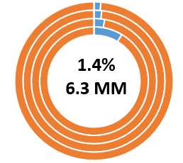
Hi and good day for everyone.  I am trying to make a ring chart look like this:


Multiring.png

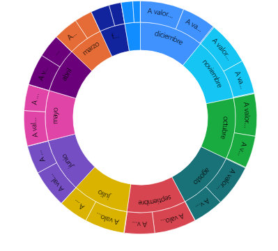
I understand the classic ring chart doesnt work to make something similar, so i search in the forum for some similar example. Somebody told i should use Sunburst Chart, but when i used the ending chart look like this.

sunburst.png


 Now in the first chart i show 3 values per month, so each ring is a new month. My question is, there is some visual or some way to make something similar to the first image?


Thanks for reading

1 REPLY 1
dm-p
Super User
Super User

Hi @isaac152,

It might be possible to do this with Charticulator and produce your own custom visual, although you might need to use a card for the centre part - do you have some sample data available for your mockup, and also details of how the values in the centre are derived from this? If so, I can take a go at it and provide instructions if I can make it work.

Regards,

Daniel


Did I answer your question? Mark my post as a solution!

Proud to be a Super User!


On how to ask a technical question, if you really want an answer (courtesy of SQLBI)


Helpful resources

Announcements
FabCon and SQLCon Barcelona 2026

FabCon & SQLCon – Barcelona 2026

Join us in Barcelona for FabCon and SQLCon, the Fabric, Power BI, SQL, and AI community event. Save €200 with code FABCMTY200.

Power BI DataViz World Championships carousel

Power BI DataViz World Championships - June 2026

A new Power BI DataViz World Championship is coming this June! Don't miss out on submitting your entry.