A new Data Days event is coming soon!
This time we’re going bigger than ever. Fabric, Power BI, SQL, AI and more. We're covering it all. You won't want to miss it.
Learn more- Power BI forums
- Get Help with Power BI
- Desktop
- Service
- Report Server
- Power Query
- Mobile Apps
- Developer
- DAX Commands and Tips
- Custom Visuals Development Discussion
- Health and Life Sciences
- Power BI Spanish forums
- Translated Spanish Desktop
- Training and Consulting
- Instructor Led Training
- Dashboard in a Day for Women, by Women
- Galleries
- Data Stories Gallery
- Themes Gallery
- Contests Gallery
- QuickViz Gallery
- Quick Measures Gallery
- Visual Calculations Gallery
- Notebook Gallery
- Translytical Task Flow Gallery
- TMDL Gallery
- R Script Showcase
- Webinars and Video Gallery
- Ideas
- Custom Visuals Ideas (read-only)
- Issues
- Issues
- Events
- Upcoming Events
Level up your Power BI skills this month - build one visual each week and tell better stories with data! Get started
- Power BI forums
- Forums
- Get Help with Power BI
- Custom Visuals Development Discussion
- Re: How To Multiple Data Contexts?
- Subscribe to RSS Feed
- Mark Topic as New
- Mark Topic as Read
- Float this Topic for Current User
- Bookmark
- Subscribe
- Printer Friendly Page
- Mark as New
- Bookmark
- Subscribe
- Mute
- Subscribe to RSS Feed
- Permalink
- Report Inappropriate Content
How To Multiple Data Contexts?
I want to display two (or more) charts in the same visual, that interact of some sort.
For this, I need two (or more) data contexts (Dimension->Measure).
How can I define the contents of capabilities.json that I can define many dimensions and many measures AND inside my code I see all the data values in update().
At the moment only the values of the first dimension are visible:
My capabilities.json
{
    "dataRoles": [
        {
            "displayName": "Dimension",
            "name": "category",
            "kind": "Grouping"
        },
        {
            "displayName": "Measure Data",
            "name": "measure",
            "kind": "Measure"
        }
    ],
    "dataViewMappings": [
        {
            "categorical": {
                "categories": {
                    "for": {
                        "in": "category"
                    },
                    "dataReductionAlgorithm": {
                        "top": {}
                    }
                },
                "values": {
                    "select": [
                        {
                            "bind": {
                                "to": "measure"
                            }
                        }
                    ]
                }
            }
        }
    ],
    "objects": {...}
}
Is there any online resource/tutorial about multiple data contexts available?
- Mark as New
- Bookmark
- Subscribe
- Mute
- Subscribe to RSS Feed
- Permalink
- Report Inappropriate Content
Hello @blumi78
Power BI returns all of values.
Have you checked the prototype object? I think the values of the second category is in the prototype.
You might access value of second category by this code below:
// options: VisualUpdateOptions

options.dataViews[0].categorical.categories[1].values
Ignat Vilesov,
Software Engineer
Microsoft Power BI Custom Visuals
- Mark as New
- Bookmark
- Subscribe
- Mute
- Subscribe to RSS Feed
- Permalink
- Report Inappropriate Content
@v-viig Thanks, I've found them! Do you have a solution for how to group them together? I want to make a (multi-)chart with N dimensions and M measures, where M >= N. So I need a mapping, which measure(s) relate to which dimension. I.e.:
dataviews[0].categorical.categories[0] => dataviews[0].categorical.values[0], dataviews[0].categorical.values[1]
dataviews[0].categorical.categories[1] => dataviews[0].categorical.values[2]
Do I need to make a custom GUI inside my extension for this or can this be done using the PowerBI sidebar somehow?
Thanks a lot!
Bastian
- Mark as New
- Bookmark
- Subscribe
- Mute
- Subscribe to RSS Feed
- Permalink
- Report Inappropriate Content
I think there's no way to implement such behavior using Power BI sidebar.
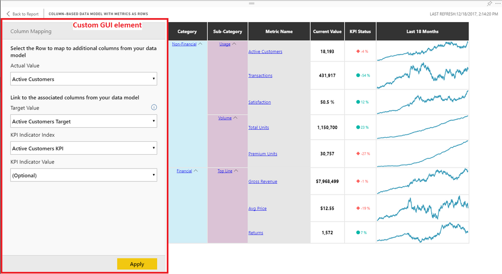
In other words, you should implement your own GUI as did in Power KPI Matrix custom visual.
Ignat Vilesov,
Software Engineer
Microsoft Power BI Custom Visuals
- Mark as New
- Bookmark
- Subscribe
- Mute
- Subscribe to RSS Feed
- Permalink
- Report Inappropriate Content
Hello,
How could we implement a custom GUI? we couldnt find any data related to it in the documentation and as per the below thread the code for Power KPI is private
https://community.powerbi.com/t5/Custom-Visuals-Development/Power-KPI-Matrix-source-code-in-github/t...
Thanks,
- Mark as New
- Bookmark
- Subscribe
- Mute
- Subscribe to RSS Feed
- Permalink
- Report Inappropriate Content
You can use React or another library to build UI.
Ignat Vilesov,
Software Engineer
Microsoft Power BI Custom Visuals
- Mark as New
- Bookmark
- Subscribe
- Mute
- Subscribe to RSS Feed
- Permalink
- Report Inappropriate Content
- Mark as New
- Bookmark
- Subscribe
- Mute
- Subscribe to RSS Feed
- Permalink
- Report Inappropriate Content
I suggest you start using our powerbi-visuals-tools@3.x.x.
It supports modern ES2015 import export and webpack. That means you can import almost any library and use it.
Ignat Vilesov,
Software Engineer
Microsoft Power BI Custom Visuals
Helpful resources

Power BI Monthly Update - April 2026
Check out the April 2026 Power BI update to learn about new features.

Data Days 2026 coming soon!
Sign up to receive a private message when registration opens and key events begin.

New to Fabric Survey
If you have recently started exploring Fabric, we'd love to hear how it's going. Your feedback can help with product improvements.


