A new Data Days event is coming soon!
This time we’re going bigger than ever. Fabric, Power BI, SQL, AI and more. We're covering it all. You won't want to miss it.
Learn more- Power BI forums
- Get Help with Power BI
- Desktop
- Service
- Report Server
- Power Query
- Mobile Apps
- Developer
- DAX Commands and Tips
- Custom Visuals Development Discussion
- Health and Life Sciences
- Power BI Spanish forums
- Translated Spanish Desktop
- Training and Consulting
- Instructor Led Training
- Dashboard in a Day for Women, by Women
- Galleries
- Data Stories Gallery
- Themes Gallery
- Contests Gallery
- QuickViz Gallery
- Quick Measures Gallery
- Visual Calculations Gallery
- Notebook Gallery
- Translytical Task Flow Gallery
- TMDL Gallery
- R Script Showcase
- Webinars and Video Gallery
- Ideas
- Custom Visuals Ideas (read-only)
- Issues
- Issues
- Events
- Upcoming Events
Did you hear? There's a new SQL AI Developer certification (DP-800). Start preparing now and be one of the first to get certified. Register now
- Power BI forums
- Forums
- Get Help with Power BI
- Custom Visuals Development Discussion
- Help with Stacked Column Chart
- Subscribe to RSS Feed
- Mark Topic as New
- Mark Topic as Read
- Float this Topic for Current User
- Bookmark
- Subscribe
- Printer Friendly Page
- Mark as New
- Bookmark
- Subscribe
- Mute
- Subscribe to RSS Feed
- Permalink
- Report Inappropriate Content
Help with Stacked Column Chart
Hi guys,
Please I need help with creating a % stacked column chart from this generated table below:
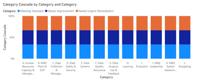
This is the expected chart below
There are 3 different categories for each column:
1. Meeting Standard (Score >=95 and score <=100)
2. Needs Improvement (Score >=81 and score <=94)
3. Needs Urgent Remediation (Score >=0 and score <=80)
I will really appreciate your help in doing this.
Thanks in advance
- Mark as New
- Bookmark
- Subscribe
- Mute
- Subscribe to RSS Feed
- Permalink
- Report Inappropriate Content
Please provide sanitized sample data that fully covers your issue. I can only help you with meaningful sample data.
Please paste the data into a table in your post or use one of the file services like OneDrive or Google Drive.
https://community.powerbi.com/t5/Community-Blog/How-to-provide-sample-data-in-the-Power-BI-Forum/ba-...
Please show the expected outcome based on the sample data you provided. Screenshots of the expected outcome are ok.
https://community.powerbi.com/t5/Desktop/How-to-Get-Your-Question-Answered-Quickly/m-p/1447523
Helpful resources

Power BI Monthly Update - April 2026
Check out the April 2026 Power BI update to learn about new features.

Data Days 2026 coming soon!
Sign up to receive a private message when registration opens and key events begin.

New to Fabric Survey
If you have recently started exploring Fabric, we'd love to hear how it's going. Your feedback can help with product improvements.


