This is best Fabric, Power BI, SQL and AI community event. How do we know? The last event sold out! Save €200 with code FABCMTY200.
Register nowJuly 28 - August 9 | Final Round of the Power BI Dataviz World Championships. This is your chance. Learn more
Hi guys,
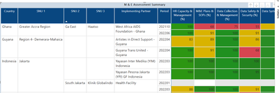
Please I need help with creating a % stacked column chart from this generated table below:
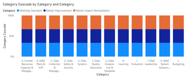
This is the expected chart below
There are 3 different categories for each column:
1. Meeting Standard (Score >=95 and score <=100)
2. Needs Improvement (Score >=81 and score <=94)
3. Needs Urgent Remediation (Score >=0 and score <=80)
I will really appreciate your help in doing this.
Thanks in advance
Please provide sanitized sample data that fully covers your issue. I can only help you with meaningful sample data.
Please paste the data into a table in your post or use one of the file services like OneDrive or Google Drive.
https://community.powerbi.com/t5/Community-Blog/How-to-provide-sample-data-in-the-Power-BI-Forum/ba-...
Please show the expected outcome based on the sample data you provided. Screenshots of the expected outcome are ok.
https://community.powerbi.com/t5/Desktop/How-to-Get-Your-Question-Answered-Quickly/m-p/1447523
Join us in Barcelona for FabCon and SQLCon, the Fabric, Power BI, SQL, and AI community event. Save €200 with code FABCMTY200.
If you love stickers, then you will definitely want to check out our community sticker challenge, Barcelona edition!
Check out the July 2026 Power BI update to learn about new features.