Get Fabric certified for FREE!
Don't miss your chance to take the Fabric Data Engineer (DP-700) exam on us!
Learn more- Power BI forums
- Get Help with Power BI
- Desktop
- Service
- Report Server
- Power Query
- Mobile Apps
- Developer
- DAX Commands and Tips
- Custom Visuals Development Discussion
- Health and Life Sciences
- Power BI Spanish forums
- Translated Spanish Desktop
- Training and Consulting
- Instructor Led Training
- Dashboard in a Day for Women, by Women
- Galleries
- Data Stories Gallery
- Themes Gallery
- Contests Gallery
- QuickViz Gallery
- Quick Measures Gallery
- Visual Calculations Gallery
- Notebook Gallery
- Translytical Task Flow Gallery
- TMDL Gallery
- R Script Showcase
- Webinars and Video Gallery
- Ideas
- Custom Visuals Ideas (read-only)
- Issues
- Issues
- Events
- Upcoming Events
We've captured the moments from FabCon & SQLCon that everyone is talking about, and we are bringing them to the community, live and on-demand. Starts on April 14th. Register now
- Power BI forums
- Forums
- Get Help with Power BI
- Custom Visuals Development Discussion
- Gantt chart with reference vertical lines
- Subscribe to RSS Feed
- Mark Topic as New
- Mark Topic as Read
- Float this Topic for Current User
- Bookmark
- Subscribe
- Printer Friendly Page
- Mark as New
- Bookmark
- Subscribe
- Mute
- Subscribe to RSS Feed
- Permalink
- Report Inappropriate Content
Gantt chart with reference vertical lines
Expected chart:
y-axis: Tasks
x-axis: Dates
Reference lines(more than one): some specific dates
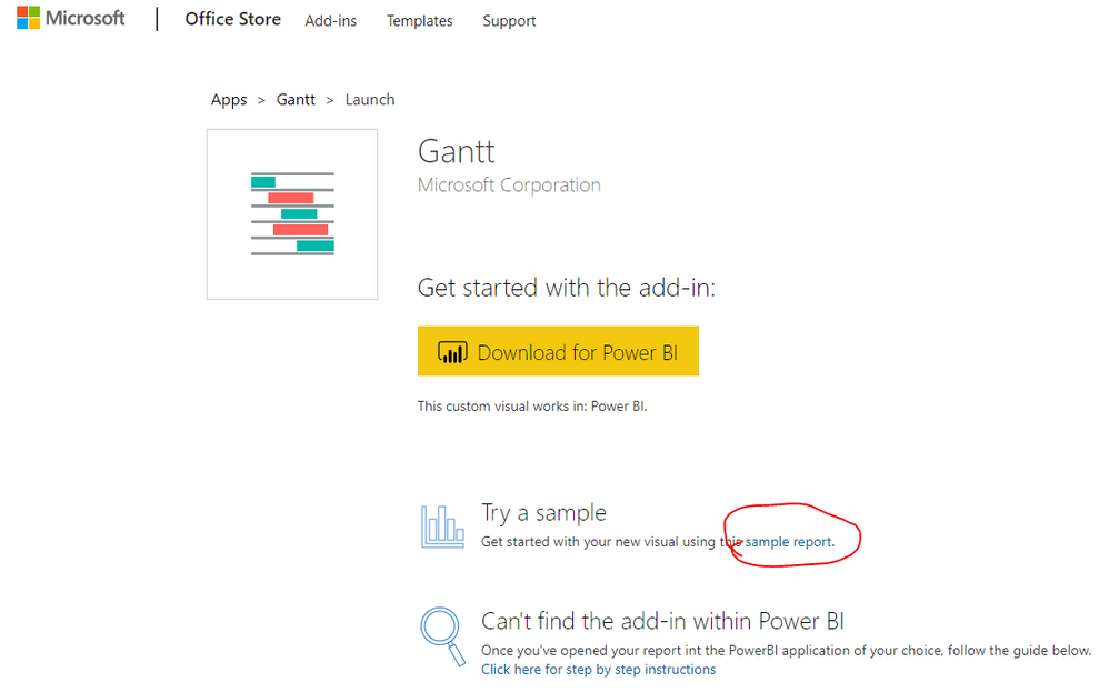
For plotting I'm using custom visual - Gantt (version-2.2.3.0) from power bi market place which is an open-source visual (code available at Github: https://github.com/microsoft/powerbi-visuals-gantt ).
I'm able to plot the duration (start date to end date) of each Task but not able to plot reference lines (which are vertical lines as shown in the graph).
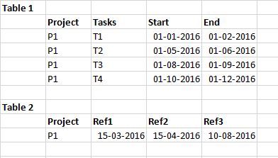
Sample Data:
Any idea of how to achieve the above scenario will be helpful. Thanks in advance.
@ganttchart @customvisual
@Greg_Deckler @v-danhe-msft @v-chuncz-msft @GuyInACube @datanaut
- Mark as New
- Bookmark
- Subscribe
- Mute
- Subscribe to RSS Feed
- Permalink
- Report Inappropriate Content
Hello,
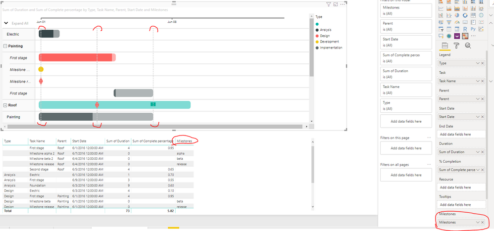
Gantt has got Milestones bucket to set up vertical lines.
You can look through standard report to figure out how to use them.
I hope this will help to solve your issue.
Kind Regards,
Evgenii Elkin,
Software Engineer
Microsoft Power BI Custom Visuals
pbicvsupport@microsoft.com
- Mark as New
- Bookmark
- Subscribe
- Mute
- Subscribe to RSS Feed
- Permalink
- Report Inappropriate Content
Hello, @v-evelk Thanks for your response.
But my milestones(ref's lines) are dependent on Project name and not on Tasks. Those are random dates which I have to plot on the visual. Which will come up as a straight line as shown in my post above.
- Mark as New
- Bookmark
- Subscribe
- Mute
- Subscribe to RSS Feed
- Permalink
- Report Inappropriate Content
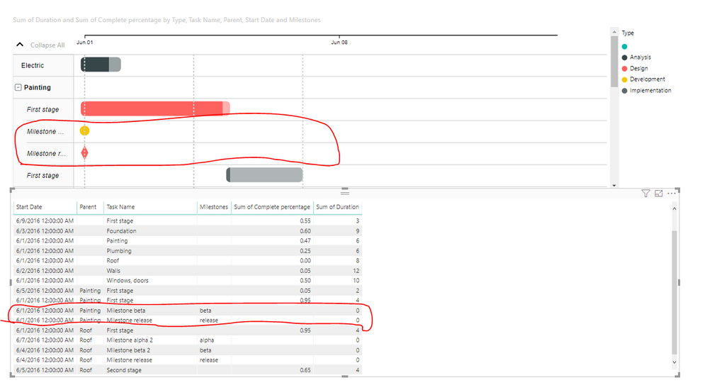
You are right that milestone records are considered as tasks but task records are just containers for them in this case.
In fact, you can call your milestone records as "ProjectName Milestone [1|2|3]" to show relation with a certain project.
Kind Regards,
Evgenii Elkin,
Software Engineer
Microsoft Power BI Custom Visuals
pbicvsupport@microsoft.com
Helpful resources

New to Fabric Survey
If you have recently started exploring Fabric, we'd love to hear how it's going. Your feedback can help with product improvements.

Power BI DataViz World Championships - June 2026
A new Power BI DataViz World Championship is coming this June! Don't miss out on submitting your entry.

Join our Fabric User Panel
Share feedback directly with Fabric product managers, participate in targeted research studies and influence the Fabric roadmap.


