FabCon is coming to Atlanta
Join us at FabCon Atlanta from March 16 - 20, 2026, for the ultimate Fabric, Power BI, AI and SQL community-led event. Save $200 with code FABCOMM.
Register now!- Power BI forums
- Get Help with Power BI
- Desktop
- Service
- Report Server
- Power Query
- Mobile Apps
- Developer
- DAX Commands and Tips
- Custom Visuals Development Discussion
- Health and Life Sciences
- Power BI Spanish forums
- Translated Spanish Desktop
- Training and Consulting
- Instructor Led Training
- Dashboard in a Day for Women, by Women
- Galleries
- Data Stories Gallery
- Themes Gallery
- Contests Gallery
- QuickViz Gallery
- Quick Measures Gallery
- Visual Calculations Gallery
- Notebook Gallery
- Translytical Task Flow Gallery
- TMDL Gallery
- R Script Showcase
- Webinars and Video Gallery
- Ideas
- Custom Visuals Ideas (read-only)
- Issues
- Issues
- Events
- Upcoming Events
The Power BI Data Visualization World Championships is back! Get ahead of the game and start preparing now! Learn more
- Power BI forums
- Forums
- Get Help with Power BI
- Custom Visuals Development Discussion
- Re: Deneb: Multi-layer card
- Subscribe to RSS Feed
- Mark Topic as New
- Mark Topic as Read
- Float this Topic for Current User
- Bookmark
- Subscribe
- Printer Friendly Page
- Mark as New
- Bookmark
- Subscribe
- Mute
- Subscribe to RSS Feed
- Permalink
- Report Inappropriate Content
Deneb: Multi-layer card
Hi everyone, I am still learning the basics and exploring the world of Deneb vega-lite. 🙂
I am currently trying to figure out how to freely position text and DAX measures in a Deneb chart.
Example: I like to position a DAX measure, e.g. Diameter Mean and a text label "Mean".
Not sure if I approach this correctly, but I have set up a chart with 10 points in position "Y": 10....1 and "X": ... and I like to position and print the Diameter Mean value at position Y: 10, X: 0 and just beneth it I like to add a text block "Diameter Mean" and the hide the axis scale and points.
{
  "data": {
    "values": [
      {"A": "0", "B": 10},
      {"A": "0", "B": 9},
      {"A": "0", "B": 8},
      {"A": "0", "B": 7},
      {"A": "0", "B": 6},
      {"A": "0", "B": 5},
      {"A": "0", "B": 4},
      {"A": "0", "B": 3},
      {"A": "0", "B": 2},
      {"A": "0", "B": 1}
    ]
  },
  "title": "Information",
  "autosize": "fit",
  "background": "lightblue",
  "width": 150,
  "height": 400,
  "padding": {
    "left": 10,
    "right": 15,
    "top": 10,
    "bottom": "10"
  },
  "encoding": {
    "x": {
      "field": "A",
      "type": "quantitative",
      "scale": {"domain": [0, 1]},
      "axis": true
    },
    "y": {"axis": true}
  },
  "layer": [
    {
      "mark": {"type": "point"},
      "encoding": {
        "y": {
          "field": "B",
          "type": "quantitative"
        }
      }
    },
    {
      "mark": {
        "type": "text",
        "dx": 20,
        "dy": 0,
        "xOffset": 0,
        "yOffset": 0,
        "angle": 0,
        "align": "left",
        "baseline": "bottom",
        "font": "sans-serif",
        "fontSize": 16,
        "fontStyle": "normal",
        "fontWeight": "normal",
        "limit": 0
      },
      "encoding": {
        "x": {
          "field": 0,
          "type": "quantitative"
        },
        "y": {
          "field": 10,
          "type": "quantitative"
        }

      }
    }
  ]
}
Any tips on how I should continue or if you could point me to some similar examples for multi-layer cards would be highly appreciated. Thanks!
Solved! Go to Solution.
- Mark as New
- Bookmark
- Subscribe
- Mute
- Subscribe to RSS Feed
- Permalink
- Report Inappropriate Content
Hi @Salle,
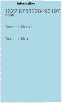
I assume that you want the text to display the mean value? If so, you need to add a text encoding channel property and put the field in there. So, your snippet of JSON that didn't match Vega-Lite's construct for what I think you want to do should look like this:
"encoding": {
  "text": { "field": "Diameter Mean" },
  "x": {"value": 0},
  "y": {"value": 10}
}
My output now looks as follows:
Revised spec:
{
  "data": {"name": "dataset"},
  "title": "Information",
  "background": "lightblue",
  "height": 400,
  "width": 200,
  "layer": [
    {
      "mark": {
        "type": "text",
        "align": "left",
        "baseline": "top",
        "font": "sans-serif",
        "fontSize": 24,
        "dx": 10,
        "dy": 0,
        "xOffset": 0,
        "yOffset": 0
      },
      "encoding": {
        "text": {
          "field": "Diameter Mean"
        },
        "x": {"value": 0},
        "y": {"value": 10}
      }
    },
    {
      "mark": {
        "text": "Mean",
        "type": "text",
        "align": "left",
        "baseline": "top",
        "font": "sans-serif",
        "fontSize": 16,
        "dx": 10,
        "dy": 0,
        "xOffset": 0,
        "yOffset": 0
      },
      "encoding": {
        "x": {"value": 0},
        "y": {"value": 30}
      }
    },
    {
      "mark": {
        "text": "Diameter Median",
        "type": "text",
        "baseline": "top",
        "align": "left",
        "font": "sans-serif",
        "fontSize": 16,
        "dx": 10,
        "dy": 0,
        "xOffset": 0,
        "yOffset": 0
      },
      "encoding": {
        "x": {"value": 0},
        "y": {"value": 80}
      }
    },
    {
      "mark": {
        "text": "Diameter Max",
        "type": "text",
        "baseline": "top",
        "align": "left",
        "font": "sans-serif",
        "fontSize": 16,
        "dx": 10,
        "dy": 0,
        "xOffset": 0,
        "yOffset": 0
      },
      "encoding": {
        "x": {"value": 0},
        "y": {"value": 130}
      }
    }
  ]
}
Regards,
Daniel
Did I answer your question? Mark my post as a solution!
Proud to be a Super User!
On how to ask a technical question, if you really want an answer (courtesy of SQLBI)
- Mark as New
- Bookmark
- Subscribe
- Mute
- Subscribe to RSS Feed
- Permalink
- Report Inappropriate Content
Hi @Salle,
If you want to explicitly position a mark you need to use the value encoding rather than field. This will let you specify an x/y position relative to the view (which is the area reserved for your axes rather than the container).
You could change your text mark's encoding channel as follows:
      "encoding": {
        "x": {
          "value": 0
        },
        "y": {
          "value": 10
        }
      }
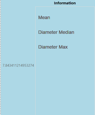
Which would plot your make at 0, 10 (noting that explicit coordinates in SVG/HTML start from the top-left), e.g.:
The challenge here is that because you are explicitly stating the same coordinates for each occurrence of your data, this will overlay all marks on top of each other (which is why they appear 'thick').
If you want to plot the position relative to your data (which I assume would be the point mark i nyour other layer, you would probably want to mix the encoding with both value (for explicit x positioning) and field (for y-positioning) - and you could probably share the y-encoding between all layers (at the top-level), e.g.:
{
  "data": {
    "values": [
      {"A": "0", "B": 10},
      {"A": "0", "B": 9},
      {"A": "0", "B": 8},
      {"A": "0", "B": 7},
      {"A": "0", "B": 6},
      {"A": "0", "B": 5},
      {"A": "0", "B": 4},
      {"A": "0", "B": 3},
      {"A": "0", "B": 2},
      {"A": "0", "B": 1}
    ]
  },
  "title": "Information",
  "background": "lightblue",
  "encoding": {
    "x": {
      "field": "A",
      "type": "quantitative",
      "scale": {"domain": [0, 1]}
    },
    "y": {
      "field": "B",
      "type": "quantitative"
    }
  },
  "layer": [
    {
      "mark": {"type": "point"}
    },
    {
      "mark": {
        "text": "my text mark",
        "type": "text",
        "align": "left",
        "font": "sans-serif",
        "fontSize": 16,
        "dx": 10
      },
      "encoding": {
        "x": {"value": 0}
      }
    }
  ]
}
Note that I've removed some of the redundant properties from your original spec just to help highlight what is needed, and I've also used a dx property to offset the text mark 10px to the right of the x-encoded value so that it doesn't overlap. If you don't need this, then you could just delete it so it sits right on the x-value.
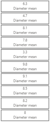
I'm still not 100% sure of your final intended result, but here's how I might attempt having multiple 'cards' with two text marks inside them - maybe this will be something you can use to evolve your idea:
{
  "data": {
    "values": [
      {"A": "0", "B": 10, "mean": 8},
      {"A": "0", "B": 9, "mean": 8.2},
      {"A": "0", "B": 8, "mean": 8.5},
      {"A": "0", "B": 7, "mean": 9.1},
      {"A": "0", "B": 6, "mean": 9.8},
      {"A": "0", "B": 5, "mean": 3.3},
      {"A": "0", "B": 4, "mean": 7.8},
      {"A": "0", "B": 3, "mean": 8.1},
      {"A": "0", "B": 2, "mean": 4.7},
      {"A": "0", "B": 1, "mean": 6.3}
    ]
  },
  "encoding": {
    "y": {
      "field": "B",
      "type": "nominal",
      "axis": null
    }
  },
  "layer": [
    {
      "description": "Card - using bar that spans width",
      "mark": {
        "type": "bar",
        "fill": "transparent",
        "stroke": "black"
      }
    },
    {
      "description": "Measure label",
      "mark": {
        "type": "text",
        "baseline": "bottom",
        "dy": -2
      },
      "encoding": {
        "text": {"field": "mean"}
      }
    },
    {
      "description": "Static text",
      "mark": {
        "type": "text",
        "baseline": "top",
        "dy": 2,
        "text": "Diameter mean"
      }
    }
  ]
}
I've added a "mean" field with random values just to show variety in the cards.
The two text marks are baselined and dy'd so that one sits 'above' the centre and the other sits 'below' the centre. As I said, this may not be exacly what you are after but may give you some additional thoughts on how to approach.
If you need further assistance, it might be worth posting a mockupu of what you expect a card to =look like and I can see if I can tweak accordingly.
Good luck!
Daniel
Did I answer your question? Mark my post as a solution!
Proud to be a Super User!
On how to ask a technical question, if you really want an answer (courtesy of SQLBI)
- Mark as New
- Bookmark
- Subscribe
- Mute
- Subscribe to RSS Feed
- Permalink
- Report Inappropriate Content
Thank you @dm-p,
for taking the time and provide your input. It never crossed my mind to approach it by the use of bar.
I will try and use and test your input now and likely will have some follow up questions 🙂
Basically I am trying to replica a multi-card I set up in Power BI.
With the following dax measures as inputs.
Each measure with text label I like to be able to pin to a certain individual position e.g. 0, 10; 0, 9 etc.
Note; In a later step I will try to replace the DAX measure input by doing the calculation in Deneb instead; but that will be another topic later...
- Mark as New
- Bookmark
- Subscribe
- Mute
- Subscribe to RSS Feed
- Permalink
- Report Inappropriate Content
Hi @dm-p , so I realized from your response I did not really need the A and B field at all to position the text labels.
But I ran into problems when I trying to position my Measure "Diameter mean", got specification error message:
"encoding": {
"field": "Diameter Mean",
"x": {"value": 0},
"y": {"value": 10}
}
Changing the code a bit I was able to get the measure printed but in wrong position.
I want it to be positioned just above the Mean text label but I guess I am fumbeling with the setup of y-value.
{
  "data": {"name": "dataset"},
  "title": "Information",
  "background": "lightblue",

  "height": 400,
  "width": 200,


  "layer":[
  {
      "mark": {

        "type": "text",
        "align": "left",
        "baseline": "top",
        "font": "sans-serif",
        "fontSize": 24,
        "dx": 10,
        "dy": 0,
        "xOffset": 0,
        "yOffset": 0
      },

      "encoding": {
        "field": "Diameter Mean",
        "x": {"value": 0},
        "y": {"value": 10}

      }


    },

    {
      "mark": {
        "text": "Mean",
        "type": "text",
        "align": "left",
        "baseline": "top",
        "font": "sans-serif",
        "fontSize": 16,
        "dx": 10,
        "dy": 0,
        "xOffset": 0,
        "yOffset": 0
      },

      "encoding": {
        "x": {"value": 0},
        "y": {"value": 30}

      }

    },

    {
      "mark": {
        "text": "Diameter Median",
        "type": "text",
        "baseline": "top",
        "align": "left",
        "font": "sans-serif",
        "fontSize": 16,
        "dx": 10,
        "dy": 0,
        "xOffset": 0,
        "yOffset": 0
      },
      "encoding": {
        "x": {"value": 0},
        "y": {"value": 80}

      }
    },


    {
      "mark": {
        "text": "Diameter Max",
        "type": "text",
        "baseline": "top",
        "align": "left",
        "font": "sans-serif",
        "fontSize": 16,
        "dx": 10,
        "dy": 0,
        "xOffset": 0,
        "yOffset": 0
      },

      "encoding": {
        "x": {"value": 0},
        "y": {"value": 130}

      }
    }

  ]
}
Any help would be appreciated. Thanks in advance!
- Mark as New
- Bookmark
- Subscribe
- Mute
- Subscribe to RSS Feed
- Permalink
- Report Inappropriate Content
Hi @Salle,
I assume that you want the text to display the mean value? If so, you need to add a text encoding channel property and put the field in there. So, your snippet of JSON that didn't match Vega-Lite's construct for what I think you want to do should look like this:
"encoding": {
  "text": { "field": "Diameter Mean" },
  "x": {"value": 0},
  "y": {"value": 10}
}
My output now looks as follows:
Revised spec:
{
  "data": {"name": "dataset"},
  "title": "Information",
  "background": "lightblue",
  "height": 400,
  "width": 200,
  "layer": [
    {
      "mark": {
        "type": "text",
        "align": "left",
        "baseline": "top",
        "font": "sans-serif",
        "fontSize": 24,
        "dx": 10,
        "dy": 0,
        "xOffset": 0,
        "yOffset": 0
      },
      "encoding": {
        "text": {
          "field": "Diameter Mean"
        },
        "x": {"value": 0},
        "y": {"value": 10}
      }
    },
    {
      "mark": {
        "text": "Mean",
        "type": "text",
        "align": "left",
        "baseline": "top",
        "font": "sans-serif",
        "fontSize": 16,
        "dx": 10,
        "dy": 0,
        "xOffset": 0,
        "yOffset": 0
      },
      "encoding": {
        "x": {"value": 0},
        "y": {"value": 30}
      }
    },
    {
      "mark": {
        "text": "Diameter Median",
        "type": "text",
        "baseline": "top",
        "align": "left",
        "font": "sans-serif",
        "fontSize": 16,
        "dx": 10,
        "dy": 0,
        "xOffset": 0,
        "yOffset": 0
      },
      "encoding": {
        "x": {"value": 0},
        "y": {"value": 80}
      }
    },
    {
      "mark": {
        "text": "Diameter Max",
        "type": "text",
        "baseline": "top",
        "align": "left",
        "font": "sans-serif",
        "fontSize": 16,
        "dx": 10,
        "dy": 0,
        "xOffset": 0,
        "yOffset": 0
      },
      "encoding": {
        "x": {"value": 0},
        "y": {"value": 130}
      }
    }
  ]
}
Regards,
Daniel
Did I answer your question? Mark my post as a solution!
Proud to be a Super User!
On how to ask a technical question, if you really want an answer (courtesy of SQLBI)
- Mark as New
- Bookmark
- Subscribe
- Mute
- Subscribe to RSS Feed
- Permalink
- Report Inappropriate Content
Hi @Salle,
This may be jumping ahead of your learning journey, but possibly something for you to think about to avoid too much repetition.
If you're just adding measures and your dataset is effectively one row, you can use a fold transform (which is the same as an unpivot in Power Query) and specify your measure names, to get a simpler list of name/value pairs that you can encode just using two marks.
So, if my dataset looks like this...
I can add the following transform...
  "transform": [
    {
      "fold": [
        "Diameter Mean",
        "Diameter Median",
        "Diameter Max"
      ],
      "as": ["measure", "value"]
    }
  ],
...and the resulting dataset (now named as data_0 by Vega-Lite) will look like this:
You'll notice that this is now 3 rows, with additional measure and value columns. You'll get as many rows as entries you specify in the fold operation (as long as they are in your dataset).
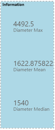
The plan here is that I can encode the y channel to measure, which will position vertically by this field, and then I can add a text mark that encodes the text channel to the value column, and another that encodes text to the measure column.
Here's what this spec might look like as a whole:
{
  "data": {"name": "dataset"},
  "title": "Information",
  "background": "lightblue",
  "transform": [
    {
      "fold": [
        "Diameter Mean",
        "Diameter Median",
        "Diameter Max"
      ],
      "as": ["measure", "value"]
    }
  ],
  "encoding": {
    "y": {
      "field": "measure",
      "axis": null
    }
  },
  "layer": [
    {
      "mark": {
        "type": "text",
        "align": "left",
        "baseline": "bottom",
        "fontSize": 24
      },
      "encoding": {
        "text": {"field": "value"}
      }
    },
    {
      "mark": {
        "type": "text",
        "align": "left",
        "baseline": "top",
        "fontSize": 16
      },
      "encoding": {
        "text": {"field": "measure"}
      }
    }
  ]
}
And here's the output:
Hopefully this might help you reduce the amount of maintenance you could potentially have with this one. Good luck!
Daniel
EDIT: if you want the y-encoding to sort in the order you type the measures in the fold transform, just add "sort": null to enforce this order (ref). The y-encoding from above would now look as follows:
  "encoding": {
    "y": {
      "field": "measure",
      "axis": null,
      "sort": null
    }
  },
Did I answer your question? Mark my post as a solution!
Proud to be a Super User!
On how to ask a technical question, if you really want an answer (courtesy of SQLBI)
- Mark as New
- Bookmark
- Subscribe
- Mute
- Subscribe to RSS Feed
- Permalink
- Report Inappropriate Content
@dm-p:
Daniel, thank you for all the time and effort you put in to guide me through some of the basic elements in Deneb! I really appreciate all the support and tips!
I will certainly look into your suggestion with using fold, I did not know it existed.
But I am starting to learn that anything is possible with Deneb 😉
Cheers/Carl
Helpful resources

Power BI Dataviz World Championships
The Power BI Data Visualization World Championships is back! Get ahead of the game and start preparing now!

| User | Count |
|---|---|
| 1 | |
| 1 | |
| 1 | |
| 1 | |
| 1 |


