Join us at FabCon Vienna from September 15-18, 2025
The ultimate Fabric, Power BI, SQL, and AI community-led learning event. Save €200 with code FABCOMM.
Get registered- Power BI forums
- Get Help with Power BI
- Desktop
- Service
- Report Server
- Power Query
- Mobile Apps
- Developer
- DAX Commands and Tips
- Custom Visuals Development Discussion
- Health and Life Sciences
- Power BI Spanish forums
- Translated Spanish Desktop
- Training and Consulting
- Instructor Led Training
- Dashboard in a Day for Women, by Women
- Galleries
- Data Stories Gallery
- Themes Gallery
- Contests Gallery
- Quick Measures Gallery
- Notebook Gallery
- Translytical Task Flow Gallery
- TMDL Gallery
- R Script Showcase
- Webinars and Video Gallery
- Ideas
- Custom Visuals Ideas (read-only)
- Issues
- Issues
- Events
- Upcoming Events
Compete to become Power BI Data Viz World Champion! First round ends August 18th. Get started.
- Power BI forums
- Forums
- Get Help with Power BI
- Custom Visuals Development Discussion
- Deneb: Line Chart Tooltips that don't require you ...
- Subscribe to RSS Feed
- Mark Topic as New
- Mark Topic as Read
- Float this Topic for Current User
- Bookmark
- Subscribe
- Printer Friendly Page
- Mark as New
- Bookmark
- Subscribe
- Mute
- Subscribe to RSS Feed
- Permalink
- Report Inappropriate Content
Deneb: Line Chart Tooltips that don't require you to hover directly over line
Hi all, I'm new to developing Custom Visuals and have decided to try using Deneb (from AppSource) to try and create a custom line chart that I want. Deneb seems to have adequate features, but I'm having trouble with tooltips.
In my line chart, I used:
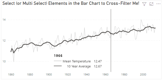
"mark" : {"type": "line","tooltip": true}to create my line marking on the chart layer. The issue is that I can only get tooltips to show if I hover my cursor directly over the line. This is unlike the default PBI line chart, where I can hover anywhere on the line chart, and I will still see the tooltip for the value that is at that x-axis point.
The functionality in this image is what I'm talking about:

Does anyone know if this is possible in Deneb? So far, I've been using Vega-Lite. Thank you!
Solved! Go to Solution.
- Mark as New
- Bookmark
- Subscribe
- Mute
- Subscribe to RSS Feed
- Permalink
- Report Inappropriate Content
Hey @Anonymous, you can layer a series of points with an opacity of zero spanning the entire x-axis and encode your tooltips off of those points. You'll want to set nearest to true.
Alternatively if you want a vertical line to show, you could do something similar with a series of rule marks and only have the one that aligns with your cursor be visible.
check out this example: https://vega.github.io/vega-lite/examples/interactive_multi_line_pivot_tooltip.html
if you still need additional help, I can try to generate an example spec later this evening when I have time.
Madison Giammaria
Proud to be a Super User 😄
Do you frequently use Deneb to provide insights to your stakeholders? Have you considered sponsoring this free and open source custom visual? More info here!
- Mark as New
- Bookmark
- Subscribe
- Mute
- Subscribe to RSS Feed
- Permalink
- Report Inappropriate Content
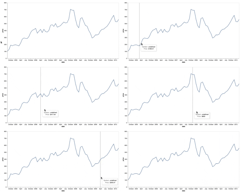
Here you go @Anonymous
If this is enough to get you going please consider liking this reply and choosing it as the solution.
gist
spec:
{
  "$schema": "https://vega.github.io/schema/vega-lite/v5.json",
  "params": [{"name": "dt", "expr": "hover['date']"}],
  "width": 800,
  "height": 400,
  "description": "Google's stock price over time.",
  "data": {"url": "data/stocks.csv"},
  "transform": [{"filter": "datum.symbol==='GOOG'"}],
  "layer": [
    {
      "encoding": {"x": {"field": "date", "type": "temporal"}},
      "layer": [
        {
          "mark": "line",
          "encoding": {"y": {"field": "price", "type": "quantitative"}}
        },
        {
          "params": [
            {
              "name": "hover",
              "select": {
                "type": "point",
                "fields": ["date"],
                "nearest": true,
                "on": "mouseover",
                "clear": "mouseout"
              }
            }
          ],
          "mark": {"type": "rule", "y": 0, "y2": {"expr": "height"}},
          "transform": [{"calculate": "format(datum['price'], '$')", "as": "price"}],
          "encoding": {
            "opacity": {
              "condition": {
                "test": "+hover['date'] === datum['date']",
                "value": 0.5
              },
              "value": 0
            },
            "tooltip": [
              {"title": "Symbol", "field": "GOOG"},
              {"title": "Price", "field": "price"}
            ]
          }
        }
      ]
    }
  ],
  "config": {"axis": {"grid": false}}
}
Madison Giammaria
Proud to be a Super User 😄
Do you frequently use Deneb to provide insights to your stakeholders? Have you considered sponsoring this free and open source custom visual? More info here!
- Mark as New
- Bookmark
- Subscribe
- Mute
- Subscribe to RSS Feed
- Permalink
- Report Inappropriate Content
Hey @Anonymous, you can layer a series of points with an opacity of zero spanning the entire x-axis and encode your tooltips off of those points. You'll want to set nearest to true.
Alternatively if you want a vertical line to show, you could do something similar with a series of rule marks and only have the one that aligns with your cursor be visible.
check out this example: https://vega.github.io/vega-lite/examples/interactive_multi_line_pivot_tooltip.html
if you still need additional help, I can try to generate an example spec later this evening when I have time.
Madison Giammaria
Proud to be a Super User 😄
Do you frequently use Deneb to provide insights to your stakeholders? Have you considered sponsoring this free and open source custom visual? More info here!
- Mark as New
- Bookmark
- Subscribe
- Mute
- Subscribe to RSS Feed
- Permalink
- Report Inappropriate Content
Thank you for this info! I was able to add the "Rule" mark to my chart layer, as well as add the point params with like in the example you linked.
One thing I'm having trouble with, though, is getting the semi-transparent hover point to show up when working with dual y-axes. The problem is that on one of my axes, I want all the lines to be dashed, because I'm using the same legend for both axes. The dashed axis is the right axis, the lines on the left axis are all solid.
This is my Vega-Lite spec:
{
  "data": {"name": "dataset"},
  "encoding" : {
    "x" : {
      "field" : "Date",
      "axis": {
        "format": "MMM yyyy",
        "formatType": "pbiFormat"
      }
    }
  },
  "layer":
  [

    {
      "encoding": {
        "color": {"field": "Legend Value", "type": "nominal"},
        "y": {"field": "Left Axis Value", "type": "quantitative"}
      },
      "layer": [
        {"mark": "line"},
        {"transform": [{"filter": {"param": "hover", "empty": false}}], "mark": "point"}
      ]
    },

    {
      "encoding": {
        "color": {"field": "Legend Value", "type": "nominal"},
        "y": {"field": "Right Axis Value", "type": "quantitative"}
      },
      "layer": [
        {"mark": "line"},
        {"transform": [{"filter": {"param": "hover", "empty": false}}], "mark": "point"}
      ]
    },

    {
    "mark" : {"type": "line","tooltip": true},
    "encoding" : {
      "y" : {"aggregate" : "sum", "field": "Left Axis Value"},
      "color" : {
        "field" : "Legend Value",
        "legend" : {
          "symbolType" : "stroke",
          "orient" : "top"
        }
        }
      }
    },
    {
    "mark" : {"type": "line","tooltip": true, "strokeDash" : [4,4], "strokeWidth" : 2},
    "encoding" : {
      "y" : {"aggregate" : "sum", "field": "Right Axis Value"},
      "color" : {
        "field" : "Legend Value",
        "legend" : {
          "symbolType" : "stroke",
          "orient" : "none",
          "direction" : "horizontal",
          "legendX" : 0,
          "legendY" : -10,
          "rowPadding" : -10
        }
        }
      }
    },

    {
      "mark" : {"type" : "rule", "tooltip" : true},
      "encoding": {
        "opacity": {
            "condition": {"value": 0.3, "param": "hover", "empty": false},
            "value": 0
          }
      },
      "params": [{
          "name": "hover",
          "select": {
            "type": "point",
            "fields": ["Date"],
            "nearest": true,
            "on": "mouseover",
            "clear": "mouseout"
          }
        }]
    }


  ],
  "resolve": {"scale": {"y": "independent"}}
}
The line mark used in the encoding starting on line 27 goes either above or under the dashed line it's supposed to provide the tooltip for and makes the line appear solid. I tried setting the opacity of line to 0, which allows me to only see the dashed line, but it takes away the tooltip circle point when I hove over the x-axis.
Do you know if there's a way to have both the dashed line and also keep the hover point parameter at the correct y-height? Without the line mark, the point mark only shows up at the very top of the graph.
EDIT: I just tried this:
{"mark": {"type" : "line", "strokeWidth" : 0}},and it worked with a dashed line while also showing the transparent point as semi-transparent when hovering over the relevant x-axis line. Not sure if there's a better way, but this seems to work.


