cancel
Showing results for 
Search instead for 
Did you mean: 

July 7 - July 17 | Round 2 of the Power BI Dataviz World Championships. Don't miss your chance! Learn more

Reply
Devin_Solkov
New Member

Custom Visuals

Hello, 
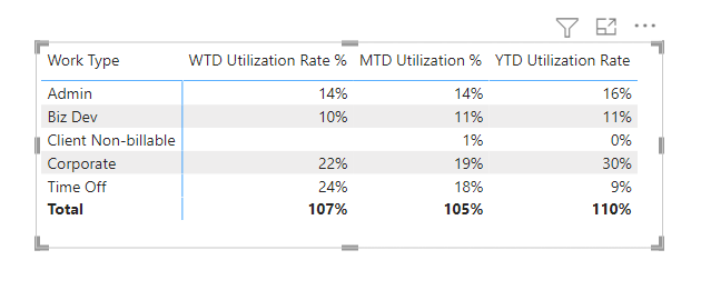
I have a problem where I have WTD, MTD, and YTD actuals for different categories. 
Mapping .png

I've slapped together a visual that looks like this: 

Frankenstien.png

I did this by layering a few different visuals on top of one another, but it's sloppy and doesn't work the way I want it to. 
My question is: Does anyone know of a good visual where you can create a stacked bar chart with different categories in the y-axis? 

Any insight is helpful and appreciated. 
_Devin 

0 REPLIES 0

Helpful resources

Announcements
FabCon and SQLCon Barcelona 2026

FabCon & SQLCon – Barcelona 2026

Join us in Barcelona for FabCon and SQLCon, the Fabric, Power BI, SQL, and AI community event. Save €200 with code FABCMTY200.

60 days of Data Days Carousel

Data Days 2026

Join Fabric Data Days 2026: 60 days of free live/on-demand sessions, challenges, study groups, and certification opportunities.

Power BI DataViz World Championships carousel

Power BI DataViz World Championships - June 2026

A new Power BI DataViz World Championship is coming this June! Don't miss out on submitting your entry.

Top Solution Authors