Get certified for free when you join Fabric Data Days 2026 and dive into Fabric, Power BI, SQL, AI, and other essential data skills.
Join nowJuly 28 - August 9 | Final Round of the Power BI Dataviz World Championships. This is your chance. Learn more
Hello,
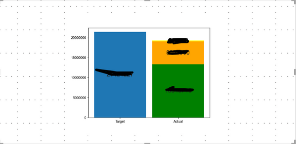
As the title says, Matplotlib Bar Chart is showing alot of empty spaces.
I want the bar chart to take up all the empty spaces shown below.
Any advice on how to get this done?
Thank you in advance!
Hi @RayWu,
Thank you for your comment.
I think my post is a little vague. What I'm trying to do is fill up the allotted space for the Python visual.
Is this an aspect ratio issue? Do you have any other advice?
Thank you in advance!
@Anonymous
To get rid of whitespace around the border, set bbox_inches='tight' in the savefig() method.
I recommend using plotly js custom visual https://appsource.microsoft.com/en-us/product/power-bi-visuals/akvelon.plotlyjsvisualbyakvelon?tab=O...
You can select bar graph and built on top of it - it has more functionality and is easier to configure stuff.
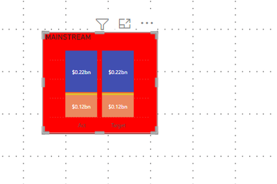
As a comparison, the table below is what I want the chart to look like.
The chart inside the square fills up all of its allotted space. No empty spaces.
Join us in Barcelona for FabCon and SQLCon, the Fabric, Power BI, SQL, and AI community event. Save €200 with code FABCMTY200.
If you love stickers, then you will definitely want to check out our community sticker challenge, Barcelona edition!
Check out the July 2026 Power BI update to learn about new features.