Get Fabric certified for FREE!
Don't miss your chance to take the Fabric Data Engineer (DP-600) exam for FREE! Find out how by attending the DP-600 session on April 23rd (pacific time), live or on-demand.
Learn more- Power BI forums
- Get Help with Power BI
- Desktop
- Service
- Report Server
- Power Query
- Mobile Apps
- Developer
- DAX Commands and Tips
- Custom Visuals Development Discussion
- Health and Life Sciences
- Power BI Spanish forums
- Translated Spanish Desktop
- Training and Consulting
- Instructor Led Training
- Dashboard in a Day for Women, by Women
- Galleries
- Data Stories Gallery
- Themes Gallery
- Contests Gallery
- QuickViz Gallery
- Quick Measures Gallery
- Visual Calculations Gallery
- Notebook Gallery
- Translytical Task Flow Gallery
- TMDL Gallery
- R Script Showcase
- Webinars and Video Gallery
- Ideas
- Custom Visuals Ideas (read-only)
- Issues
- Issues
- Events
- Upcoming Events
Next up in the FabCon + SQLCon recap series: The roadmap for Microsoft SQL and Maximizing Developer experiences in Fabric. All sessions are available on-demand after the live show. Register now
- Power BI forums
- Forums
- Get Help with Power BI
- Custom Visuals Development Discussion
- Custom Color Visual Defaulting Colors Upon Refresh
- Subscribe to RSS Feed
- Mark Topic as New
- Mark Topic as Read
- Float this Topic for Current User
- Bookmark
- Subscribe
- Printer Friendly Page
- Mark as New
- Bookmark
- Subscribe
- Mute
- Subscribe to RSS Feed
- Permalink
- Report Inappropriate Content
Custom Color Visual Defaulting Colors Upon Refresh
Hi everyone,
To save time, I saved off an existing, functiong report and just changed the data source to create a new report so I didnt have to recreate all the visuals from scratch.
The original report used standard offered BI visuals and I added custom colors for status (Red, Yellow, Green, Blue etc). This original report has been funtioning with it's original data set with no issues even with hourly refreshes for the last year.
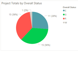
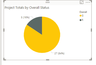
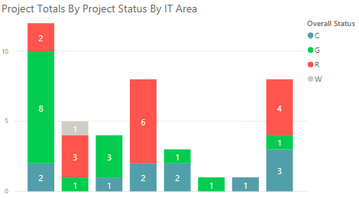
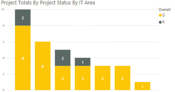
When I updated the fields in the new report to point to the new data source all the custom colors reverted back to standard BI colors. I then manually recreated all colors to match the red, yellow, green status colors and all was good. Then, I refreshed the data source to get updated data. The colors reverted back to non-custom colors, AGAIN. This report is set to refresh at least daily, if not hourly so I cant risk the colors changing every day - not sustainable. Examples of the old and new report below
Does anyone have any thoughts?
- Mark as New
- Bookmark
- Subscribe
- Mute
- Subscribe to RSS Feed
- Permalink
- Report Inappropriate Content
Please post this issue to another topic since it is not related to custom visuals.
Ignat Vilesov,
Software Engineer
Microsoft Power BI Custom Visuals
Helpful resources

New to Fabric Survey
If you have recently started exploring Fabric, we'd love to hear how it's going. Your feedback can help with product improvements.

Power BI DataViz World Championships - June 2026
A new Power BI DataViz World Championship is coming this June! Don't miss out on submitting your entry.

Join our Fabric User Panel
Share feedback directly with Fabric product managers, participate in targeted research studies and influence the Fabric roadmap.


